Band 5.5 IELTS Writing Task 1 Model Answer
Overall Band Score: 5.5 · Recent IELTS Exams (Canada & India) · 2026-11-17
IELTS Writing Task 1 question
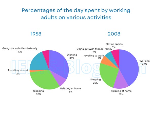
The pie charts below show how working adults in a particular country spent their time in 1958 and 2008.
Summarise the information by selecting and reporting the main features, and make comparisons where relevant.
* Note: these aren’t the original diagrams given in the test, they were recreated for the purpose of demonstration.
Student answer (Band 5.5)
The given pie charts illustrates the time spent by adult working in particular country in the year 1958 and 2008.
Overall, it can be seen that working activities were higher in both the pie charts as well as in 1958 travelling to work was just 2 percantage but it was increase by 5 percentage in the year 2008 .
Firstly its can be seen that ,in 1958 the working activites were 33 percentage but in 2008 it was 42 percentage respectively . Adults usually speend their less times on relaxing at home it was just 8 percentage in 1958 but it was increase by 5 percentage in 2008 .Moreover , sleeping activity was 32 percentage in 1958 and 25 percentage in 2008 respectively . Travelling to work was just 2 percentage in 1958 but it was increase by 5 percentage in 2008 .
Furthermore, in 1958 going out with family / friend was higher than 2008 it was 19 and 6 percentage respectively . Playing sports done by adult was same in the both year it was 7 percentage .
AI examiner evaluation
| Criterion | Band |
|---|---|
| Task Achievement / Task Response | 6.0 |
| Coherence and Cohesion | 6.0 |
| Lexical Resource | 5.0 |
| Grammatical Range and Accuracy | 5.0 |
| Overall | 5.5 |
Task Achievement / Task Response: Band 6.0
You cover the main activities and make several accurate comparisons, including work rising from 33% to 42%, sleeping falling from 32% to 25%, and socialising dropping from 19% to 6%. The overview also identifies work as a major use of time and notes the increase in commuting. However, the overview is not fully clear: “working activities were higher in both” does not specify the comparison, and the charts show that work was the largest category only in 2008, not in 1958, when sleeping was almost equal. The account also misreports sports as unchanged at 7% in both years; the chart shows sports only in 2008. A clearer overview and more careful coverage of this category would make the key features more complete.
Coherence and Cohesion: Band 6.0
The response has a recognisable structure, with an introduction, an overview, and two paragraphs presenting details. Sequencing words such as “Firstly” and “Furthermore” help signal movement between points, and the comparisons are generally grouped by activity. However, some linking is mechanical or repetitive, particularly the repeated use of “but” and “respectively.” The overview sentence combines several points in a way that is difficult to follow, and the repeated commuting comparison in the overview and first detail paragraph adds little progression. Improve cohesion by grouping increases together and decreases together, using clearer references, and ensuring each paragraph adds a distinct part of the comparison.
Lexical Resource: Band 5.0
You use relevant vocabulary for describing the charts, including “percentage,” “increase,” “relaxing at home,” and “going out with family / friend.” This gives the reader a basic understanding of the activities and changes. However, the range is limited and several word choices or forms are inaccurate, such as “working activities,” “spent their less times,” and “playing sports done by adult.” Spelling errors, including “percantage,” “activites,” and “speend,” also reduce precision. Choose standard chart language and check spelling and word forms; for example, describe the share of time “spent working” and say that a figure “rose” or “increased” by a stated number of percentage points.
Grammatical Range and Accuracy: Band 5.0
You attempt both simple and more complex sentences, and the reader can usually understand the comparisons. However, errors in agreement, articles, verb forms, and sentence construction are noticeable. For example, “The given pie charts illustrates” has a plural subject with a singular verb, while “it was increase by 5 percentage” uses an incorrect verb form. The opening phrase “The given pie charts illustrates the time spent by adult working” also has an unclear grammatical structure. Punctuation and spacing are inconsistent, especially around commas. Practise accurate comparison patterns such as “the figure increased from 2% to 7%” and check subject–verb agreement and past-tense forms when describing the two years.
See this exact question answered at other band scores. The same prompt compared across bands.
Browse more IELTS Writing model answers or get your own writing scored by the same AI examiner.