Band 5.0 IELTS Writing Task 1 Model Answer
Overall Band Score: 5.0 · Recent IELTS Exams (Canada & India) · 2026-11-17
IELTS Writing Task 1 question
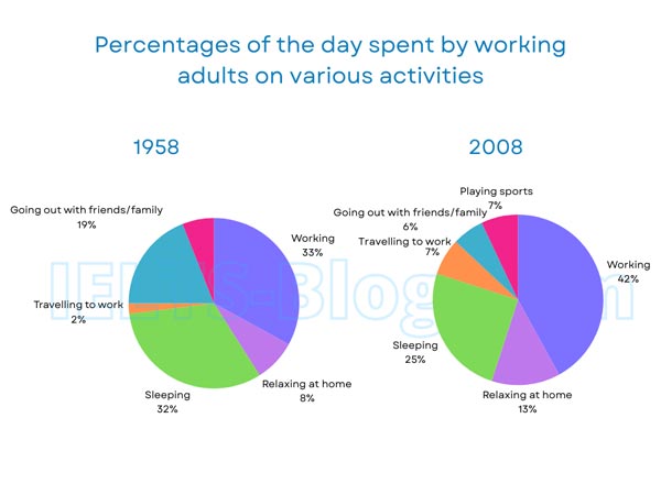
The pie charts below show how working adults in a particular country spent their time in 1958 and 2008.
Summarise the information by selecting and reporting the main features, and make comparisons where relevant.
* Note: these aren’t the original diagrams given in the test, they were recreated for the purpose of demonstration.
Student answer (Band 5.0)
This pie chart present tha discriptive data of the percentages of the day spent by working adults on varius activities as playing sports, travelling to work, going out with friends/ family, working, sleeping and relaxing at home of 1958 and year 2008. All these variable is given different colors coding like blue for working, purple for relaxing at home etc. As we see in chart there is changes of all these variable presented in 1958 and 2008 respectively in term of the people preferences. as in1958 33% people is working as compared to 2008 where 42% people prefered working this may be due to increase of inflation day by day. The same happen to travelling as only 2% people use to travel to work in 1958 and in 2008 it increases to 7% because people are more worried to have a job to bear their routine expenses. the other drastic change is in going out with family and friends and this all because of infation.
AI examiner evaluation
| Criterion | Band |
|---|---|
| Task Achievement / Task Response | 5.0 |
| Coherence and Cohesion | 4.5 |
| Lexical Resource | 5.5 |
| Grammatical Range and Accuracy | 5.0 |
| Overall | 5.0 |
Task Achievement / Task Response: Band 5.0
You identify the topic and report two accurate comparisons: working rises from 33% to 42%, while commuting increases from 2% to 7%. However, the response only partially summarises the charts. It does not give an overview of the main pattern, and it stops before explaining several important categories: sleeping falls from 32% to 25%, relaxing at home rises from 8% to 13%, and going out with friends or family drops sharply from 19% to 6%. Playing sports appears only in 2008 at 7%. The explanations about inflation and job concerns are speculative and are not shown by the charts. Focus on describing the data and include the main changes across both years.
Coherence and Cohesion: Band 4.5
The response begins by introducing the charts and then moves to comparisons between 1958 and 2008, so there is some basic organisation. However, it is presented as one long paragraph, and the progression is difficult to follow: the opening description, colour details, figures and speculative explanations are mixed together. Linking phrases such as “As we see in chart,” “as in 1958” and “the same happen” are repetitive or unclear, and the final point about going out is left without figures or a clear comparison. Use a short introduction, a separate overview, and organised detail paragraphs grouped by increases and decreases. Clearer referencing and more precise links between sentences would make the information easier to follow.
Lexical Resource: Band 5.5
You use some relevant vocabulary for describing the topic, including “percentages,” “working,” “travelling,” “drastic change” and “preferences.” This gives you a basic range for reporting the chart. However, several spelling and word-choice errors are noticeable, such as “discriptive,” “varius” and “infation,” and some phrases are unnatural or imprecise, including “different colors coding” and “people use to travel.” The repeated use of “people” and “change” also limits variety. Choose standard chart language and accurate collocations, such as “the proportion of time spent working” and “the figure for commuting.” Avoid adding explanations that the data cannot support; precise description is more effective than speculative wording.
Grammatical Range and Accuracy: Band 5.0
You attempt to connect ideas in longer sentences, for example by comparing the two years with “as compared to 2008” and giving reasons with “because.” However, these complex attempts are often faulty, and the response contains frequent errors in sentence structure, agreement and verb forms. Examples include “This pie chart present,” “All these variable is given,” and “33% people is working”; these need a singular verb, plural agreement, and more accurate sentence patterns. Tense and punctuation are also inconsistent, as in “As we see in chart” followed by a lower-case “as.” Use controlled structures such as “The proportion working rose from 33% in 1958 to 42% in 2008,” and check articles, agreement and sentence boundaries.
See this exact question answered at other band scores. The same prompt compared across bands.
Browse more IELTS Writing model answers or get your own writing scored by the same AI examiner.