Band 5.5 IELTS Writing Task 1 Model Answer
Overall Band Score: 5.5 · Recent IELTS Exams (Canada & India) · 2026-11-17
IELTS Writing Task 1 question
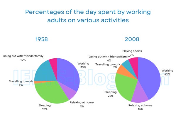
The pie charts below show how working adults in a particular country spent their time in 1958 and 2008.
Summarise the information by selecting and reporting the main features, and make comparisons where relevant.
* Note: these aren’t the original diagrams given in the test, they were recreated for the purpose of demonstration.
Student answer (Band 5.5)
The pie charts illustrates the time spends of working adults on various activities from 1958 to 2008.
overall,in the both charts highest number of the people devote their time in working. But there is a difference between the lowest percentage in using time, in the first chart peoples lowest spending sector is travelling to work, on the other hand, going out with family and friend is the lowest spending sector.
Starting with the first chart, worker invest their most of the time in working, followed by sleeping which is 32%, 1 percent less then working almost in the simillar position, then, going out with friends and family is in the third place. Moreover, 8% time is being invested in relaxing. Furthermore, only 2% time is being spend in travelling to work.
Now talking about the second chart, in year 2008 people is more cooperate with their work almost fifty percent of time is invested in working, then, 25% time is being spend in sleeping. Afterthat, relaxing consumes 13% time of a person daily activites.Then, 2 sectors are in the same percentage ( 7%) playing sports and travelling to work. Only 6% time is using in going out with others.
AI examiner evaluation
| Criterion | Band |
|---|---|
| Task Achievement / Task Response | 6.0 |
| Coherence and Cohesion | 6.0 |
| Lexical Resource | 5.5 |
| Grammatical Range and Accuracy | 5.0 |
| Overall | 5.5 |
Task Achievement / Task Response: Band 6.0
You identify the main categories and make relevant comparisons, including the rise in working time and the fall in going out with friends and family. Most figures are reported accurately: for example, you give sleeping as 32% in 1958 and 25% in 2008, and travelling as 2% and 7%. Your overview also notes that working is the largest category in both years. However, the overview could capture the overall shifts more clearly, especially the increase in relaxing at home and the appearance of sports in 2008. Some descriptions are imprecise: “almost fifty percent” does not accurately summarise 42%, and “people is more cooperate with their work” obscures the intended comparison. A sharper overview and more precise reporting would strengthen the response.
Coherence and Cohesion: Band 6.0
The response has a clear overall arrangement: an introduction, an overview, and separate paragraphs for 1958 and 2008. This makes the two charts easy to follow, and signposts such as “Starting with the first chart” and “Now talking about the second chart” help indicate progression. However, the linking is sometimes mechanical, with repeated “Then” and “Moreover,” and some connections between details are awkward. For example, “followed by sleeping… then, going out…” could be organised into a smoother comparison of the main categories. The overview also combines several points in a long sentence, making its contrast less clear. Use fewer formulaic transitions and group related figures into more deliberate comparisons.
Lexical Resource: Band 5.5
You use a relevant range of activity vocabulary, including “working,” “sleeping,” “relaxing,” and “travelling to work,” and you attempt more varied expressions such as “consumes” and “invested.” However, several word choices and collocations are inaccurate or unnatural, including “highest number of the people,” “worker invest their most of the time,” and “time is using in going out.” These choices sometimes make the intended meaning less clear. There are also spelling and word-form errors, such as “simillar,” “Afterthat,” and “activites.” Aim for precise chart language, for example “the largest share of the day was spent working” and “accounted for,” and check spelling and collocations carefully.
Grammatical Range and Accuracy: Band 5.0
You attempt both simple and more extended sentence forms, and the reader can generally understand the comparisons. However, errors in agreement, articles, verb forms, and sentence construction occur in several places. For example, “The pie charts illustrates” should use a plural verb, while “people is more cooperate” has problems with both agreement and verb form. In “the lowest percentage in using time,” the grammatical pattern is also unclear. Punctuation and spacing are inconsistent, particularly after “overall” and around commas. These errors do not prevent the main message from being understood, but they limit accuracy and control. Practise building clear sentences with a subject and correctly formed verb, then proofread agreement and punctuation.
See this exact question answered at other band scores. The same prompt compared across bands.
Browse more IELTS Writing model answers or get your own writing scored by the same AI examiner.