Band 6.0 IELTS Writing Task 1 Model Answer
Overall Band Score: 6.0 · Recent IELTS Exams (Canada & India) · 2026-11-17
IELTS Writing Task 1 question
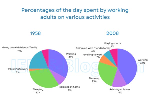
The pie charts below show how working adults in a particular country spent their time in 1958 and 2008.
Summarise the information by selecting and reporting the main features, and make comparisons where relevant.
* Note: these aren’t the original diagrams given in the test, they were recreated for the purpose of demonstration.
Student answer (Band 6.0)
The pie charts illustrate the percentage of the day spent by working adults on various activities in 1958 and 2008 in a particular country.
At a glance, it is clear that the highest figure of adults spent their time in working while the lowest proportion accounted for traveling to work and going out with friends or family in both charts.
In 1958, most adults spent their time in working accounting at 33%. By contrast, only 2% of them travelled for work. However, 32% of adults spent their time in sleep and 8% of them relaxed at home. Many of them spent their time by going out with friends or family which accounting at 19%.
After five decades, the adults favourite activity remained at the top which is working accounting for 42%. In contrast, 6% of them spent their time by going outside with friends or family. In addition, Traveling to work and playing sports showed same figure which is 7%. Sleeping activity showed a typical proportion accounted at 25%. Finally, 13% of them spent their time through relaxing at home.
AI examiner evaluation
| Criterion | Band |
|---|---|
| Task Achievement / Task Response | 6.0 |
| Coherence and Cohesion | 6.5 |
| Lexical Resource | 6.0 |
| Grammatical Range and Accuracy | 5.5 |
| Overall | 6.0 |
Task Achievement / Task Response: Band 6.0
You identify the main pattern that working took the largest share in both years and report several relevant figures accurately, including 33% and 42% for work, and the decline in sleeping and socialising. However, the overview is not fully accurate: travelling to work and going out with friends or family were not the lowest categories in both charts, since sleeping was the smallest category in 2008 only if comparing? In fact, socialising at 6% was the lowest in 2008, while travelling was 2% in 1958. More importantly, playing sports appears only in 2008, but this notable feature is not explained. Some comparisons are listed rather than developed, so the main changes across the period could be clearer and more complete.
Coherence and Cohesion: Band 6.5
The response has a clear four-part structure: an introduction, an overview, and separate paragraphs for each year. This makes the information easy to follow, and time markers such as “In 1958” and “After five decades” help signal the comparison. The sequence within each year is generally understandable, although the figures are mostly presented one by one rather than grouped into meaningful comparisons. Some linking is mechanical, particularly the repeated “In contrast,” “In addition,” and “Finally,” and “However” does not express a clear contrast in its sentence. To strengthen progression, group related changes—for example, the rise in work and travel against the falls in sleep and socialising—and use referencing and transitions more selectively.
Lexical Resource: Band 6.0
You use an adequate range of task-related vocabulary, including “proportion,” “accounted for,” “relaxed at home,” and “travelled to work,” so the chart is generally clear. There are also attempts to vary expressions for describing shares. However, several collocations are inaccurate or unnatural, such as “spent their time in working,” “spent their time in sleep,” and “spent their time by going out.” “Favourite activity” is also imprecise for a chart showing time allocation, and “typical proportion” does not clearly describe the 25% figure. These choices do not prevent understanding, but they limit precision. Prefer standard reporting phrases such as “the share of the day devoted to…” and “accounted for” or “represented” a given percentage.
Grammatical Range and Accuracy: Band 5.5
You attempt a mix of simple and more complex sentences, and most figures remain understandable. Some grammatical errors occur in sentence patterns and agreement. For example, “the highest figure of adults spent their time in working” has an unclear subject construction, while “which accounting at 19%” and “which is 42%” do not use the appropriate verb form for reporting data. The sentence beginning “At a glance” also has a faulty parallel structure: the categories are described as the “lowest proportion,” although the sentence refers to two activities. There is some control of past-tense reporting, but tense and clause construction are not consistently accurate. Use direct structures such as “Working accounted for 33%” and check that relative clauses have a complete, correctly formed verb.
See this exact question answered at other band scores. The same prompt compared across bands.
Browse more IELTS Writing model answers or get your own writing scored by the same AI examiner.