Band 5.5 IELTS Writing Task 1 Model Answer
Overall Band Score: 5.5 · Recent IELTS Exams (Canada & India) · 2026-11-18
IELTS Writing Task 1 question
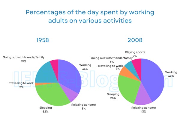
The pie charts below show how working adults in a particular country spent their time in 1958 and 2008.
Summarise the information by selecting and reporting the main features, and make comparisons where relevant.
* Note: these aren’t the original diagrams given in the test, they were recreated for the purpose of demonstration.
Student answer (Band 5.5)
The pie charts illustrates how working adulits in a particular country spent their time in 1858 and 2008. Percentag of the day spent by working adulits on various activities-going out with friends/family, playing sports, working, relaxing at home, sleeping, travelling to work.
Overall it is clear that, both pie chart comparatively adults working is the highest percentage of spent on the activities and second highest percentage of sleeping. While,going out with friends/family and relaxing at home lowest percentage of activities. Furthermore,in contrast travelling and playing sports is the least percentage of time spent adults.
Looking at the details, in 1958 working just 33% of adult go to work, after in 2008 peacked at 42% of worker go to working and the second highest sleeping 32% to decrease 25%. Moreover, going out with friends/family 19% 0f adult first year but after in 2008 declined 6% and relaxing at home adults for 8% to 13% rise. In contrast , travelling to work and playing sports 2% to 7% and 5% to 7% both activities ,it,s the least time spent by working adults on activities the day.
In summary, most of the adults spent on working and sleeping. The lowest percentage of adults going with friends/family and relaxing time. While, least percentage of travelling to work and playing sports.
AI examiner evaluation
| Criterion | Band |
|---|---|
| Task Achievement / Task Response | 6.0 |
| Coherence and Cohesion | 6.0 |
| Lexical Resource | 5.0 |
| Grammatical Range and Accuracy | 5.0 |
| Overall | 5.5 |
Task Achievement / Task Response: Band 6.0
You identify the main pattern that working takes the largest share in both years and report several relevant changes, including work rising from 33% to 42%, sleep falling from 32% to 25%, and socialising dropping from 19% to 6%. This gives the reader a useful comparison across the charts. However, the overview is not fully clear: it calls relaxing and socialising the lowest categories, although travelling is lower in 1958, and it does not clearly explain that sports appears only in 2008. The sports figure is also reported as 5% in 1958, whereas the chart gives no 1958 sports category and shows 7% in 2008. Focus the overview on the largest increases and decreases, and report only chart-supported figures.
Coherence and Cohesion: Band 6.0
The response has a recognisable structure, with an introduction, an overview, a paragraph of details and a concluding summary. The detail paragraph generally moves through the main categories and uses comparison markers such as “after,” “Moreover” and “In contrast.” However, some links are mechanical or unclear, and the final summary repeats points already made without adding a clearer synthesis. Phrases such as “both pie chart comparatively” and “travelling and playing sports is the least percentage” make relationships between ideas difficult to follow. Group the figures by the most notable changes—for example, increases in work and commuting versus decreases in sleep and socialising—and use clear sentence links and references to guide the reader.
Lexical Resource: Band 5.0
You use relevant topic vocabulary, including “percentage,” “declined,” “rise” and “activities,” and attempt to describe change rather than simply list figures. However, the range and control are limited, with repeated wording such as “percentage,” “activities” and “spent,” and several inaccurate or unnatural combinations. “Adults working is the highest percentage of spent” does not express the intended comparison naturally, while “peacked” is a misspelling and “go to working” is an unsuitable phrase. These choices sometimes make the meaning harder to understand. Build a small set of accurate chart-description expressions, such as “accounted for,” “increased to” and “the smallest share,” and check spelling and word forms before submitting.
Grammatical Range and Accuracy: Band 5.0
You attempt both simple statements and longer comparisons, including the sentence contrasting the changes in work and sleep. Some grammatical control is evident, but errors in agreement, sentence construction, articles and punctuation recur. For example, “The pie charts illustrates” has a plural subject with a singular verb, and “working just 33% of adult go to work” lacks a clear grammatical structure. The sentence beginning “Moreover, going out with friends/family 19%” also needs a verb to connect the category and figure. Use complete subject–verb sentences, keep comparisons parallel, and separate clauses with appropriate punctuation. More accurate control of these basic patterns would make your comparisons much easier to follow.
See this exact question answered at other band scores. The same prompt compared across bands.
Browse more IELTS Writing model answers or get your own writing scored by the same AI examiner.