Band 5.5 IELTS Writing Task 1 Model Answer
Overall Band Score: 5.5 · Recent IELTS Exams (Canada & India) · 2026-11-18
IELTS Writing Task 1 question
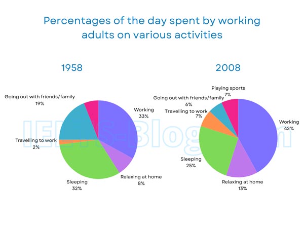
The pie charts below show how working adults in a particular country spent their time in 1958 and 2008.
Summarise the information by selecting and reporting the main features, and make comparisons where relevant.
* Note: these aren’t the original diagrams given in the test, they were recreated for the purpose of demonstration.
Student answer (Band 5.5)
The pie chart illustrate that the how working adults spent their time in diffierent activites in two different years in a nation in the year 1958 and 2008. Overall , In a both year pepole were prefer to working in office rather than spending time in other activites.since 1958 adults should less spend time in travelling on the other hand year of 2008 citizens less admire in spending time with their family . To begin with, both two years pepole are prefer the doing their woerk rether than other curicular activities by the above 30%.Secondly, highest admired activiy was sleeping in the both years since 1958 pepole sleeps 32% otherwies in the year of 2008 it was decined by 7%. In the year of 1958 adult prefer to spent time with their family 19% in contras year of 2008 it was drastically declined to 6%.Additonally in a year of 1958 travelling was wrost activity for adult only 2 %prefer to traveld their work place.But some how it was increased in 2008 by the 5%. Least activity in both years was playing sport it dose not change intresest in these years.
AI examiner evaluation
| Criterion | Band |
|---|---|
| Task Achievement / Task Response | 6.0 |
| Coherence and Cohesion | 5.0 |
| Lexical Resource | 5.0 |
| Grammatical Range and Accuracy | 5.0 |
| Overall | 5.5 |
Task Achievement / Task Response: Band 6.0
You identify several important comparisons, including the rise in working time from 33% to 42%, the fall in sleeping from 32% to 25%, and the decline in time with family or friends from 19% to 6%. These details support a relevant overview of changing routines. However, the overview is unclear in places: the claim that sleeping was the “highest admired activity” in both years is inaccurate, since work was the largest category in 2008. You also say playing sport was the least activity in both years and did not change, but it appears only in the 2008 chart, at 7%. Covering the new category and clarifying the main overall shifts would make the report more complete and precise.
Coherence and Cohesion: Band 5.0
The response has a recognisable overall structure: an introduction and overview are followed by comparisons of work, sleep, socialising and travel. Connectors such as “To begin with,” “Secondly,” and “Additionally” help signal movement between points. However, progression is weakened by unclear or contradictory statements, particularly the overview’s claim about the preferred activity and the later assertion that sleeping was highest. Some transitions are mechanical, and several ideas are crowded into long, poorly punctuated sentences. Grouping the main increases and decreases into clearer paragraphs, then using precise links such as “By contrast” or “Meanwhile,” would make the comparisons easier to follow.
Lexical Resource: Band 5.0
You attempt a range of vocabulary relevant to describing charts, including “declined,” “increased,” “prefer,” and “in contrast.” This shows an effort to report trends rather than simply list figures. However, many choices are inaccurate or unnatural, such as “highest admired activity,” “wrost activity,” and “less admire in spending time.” Spelling errors—including “diffierent,” “activites,” and “Additonally”—also make the report less clear. Use standard chart language and check word forms and spelling carefully; for example, describe a category as the “largest share” and say that a percentage “fell” or “rose.”
Grammatical Range and Accuracy: Band 5.0
You attempt both simple statements and longer sentences with contrast, as in “In the year of 1958 adult prefer to spent time with their family … in contras year of 2008…”. However, errors in verb forms, agreement, articles and sentence construction are frequent enough to make some relationships difficult to understand. Examples include “The pie chart illustrate,” “people were prefer,” and “it was declined by 7%.” Several sentences also lack clear boundaries or have faulty punctuation, such as the opening overview. Practise forming accurate past-tense comparisons—for example, “Adults spent 19% of their day with family or friends in 1958, compared with 6% in 2008”—before adding more complex clauses.
See this exact question answered at other band scores. The same prompt compared across bands.
Browse more IELTS Writing model answers or get your own writing scored by the same AI examiner.