Band 5.5 IELTS Writing Task 1 Model Answer
Overall Band Score: 5.5 · Recent IELTS Exams (Canada & India) · 2026-11-18
IELTS Writing Task 1 question
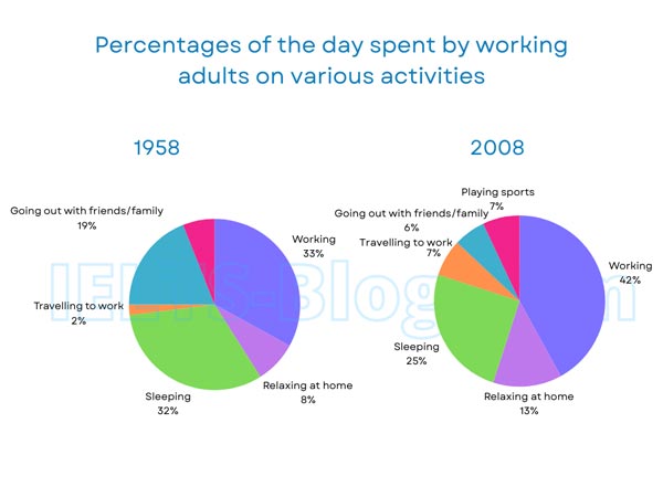
The pie charts below show how working adults in a particular country spent their time in 1958 and 2008.
Summarise the information by selecting and reporting the main features, and make comparisons where relevant.
* Note: these aren’t the original diagrams given in the test, they were recreated for the purpose of demonstration.
Student answer (Band 5.5)
The pie charts give information about the how working adults in a any nation spent their time in the year of 1958 as well as 2008.
After analyzing the pie graph, it can seen that the time of day most of the working people spend their time on working which was 33% in the year of 1958. Therefore, 2% and 8% of day time spend on travelling as well as relaxing time. In the year of 1958 worker expand their 32% time on sleeping. Moreover, 19% worker like to spend their time to going out with their family/ friends.
Further, the next pie chart shows, employes spend their on working which was 42% in the year of 2008. Furthermore, adults worker invest their 25% of time on sleeping. worker like to spend thier 13% time on relaxing at home. In addition, travelling to work and playing sports was same(7%) in the year 2008. Workers like to go with their family or friends which was 6%.
Overall, the adults worker like to spend their more time on working activities in the both years.
AI examiner evaluation
| Criterion | Band |
|---|---|
| Task Achievement / Task Response | 5.0 |
| Coherence and Cohesion | 6.0 |
| Lexical Resource | 5.0 |
| Grammatical Range and Accuracy | 5.0 |
| Overall | 5.5 |
Task Achievement / Task Response: Band 5.0
You report the main figures for both years, including the largest categories: working (33% in 1958 and 42% in 2008) and sleeping (32% and 25%). You also include the smaller categories, so the response is relevant to the charts. However, the overview is limited to saying that working took the most time in both years. It does not summarise the other major changes, such as the fall in going out with friends or family from 19% to 6%, or the increases in travel and relaxing at home. The opening also says “a any nation,” which is unclear. To address the task more fully, give a concise overview of the main rises and falls, then compare the figures rather than mainly listing them year by year.
Coherence and Cohesion: Band 6.0
The response has a coherent overall arrangement: it introduces the charts, describes 1958, moves to 2008, and ends with an overview. Connectors such as “Moreover,” “Further,” and “In addition” help signal the sequence. However, the organisation is mostly a list of figures, and the comparisons between years are not developed together, which makes the progression less effective. Some linking is mechanical, and references such as “the next pie chart” add little to the comparison. Grouping the information by trends—for example, categories that increased versus those that decreased—would create a clearer line of development. Keep the overview distinct and make sure each paragraph has a clear purpose.
Lexical Resource: Band 5.0
You use relevant topic vocabulary, including “working,” “sleeping,” “travelling,” and “relaxing at home,” and the reader can generally identify the activities being described. However, the range is limited and several word choices or collocations are inaccurate, such as “spend their time on working,” “invest their 25% of time,” and “go with their family or friends.” There are also noticeable spelling errors, including “employes” and “thier.” These choices sometimes make the description less natural or less precise. Use standard chart-reporting language such as “accounted for,” “spent,” “rose,” and “fell,” and check spelling carefully. Avoid repeating “like to spend,” since the charts show proportions rather than preferences.
Grammatical Range and Accuracy: Band 5.0
You attempt both simple and longer sentence forms, and the main figures are usually understandable. However, errors occur frequently in basic sentence construction and in attempts at more complex structures. For example, “it can seen” is missing a verb form, while “2% and 8% of day time spend” lacks a clear subject and correct passive construction. There are also problems with articles and agreement in phrases such as “the adults worker” and “working activities in the both years.” Most sentences follow a similar pattern, so the range remains limited. Practise accurate forms such as “2% of the day was spent travelling” and “workers spent 13% of their time relaxing at home,” then vary sentence structures while maintaining control.
See this exact question answered at other band scores. The same prompt compared across bands.
Browse more IELTS Writing model answers or get your own writing scored by the same AI examiner.