Band 5.0 IELTS Writing Task 1 Model Answer
Overall Band Score: 5.0 · Recent IELTS Exams (Canada & India) · 2026-11-18
IELTS Writing Task 1 question
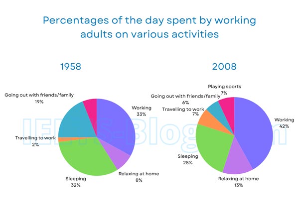
The pie charts below show how working adults in a particular country spent their time in 1958 and 2008.
Summarise the information by selecting and reporting the main features, and make comparisons where relevant.
* Note: these aren’t the original diagrams given in the test, they were recreated for the purpose of demonstration.
Student answer (Band 5.0)
in this picture show that the adults activities in 1958 camparison with the 2008 which shows alot of difference between both of them in 1958 we see the percentage of adults between the family only 19 percent they can serve19 percent of their time to go out family or freinds they work 33 percent for working from their daily hours 2 percent only for travelling to work they can be sleeep for 32 percentage and realing hojme only 8 percent 5 percent for \playing sports in the second graph which show that a very busy sceduale in 2008 they are 42 percent spent for working tghey can be spent 7 percent for playing sports or they go out with their family and freinds only 6 percent theyu can be spent 7 percent for travelling to work and they must b 25 percent spent on sleeping last 13 percent they spent 13 percent relaxing at home
AI examiner evaluation
| Criterion | Band |
|---|---|
| Task Achievement / Task Response | 5.0 |
| Coherence and Cohesion | 4.5 |
| Lexical Resource | 5.0 |
| Grammatical Range and Accuracy | 4.5 |
| Overall | 5.0 |
Task Achievement / Task Response: Band 5.0
You include figures from both years and identify several relevant categories, such as working, sleeping, travel and relaxing at home. However, the response mainly lists individual percentages rather than summarising the most important overall changes. A clear overview is missing: for example, working became the largest share in 2008, while sleeping and going out with friends or family declined; travel and relaxing at home increased. There is also a factual error in saying that 5% of the day was spent playing sports in 1958: that category is not shown for that year. The comparison that 2008 was a “very busy schedule” is not sufficiently explained by the data. Select the main trends and report them accurately to make the response more complete.
Coherence and Cohesion: Band 4.5
The response follows a basic chronological order, discussing 1958 before moving to 2008, and this gives the reader some sense of how the information is organised. However, it is presented as one long, largely unpunctuated sequence, so the relationships between details are often difficult to follow. Phrases such as “in the second graph” provide a simple transition, but links between the figures are limited and the repeated “they” has unclear reference. Grouping the information into an introduction, an overview and two comparison-focused detail sections would create clearer progression. Use full stops and linking expressions to distinguish the main trends from supporting figures, rather than presenting each percentage as a separate item in a run-on sentence.
Lexical Resource: Band 5.0
You use some relevant vocabulary for describing the charts, including “percentage,” “working,” “travelling to work” and “relaxing at home.” This shows a basic range suited to the topic. However, spelling errors and inaccurate or awkward word choices are frequent enough to make parts of the response difficult to understand, as in “camparison,” “sceduale,” “real ing hojme” and “serve19 percent.” Some expressions are also imprecise: “adults activities” and “spent for working” do not describe the data naturally. Aim for accurate chart language and check spelling carefully. For example, “accounted for” or “made up” can introduce a share, while “the proportion of time spent working” is clearer than “spent for working.”
Grammatical Range and Accuracy: Band 4.5
There are attempts to form longer sentences and connect information, but the response relies heavily on loosely joined clauses, and frequent grammatical errors make the relationships between ideas unclear. For instance, “in this picture show that” lacks a clear subject and correctly formed verb, while “they work 33 percent for working” has an unclear structure. Verb forms and agreement are also inconsistent, as in “which show” and “they can be spent.” Punctuation is largely absent, creating run-on sentences and making it harder to identify where one point ends and another begins. Practise writing short, complete sentences with a clear subject and verb, then combine them using accurate clauses and punctuation.
See this exact question answered at other band scores. The same prompt compared across bands.
Browse more IELTS Writing model answers or get your own writing scored by the same AI examiner.