Band 7.0 IELTS Writing Task 1 Model Answer
Overall Band Score: 7.0 · Recent IELTS Exams (Canada & India) · 2026-11-19
IELTS Writing Task 1 question
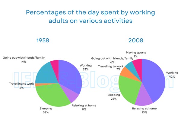
The pie charts below show how working adults in a particular country spent their time in 1958 and 2008.
Summarise the information by selecting and reporting the main features, and make comparisons where relevant.
* Note: these aren’t the original diagrams given in the test, they were recreated for the purpose of demonstration.
Student answer (Band 7.0)
The pie chart illustrates percentage of the day spent by working adults on various activities in 1958 and 2008.
Overall, working occupied the largest proportion of adult's time in both years, and its share increased with time considerably. In contrast, the percentage of time spent sleeping declined, while playing sports and relaxing at home became more popular activities.
In 1958, working accounted for 33% of people's time, which made it the most common activity. Sleeping represented almost a third, at 32%. Going out with friends and family made up 19%. A very less proportion of time was devoted to relaxing at home, which was only 8%. travelling to work accounted for the smallest figure, at just 2%.
By 2008, the portion of time allocated to working had risen significantly to 42% an increase of nine percentage points. Sleeping, however had a notable decline from 32% to 25%. Going out with friends and family had a substantial decrease from 19% to 6%. Playing sports which was not represented in 1958 accounted for 7%. Relaxing at home had an increase of 5 percentage points and became 13%. Finally travelling to work rose from 2% to 7%.
AI examiner evaluation
| Criterion | Band |
|---|---|
| Task Achievement / Task Response | 7.5 |
| Coherence and Cohesion | 7.0 |
| Lexical Resource | 6.5 |
| Grammatical Range and Accuracy | 6.0 |
| Overall | 7.0 |
Task Achievement / Task Response: Band 7.5
The response selects the main features and reports the figures accurately: work was the largest category in both years and rose from 33% to 42%, while sleeping and socialising declined. The overview also notes the growth in time spent relaxing at home and the appearance of sports in 2008. Comparisons such as the nine-percentage-point rise in work and the fall in going out from 19% to 6% are relevant and well supported. This is a strong, well-developed account of the charts. To make the coverage still more complete, clarify that sports is shown only in 2008 rather than implying a measured increase, and keep the overview’s claim that activities became “more popular” precise: the chart shows time shares, not popularity itself.
Coherence and Cohesion: Band 7.0
The response is organised clearly into an introduction, an overview, and separate paragraphs for the two years. The progression from the 1958 figures to the 2008 comparisons is easy to follow, and linking expressions such as “In contrast,” “By 2008,” and “Finally” help guide the reader. The comparisons within the final paragraph are also logically grouped. Some cohesion is slightly mechanical because several sentences begin with activity labels, and the 2008 paragraph lists categories one by one rather than grouping the increases and decreases. More varied referencing and clearer grouping of related trends would make the progression feel more flexible and less list-like.
Lexical Resource: Band 6.5
There is an adequate range of task-appropriate vocabulary, including “accounted for,” “represented,” “allocated,” “decline,” and “percentage points.” These choices allow the writer to describe proportions and changes clearly, and the meaning remains easy to understand. Some less natural or imprecise expressions limit the flexibility of the vocabulary: “a very less proportion” is awkward, and “became more popular” interprets time allocation as popularity. “The smallest figure” is understandable but could be more precise as “the smallest share.” There is also inconsistent capitalisation of “travelling” after a full stop. Aim for more natural collocations and precise descriptions of what the chart measures.
Grammatical Range and Accuracy: Band 6.0
The response uses a mix of simple and more complex sentence forms, including relative clauses (“which made it the most common activity”) and contrastive structures (“Sleeping, however, had a notable decline”). Most sentences communicate the data clearly, but some grammatical and punctuation errors remain. In “working had risen significantly to 42% an increase of nine percentage points,” a full stop, semicolon, or dash is needed before the added comparison. Commas are also missing around “however” and the clause beginning “which was not represented in 1958.” The phrase “percentage of the day” would be more accurate grammatically as “percentage of the day spent,” and “adult’s time” should be plural possessive (“adults’ time”) or recast. Greater control of these details would strengthen accuracy.
See this exact question answered at other band scores. The same prompt compared across bands.
Browse more IELTS Writing model answers or get your own writing scored by the same AI examiner.