Band 6.0 IELTS Writing Task 1 Model Answer
Overall Band Score: 6.0 · Recent IELTS Exams (Canada & India) · 2026-11-19
IELTS Writing Task 1 question
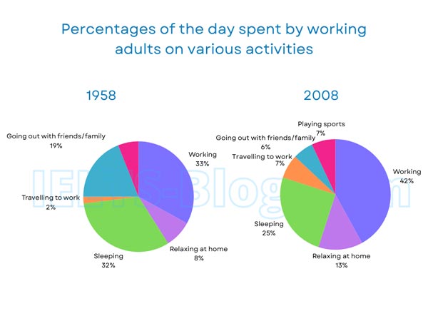
The pie charts below show how working adults in a particular country spent their time in 1958 and 2008.
Summarise the information by selecting and reporting the main features, and make comparisons where relevant.
* Note: these aren’t the original diagrams given in the test, they were recreated for the purpose of demonstration.
Student answer (Band 6.0)
working barche
The pie chart illustrates the percentages of the day spent by working adults of a country on various activities in 1958 and 2008.
Overall, working adults spent their most of the time of a day in working and sleeping in both the years. While,other activities such as travelling to work, relaxing increased and outing decreased over the time. Meanwhile, young employers also added playing sports as part of their daily activity in 2008.
Working was one of the most common activities which took most of the time of their day, which was 33% in 1958 and 42% in 2008. Additionally, working adults used their 32% of day time in sleeping in 1958, which dropped to only 25% in 2008.Going out was another famous activity in 1958, which was 19% but in 2008 in was declined to only 6%.
Travelling to work was only 2% in 1958 and the proportion rose to 7% in the 2008, meanwhile, playing sports was new addition to their daily activities which stood for 7% in their day to day work.
AI examiner evaluation
| Criterion | Band |
|---|---|
| Task Achievement / Task Response | 6.5 |
| Coherence and Cohesion | 6.0 |
| Lexical Resource | 5.5 |
| Grammatical Range and Accuracy | 5.5 |
| Overall | 6.0 |
Task Achievement / Task Response: Band 6.5
You identify the main pattern accurately: working takes the largest share in 2008, while sleeping and going out both decline, and you include several correct figures, such as work rising from 33% to 42% and going out falling from 19% to 6%. The overview also notes the appearance of sports in 2008. This gives the response a clear summary of the key changes. However, some features are less fully reported: relaxing at home rises from 8% to 13%, but this change is only mentioned generally, and the 2008 figures for going out and sleeping could be compared more explicitly with the other activities. The phrase “young employers” is unsupported by the chart. More complete coverage and precise descriptions would strengthen the response further.
Coherence and Cohesion: Band 6.0
The response has a recognisable structure, moving from an introduction and overview to paragraphs describing the figures. The main comparisons are generally easy to follow, and linking expressions such as “Additionally” and “Meanwhile” help connect information. However, cohesion is sometimes mechanical or unclear. For example, “While, other activities…” is an awkward transition, and “Meanwhile” is used to introduce sports even though the relationship between that point and the preceding trend is not clear. The final paragraph groups travel and sports but leaves relaxing at home without a specific comparison. Use clearer topic sentences and organise the details into related groups, such as increases and decreases, to make the progression more consistent.
Lexical Resource: Band 5.5
You use relevant vocabulary for describing charts, including “proportion,” “rose,” “dropped,” and “declined,” and the reader can understand the main comparisons. There is some variety in how changes are expressed. However, several word choices and collocations are inaccurate or unnatural, including “spent their most of the time,” “famous activity,” “new addition,” and “stood for 7%.” “Young employers” is also an inaccurate label for the people represented. These choices reduce precision, particularly in an academic report. Aim for standard chart language and accurate activity labels, such as “accounted for,” “share,” and “leisure activities,” while avoiding informal or unsupported descriptions.
Grammatical Range and Accuracy: Band 5.5
You attempt a mix of simple and complex sentences, including clauses with “which” and contrasts between the two years. Most of the intended meaning remains understandable, but some grammatical errors recur. For example, “spent their most of the time of a day” has an incorrect possessive structure, and “which dropped to only 25%” needs a clearer grammatical connection to the preceding clause. There are also punctuation and sentence-boundary problems, as in “2008.Going out,” and the opening overview has an awkward “While” construction. Practise accurate article use, clause linking, and punctuation, then check each sentence for a complete and natural structure.
See this exact question answered at other band scores. The same prompt compared across bands.
Browse more IELTS Writing model answers or get your own writing scored by the same AI examiner.