Band 5.0 IELTS Writing Task 1 Model Answer
Overall Band Score: 5.0 · Recent IELTS Exams (Canada & India) · 2026-11-20
IELTS Writing Task 1 question
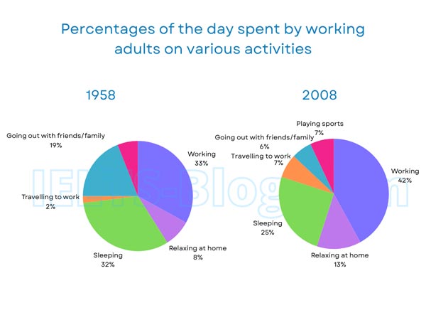
The pie charts below show how working adults in a particular country spent their time in 1958 and 2008.
Summarise the information by selecting and reporting the main features, and make comparisons where relevant.
* Note: these aren’t the original diagrams given in the test, they were recreated for the purpose of demonstration.
Student answer (Band 5.0)
Here we see that, In 1958 33% person were involve in working and it was the highest rate. I think it was a good things. By involved in working people earned more money and left away from different types of crime. On the others hand, In 2008 42% people were working and its definitely a higher rate than 1958. Thats mean Rates were increase from pervious and more person involve in work and obviously its a good way for countries economy. we can see that sleeping rate decreased from 1958 to 2008. At 1958, 32% people was sleep at home but at 2008 25% people found in sleeping. Traveling to work is also a portion of this pie chart. At, 1958 2% people was traveling to work where 7% people was traveling to work its a increasing rate. Relaxing at home its a interesting part of this chart.Which is change in a increasing manner. It indicates thats people at 1958 was more introvert than people of 2008.
Playing sports is a most common things for recent age but it was not more popular for 1958s people . But its a matter of regret that going out with family is a important family part which is decrease day by day.
AI examiner evaluation
| Criterion | Band |
|---|---|
| Task Achievement / Task Response | 5.5 |
| Coherence and Cohesion | 5.0 |
| Lexical Resource | 5.0 |
| Grammatical Range and Accuracy | 5.0 |
| Overall | 5.0 |
Task Achievement / Task Response: Band 5.5
You report several accurate comparisons, including the rise in working from 33% to 42%, the fall in sleeping from 32% to 25%, and the increase in commuting from 2% to 7%. You also mention the decline in going out with family and friends, which is an important change. However, the response does not give the figures for relaxing at home or going out, and it does not clearly summarise the overall pattern across the charts. Some commentary, such as claiming that working reduced crime or that the figures show people were more introverted, is not supported by the data. Focus on describing what the charts show, include the main figures, and provide a concise overview rather than personal explanations.
Coherence and Cohesion: Band 5.0
The response moves through several activities and uses basic linking phrases such as “On the others hand,” “but,” and “also,” so the reader can follow some comparisons. However, the information is presented as one continuous sequence without clear paragraphing or an overview-first structure. Connections are sometimes unclear: “Relaxing at home its a interesting part of this chart. Which is change…” leaves the relationship between the sentences incomplete, while “Playing sports” appears abruptly near the end. Group the main trends into paragraphs and use clear comparisons to connect each pair of figures. Avoid repeating “we can see” and “at 1958”; more varied, accurate referencing would make the progression easier to follow.
Lexical Resource: Band 5.0
You use some relevant topic vocabulary, including “working,” “sleeping,” “traveling to work,” and “decreased,” and the reader can generally identify the activities being discussed. However, the range is limited and several word choices or collocations are inaccurate, such as “highest rate” for a share of time, “people found in sleeping,” and “a increasing rate.” Informal or evaluative phrases such as “a matter of regret” and “a good things” are not suitable for a neutral chart summary. Choose precise terms for proportions and changes, and avoid interpreting the data emotionally. For example, “accounted for the largest share” and “rose from 2% to 7%” would express the information more naturally.
Grammatical Range and Accuracy: Band 5.0
You attempt some longer sentences and comparisons, but the response relies mainly on simple structures, and errors are frequent enough to make parts awkward or unclear. Examples include “33% person were involve,” “32% people was sleep,” and “Thats mean Rates were increase,” which show problems with articles, agreement, verb forms, and tense. Sentence boundaries and punctuation also need attention: “chart.Which” runs together, while “Which is change…” is a fragment. Practise forming accurate past-tense reporting sentences, such as “In 1958, 32% of the day was spent sleeping, compared with 25% in 2008.” Use a consistent past tense and check subject–verb agreement and sentence completeness.
See this exact question answered at other band scores. The same prompt compared across bands.
Browse more IELTS Writing model answers or get your own writing scored by the same AI examiner.