Band 6.0 IELTS Writing Task 1 Model Answer
Overall Band Score: 6.0 · Recent IELTS Exams (Canada & India) · 2026-11-20
IELTS Writing Task 1 question
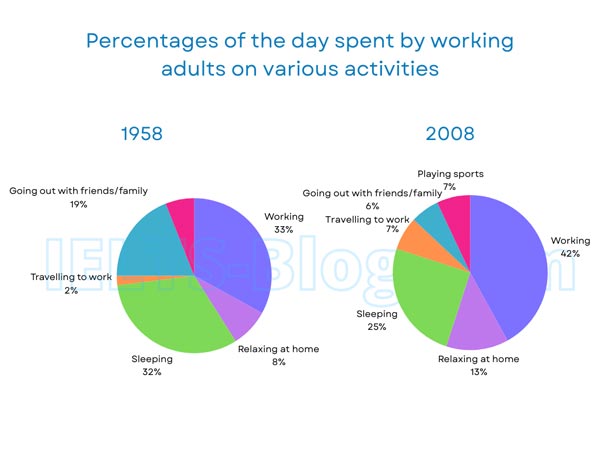
The pie charts below show how working adults in a particular country spent their time in 1958 and 2008.
Summarise the information by selecting and reporting the main features, and make comparisons where relevant.
* Note: these aren’t the original diagrams given in the test, they were recreated for the purpose of demonstration.
Student answer (Band 6.0)
The pie charts illustrate the percentage of the day spent by working adults on differnet activities in a country in 1958 and 2008.
Overall, people were spending more time on working had increased, as well as, spending time on realxing at home and travelling to work also rose up. In contrast,Sleeping time and going out with family time decreased.
In 1958, people spent their most of the time on working and this percentage was 33. Along with that, 32% of their time, they spent on sleeping. Going out with their friends and family accounted for only 19% their time. A very less proportion of time devoted at relaxing at home, which was only 8%. Only 2% of their time, they spent on travelling to work.
In 2008, the portion of allocated time on working had risen significantly to 42% an increase nine percentage points. Time spent on sleeping and going out with familly and friends dicreased, the percentage was 32 to 25 for sleeping and 19 to 6 in going out with family and friends. There was no figure in 1958 for playing sports but 7% of their time they were spending on sports. Relaxing at home had increased to 8% to 13%. On the other hand travel time increased from 2% to 7%.
AI examiner evaluation
| Criterion | Band |
|---|---|
| Task Achievement / Task Response | 6.5 |
| Coherence and Cohesion | 6.5 |
| Lexical Resource | 5.5 |
| Grammatical Range and Accuracy | 5.5 |
| Overall | 6.0 |
Task Achievement / Task Response: Band 6.5
You identify the main overall shifts accurately: working, relaxing at home and commuting took a larger share in 2008, while sleeping and socialising declined. The key figures are also mostly reported correctly, including work rising from 33% to 42% and going out falling from 19% to 6%. This gives the response a clear, relevant account of both charts. However, the overview is awkwardly phrased, and the comparison of the largest categories could be clearer: sleeping was almost equal to working in 1958, whereas work was clearly dominant in 2008. The sports figure is correctly noted as 7% in 2008, but saying there was “no figure” in 1958 is less precise than explaining that sports is not shown for that year. More selective, clearly expressed comparisons would strengthen the summary.
Coherence and Cohesion: Band 6.5
The response has a sensible four-part structure: an introduction, an overview, and separate descriptions of the two years. This makes the information easy to follow, and phrases such as “In contrast” and “On the other hand” help signal comparisons. The progression is generally logical, but some links are mechanical or unclear. For example, “Along with that” does not express the relationship between work and sleeping particularly precisely, while the long sentence beginning “Time spent on sleeping and going out…” combines several comparisons without clear punctuation. The overview also contains a confusing sequence of ideas. To make the organisation more fluent, group related increases and decreases together and use concise linking language that makes each comparison explicit.
Lexical Resource: Band 5.5
You use relevant chart vocabulary, including “percentage,” “accounted for,” “allocated time,” and “increase nine percentage points,” so the reader can understand the main comparisons. However, word choice and collocation are often inaccurate or unnatural, which limits precision. Examples include “people spent their most of the time,” “a very less proportion,” “devoted at relaxing,” and “travel time” where “time spent travelling to work” would be clearer. There are also noticeable spelling errors, such as “differnet,” “realxing,” “familly,” and “dicreased.” Aim for a smaller set of accurate, natural expressions rather than forcing formal-sounding phrases. Proofreading spelling and checking common collocations would make the description more fluent and reliable.
Grammatical Range and Accuracy: Band 5.5
You attempt both simple and more complex sentence forms, and most of the chart information remains understandable. However, some grammatical errors recur and make several sentences awkward. The overview’s “people were spending more time on working had increased” has an incorrect verb construction; a clearer form is “the proportion of time spent working increased.” In “19% their time,” a preposition is missing, and “Only 2% of their time, they spent…” uses an awkward sentence structure. The sentence comparing sleeping and socialising also needs clearer parallel structure and punctuation. These issues show that complex comparisons are not yet consistently controlled. Practise accurate passive and comparative forms, and check articles, prepositions and clause structure when editing.
See this exact question answered at other band scores. The same prompt compared across bands.
Browse more IELTS Writing model answers or get your own writing scored by the same AI examiner.