Band 6.0 IELTS Writing Task 1 Model Answer
Overall Band Score: 6.0 · Recent IELTS Exams (Canada & India) · 2026-11-20
IELTS Writing Task 1 question
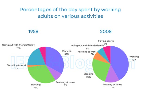
The pie charts below show how working adults in a particular country spent their time in 1958 and 2008.
Summarise the information by selecting and reporting the main features, and make comparisons where relevant.
* Note: these aren’t the original diagrams given in the test, they were recreated for the purpose of demonstration.
Student answer (Band 6.0)
The two pie charts illustrate the percentages of the day spent by working adults on various activities between 1958 and 2008.
Overall, it is clear that adults in both periods spent their most time on working. While their second priorities are sleeping and spent the least time on travelling to work and going out with friends and family.
In 1958, working overtook the all other activities and accounted for highest percentage which is 33 percent. Adults spent 32 percent on sleeping.This is followed by going out with friends and family at 19 percent.They less prioritized to travelling to work and relaxing at home which is 2 percent in travelling work and 8 percent in relaxing respectively.
In contrast,In 2008 working surged compared to all other activities accounted for 42 percent. Sleeping marginally fell at 25 percent.Travelling to work rose at 7 percent.While going outside with freinds and family plummeted and reached at 6 percent. Another activity is added in adult time which is playing sports at 7 percent.Relaxing at home considerably increaded at 13 percent.
AI examiner evaluation
| Criterion | Band |
|---|---|
| Task Achievement / Task Response | 6.5 |
| Coherence and Cohesion | 6.5 |
| Lexical Resource | 6.0 |
| Grammatical Range and Accuracy | 5.5 |
| Overall | 6.0 |
Task Achievement / Task Response: Band 6.5
You identify the main pattern that working took the largest share in both years, and you report the key figures for work, sleep and several other activities accurately. The comparison between 1958 and 2008 is also clear in places, especially the rise in working and the fall in socialising. However, the overview is not fully precise: travelling was the smallest category in 1958, but in 2008 both travelling and sport were at 7%, while socialising fell to 6%. The claim that adults spent the least time on travelling and socialising therefore does not describe both years accurately. You also list changes more than you explain their relative significance. A sharper overview identifying the main increases and decreases, with the equal 7% categories noted, would make the response more complete.
Coherence and Cohesion: Band 6.5
The response has a clear overall structure: an introduction and overview are followed by separate paragraphs for 1958 and 2008. This makes the year-by-year information easy to locate, and transitions such as “In contrast” help signal the comparison. However, some links are mechanical or incomplete. For example, “While going outside with friends and family plummeted…” is a dependent clause without a main clause, and the overview’s “While their second priorities…” does not connect smoothly to the preceding sentence. Several figures are presented as a sequence rather than grouped into meaningful comparisons. To strengthen progression, use complete sentences and connect related changes—for example, contrast the rise in work and travel with the decline in sleep and socialising.
Lexical Resource: Band 6.0
You use a suitable range of vocabulary for describing chart data, including “accounted for,” “surged,” “marginally fell” and “plummeted.” These choices show an attempt to vary the language rather than repeat “increased” and “decreased.” Some expressions, however, are inaccurate or unnatural, such as “working overtook the all other activities,” “second priorities,” and “reached at 6 percent.” There are also spelling errors in “freinds” and “increaded,” which reduce the accuracy of the presentation. Choose collocations that fit statistical descriptions and check spelling carefully. More precise wording would help you describe the figures clearly without relying on dramatic verbs where a neutral comparison is more appropriate.
Grammatical Range and Accuracy: Band 5.5
You attempt both simple and more complex sentence forms, and the main figures are generally understandable. However, some grammatical errors remain, including faulty sentence construction and missing or incorrect grammatical elements. “While their second priorities are sleeping…” is not a complete sentence, and “In contrast,In 2008…” has a punctuation and spacing problem. In “Adults spent 32 percent on sleeping.This is followed…,” the missing space after the full stop also affects presentation. There are tense and structure issues in phrases such as “which is 33 percent” within a past-time description. Aim to make each sentence complete, use past-tense forms consistently for the two years, and proofread punctuation and sentence boundaries.
See this exact question answered at other band scores. The same prompt compared across bands.
Browse more IELTS Writing model answers or get your own writing scored by the same AI examiner.