Band 5.5 IELTS Writing Task 1 Model Answer
Overall Band Score: 5.5 · Recent IELTS Exams (Canada & India) · 2026-11-21
IELTS Writing Task 1 question
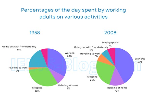
The pie charts below show how working adults in a particular country spent their time in 1958 and 2008.
Summarise the information by selecting and reporting the main features, and make comparisons where relevant.
* Note: these aren’t the original diagrams given in the test, they were recreated for the purpose of demonstration.
Student answer (Band 5.5)
The given chart illustrates the proportion of how working adults in a specific nation occupied their time in 1958 and 2008.
To begin with, ratio of the day spent by functional adults on various activites in the year 1958 were as follows, The working adults were 33%. 8% adults were relaxing at home. 32% of adults were spending their time on sleeping.Only 2% of adults were spending their time on travelling to work. Following to that 19% ratio were going out with friends/family.
Now coming on to the second chart in the year 2008, 42% were working. Along with that, the ratio of adults who relaxing at home was 13%. Then 25% of adults were spending their time in sleeping. Following to that, 7% was busy in travelling to work. There were 6% of adults were going out with friends and family. Lastly, 7% were occupied thier time in playing sports.
Overall, it can be seen that the ratio of going out with family and friends were decreased in 2008 in the race of 1958.
AI examiner evaluation
| Criterion | Band |
|---|---|
| Task Achievement / Task Response | 5.0 |
| Coherence and Cohesion | 6.0 |
| Lexical Resource | 5.5 |
| Grammatical Range and Accuracy | 5.0 |
| Overall | 5.5 |
Task Achievement / Task Response: Band 5.0
You report most of the chart categories and figures accurately, including the rise in working from 33% to 42%, and the fall in sleeping from 32% to 25%. However, the response is mainly a sequence of figures rather than a summary of the main features. The overview focuses only on going out with friends and family, which fell from 19% to 6%, and misses other important contrasts: working became the largest activity, while travelling to work and relaxing at home both increased. The 2008 sports figure is included, but its absence from the 1958 chart is not explained. To strengthen the response, give a broader overview and compare the most significant changes rather than listing each category separately.
Coherence and Cohesion: Band 6.0
The response has a clear basic structure: an introduction, a paragraph for each year, and a concluding overview. This makes the information generally easy to follow. However, the progression is largely a list, and repeated transitions such as “To begin with,” “Following to that,” and “Then” make the linking feel mechanical. The final overview is also too narrow to bring the main comparisons together. Grouping related changes—for example, increases in work, travel and home relaxation against decreases in sleep and socialising—would create a clearer line of development. Use fewer formulaic connectors and make the relationship between figures explicit, so the reader can see the overall pattern rather than just move from one statistic to the next.
Lexical Resource: Band 5.5
You use enough topic vocabulary to identify the activities, including “relaxing at home,” “travelling to work,” and “playing sports.” However, the range is limited and several expressions are inaccurate or unnatural, which makes the report less precise. “Functional adults” is not an appropriate substitute for “working adults,” and “ratio of the day” is an awkward way to describe a percentage of time. There are also spelling errors such as “activites” and “thier.” Aim for accurate, natural chart language and avoid repeatedly using “ratio” or “spending their time.” Phrases such as “accounted for,” “the proportion of time spent,” and “rose from…to…” would help you describe the data more clearly and flexibly.
Grammatical Range and Accuracy: Band 5.0
The response relies mostly on short, simple statements, with limited variety in sentence structure. Some sentences communicate the figures clearly, but errors in verb forms, agreement, articles and punctuation are frequent enough to affect fluency. For example, “the ratio of adults who relaxing at home was 13%” needs a verb form such as “who were relaxing,” while “There were 6% of adults were going out” combines two incompatible sentence patterns. The opening of the 1958 paragraph also has faulty agreement and punctuation: “ratio … were as follows, The working adults were 33%.” Practise forming complete comparison sentences, checking subject–verb agreement, and using full stops to separate ideas.
See this exact question answered at other band scores. The same prompt compared across bands.
Browse more IELTS Writing model answers or get your own writing scored by the same AI examiner.