Band 5.5 IELTS Writing Task 1 Model Answer
Overall Band Score: 5.5 · Recent IELTS Exams (Canada & India) · 2026-11-21
IELTS Writing Task 1 question
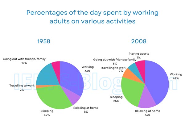
The pie charts below show how working adults in a particular country spent their time in 1958 and 2008.
Summarise the information by selecting and reporting the main features, and make comparisons where relevant.
* Note: these aren’t the original diagrams given in the test, they were recreated for the purpose of demonstration.
Student answer (Band 5.5)
The two pie charts illustrate a comparison of how adults spent their time on different activities in a specific country in 1958 and 2008.
Overall, it is clearly seen that young people spent the largest share on working which was 33% in 1958 and 42% in 2008. By contrast, they spent the least time travelling to work at 2% in 1958 and going out with friends and family at 6% in 2008.
In 1958, time spent on working was one third portion of the total pie chart, that increased in 2008 at 42%. Moreover, sleeping time was a quarter in 2008, which actually decreased from 1958, when they slept 32%. Similarly, spending time on going out with friends/family declined from 19% to 6% from 1958 to 2008.
There were some tasks that took more time than in 1958. Young people spent time to travelling to work 2% in 1958 that increased to 7% in 2008. Likewise, the proportion of people relaxing at home rocketed from 8% to 13% from 1958 to 2008. The interesting thing is that adults were not interested in playing in 1958, but they spent 7% of their time playing in 2008.
AI examiner evaluation
| Criterion | Band |
|---|---|
| Task Achievement / Task Response | 5.5 |
| Coherence and Cohesion | 6.0 |
| Lexical Resource | 5.5 |
| Grammatical Range and Accuracy | 5.5 |
| Overall | 5.5 |
Task Achievement / Task Response: Band 5.5
You identify several important changes accurately: working rose from 33% to 42%, while sleeping and socialising fell from 32% to 25% and 19% to 6%, respectively. You also include the increases in commuting and relaxing, and note that sport appears only in 2008. However, the overview is not fully reliable because it calls the adults “young people,” and the claim that working took the largest share is not true in 1958: sleeping was almost equal at 32%. The overview would be stronger if it summarised the main overall shifts without describing the smallest categories as the only key contrast. Some details are reported clearly, but the selection and interpretation of the main features remain uneven.
Coherence and Cohesion: Band 6.0
The response has a clear overall structure: an introduction and overview are followed by two paragraphs comparing the years. This makes the information easy to locate, and linking expressions such as “Moreover,” “Similarly,” and “Likewise” help connect comparisons. However, the progression is somewhat mechanical, with repeated year-to-year phrasing such as “from 1958 to 2008.” Some references are also unclear: “There were some tasks” does not specify the activities, and “that increased” in the working sentence has an uncertain reference. The overview’s contrast between the largest and least shares is not consistently supported by the figures. More precise topic sentences and varied, accurate linking would make the organisation more effective.
Lexical Resource: Band 5.5
You use a relevant range of vocabulary for describing charts, including “proportion,” “declined,” “increased,” and “spent.” These choices generally communicate the comparisons, and the activity labels are mostly clear. However, several expressions are imprecise or unnatural for an academic report. “Young people” does not match the chart’s “working adults,” “one third portion” is awkward, and “rocketed” overstates a rise from 8% to 13%. “Spent time to travelling” is also an inaccurate collocation, while “not interested in playing” adds an unsupported interpretation of the absence of a sports category in 1958. Aim for neutral, precise reporting language and use the chart’s categories consistently.
Grammatical Range and Accuracy: Band 5.5
You attempt a mixture of simple and more complex sentences, including clauses with “which” and comparisons across years. Most of the message remains understandable, but some grammatical errors make relationships between ideas less clear. For example, “time spent on working was one third portion …, that increased” joins clauses incorrectly; use a full stop or a suitable relative construction. In “Young people spent time to travelling to work 2%,” the sentence lacks a clear grammatical structure for reporting the figure. There are also awkward article and preposition patterns, as in “on working” and “spent time to travelling.” Practise forming accurate comparison sentences with a clear subject, verb, and percentage phrase.
See this exact question answered at other band scores. The same prompt compared across bands.
Browse more IELTS Writing model answers or get your own writing scored by the same AI examiner.