Band 5.5 IELTS Writing Task 1 Model Answer
Overall Band Score: 5.5 · Cambridge IELTS 20 · 2026-11-15
IELTS Writing Task 1 question
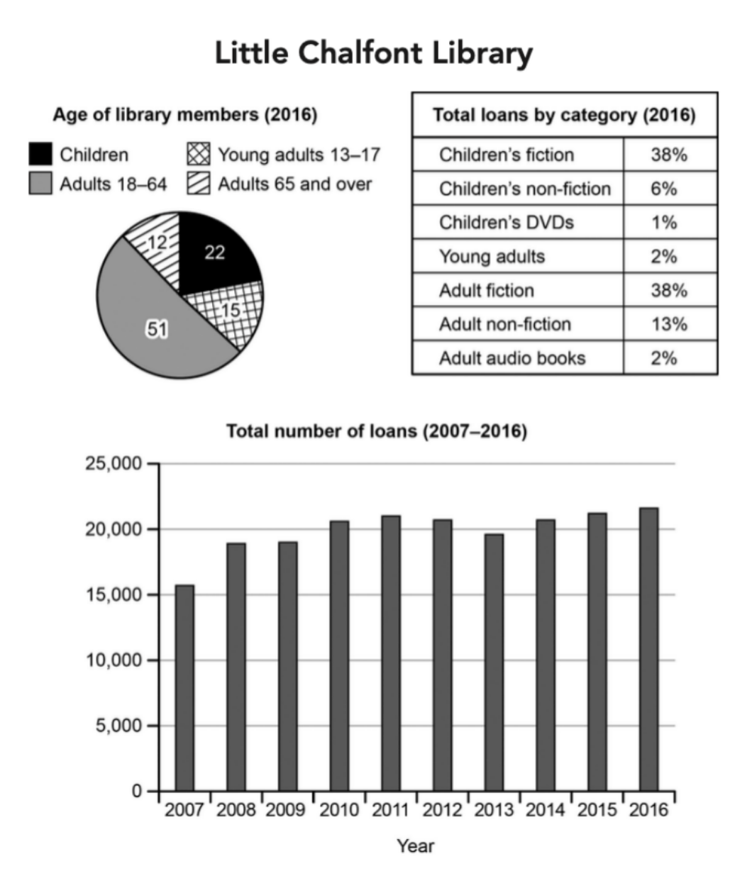
The charts below give information about a public library in a town called Little Chalfont.
Summarise the information by selecting and reporting the main features, and make comparisons where relevant.
Student answer (Band 5.5)
The pie chart, table and bar graph illustrates the information regarding the ages, total loan by categories and the number of loa taken by the peoples over a 9 year during the period between 2007 to 2016.
Overall, in all layouts Adults were in larger proportion as compared to children.
The pie chart shows the percentags of libraray in refrence to their ages. The adults showed the highest proportion. While the Adults 65 and over showed lower trend. Whereas children shows 22% percentage.
The table shows the total loan by catagories, the most noticeable thing was the equal pecentage of adult fiction and children fiction. And the most noteworthy trend was the percentage of children that was 1%.
The bar graph shows how many loan taken by the number of people during period 2007 to 2016. The bar graph showed the compareable equal trend during the year. While it showed less proportion during 2007.
AI examiner evaluation
| Criterion | Band |
|---|---|
| Task Achievement / Task Response | 5.5 |
| Coherence and Cohesion | 6.0 |
| Lexical Resource | 5.0 |
| Grammatical Range and Accuracy | 5.0 |
| Overall | 5.5 |
Task Achievement / Task Response: Band 5.5
You identify all three visuals and include relevant comparisons, especially the equal 38% shares for adult and children’s fiction and the low figure for children’s DVDs. However, the overview is too general: saying adults were the largest group does not capture the main pattern in the membership data, and “adults 65 and over showed lower trend” is unclear. Several key figures are omitted, including the 51% share for adults aged 18–64 and the 13% for adult non-fiction. The loans chart is described only as broadly comparable, with 2007 as the low point; this misses the overall rise from about 15,700 to 21,700 and the fluctuations in between. More accurate figures and a clearer overview would make the report more complete.
Coherence and Cohesion: Band 6.0
The response has a recognisable structure: an introduction, an overview, and separate paragraphs for the pie chart, table and bar graph. This makes the three sources easy to identify. However, progression within paragraphs is limited, and several linking words are used mechanically or create incomplete contrasts, as in “While the Adults 65 and over showed lower trend” and “Whereas children shows 22% percentage.” The overview also does not clearly connect the main features across the visuals. Organise each body paragraph around the most important comparisons, and use complete sentences with clear references to the relevant group or figure. This would make the relationships between details easier to follow.
Lexical Resource: Band 5.0
You use some task-related vocabulary, including “proportion,” “percentage,” “categories” and “trend,” and the reader can generally identify which chart you are discussing. However, the range is limited and several word choices or collocations are inaccurate, such as “total loan by categories,” “the percentage of children that was 1%,” and “the bar graph showed the comparable equal trend.” Spelling errors such as “libraray,” “catagories” and “percentags” are also noticeable. Use precise terms such as “share of loans,” “membership age groups” and “fluctuated,” and check spelling carefully. Avoid repeating “shows” and “trend” when a more exact description of the data is available.
Grammatical Range and Accuracy: Band 5.0
The response attempts some complex sentence forms, but control is inconsistent. The opening sentence has subject–verb disagreement (“charts … illustrates”) and an unclear time expression (“over a 9 year during the period between 2007 to 2016”). There are also errors in articles, plurals and agreement, for example “the Adults 65 and over showed lower trend” and “children shows 22% percentage.” Sentence fragments or incomplete contrasts occur after “While” and “Whereas,” and punctuation around these clauses is not controlled. Most sentences follow a simple pattern, so the range is limited. Practise writing complete comparisons with accurate agreement and tense, for example, “Adults aged 18–64 made up the largest group, at 51%.”
See this exact question answered at other band scores. The same prompt compared across bands.
Browse more IELTS Writing model answers or get your own writing scored by the same AI examiner.