Band 6.0 IELTS Writing Task 1 Model Answer
Overall Band Score: 6.0 · Cambridge IELTS 17 · 2026-11-11
IELTS Writing Task 1 question
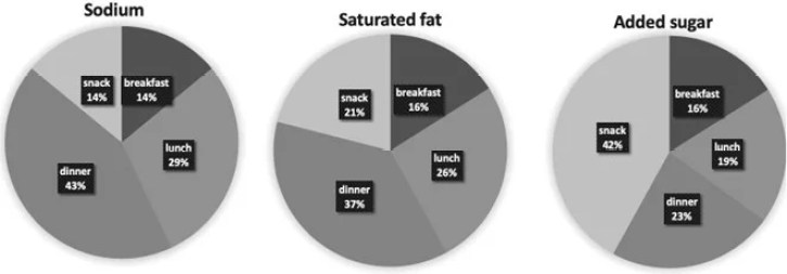
The charts below show the average percentages in typical meals of three types of nutrients, all of which may be unhealthy if eaten too much.
Summarise the information by selecting and reporting the main features, and make comparisons where relevant.
Average percentages of sodium, saturated fats and added sugars in typical meals consumed in the USA
Student answer (Band 6.0)
The three pie charts illustrates the information the average percentage in typical meals of three types of nuitrients consumed in the USA.
Overall, the dinner is the main source of sodium amd saturated fat, while snacks are the main source of added sugar. Breakfast contributes in all categories except for sodium which is equal to snacks.
Looking at sodium, dinner contains the 43% which is the largest portion, lunch account for 29% while the breakfast and snack followed by 14% for each.
A similar pattern can be seenfor saturated fat. Dinner again contain the largest part followed by 37%, lunch account for 26% while snack and breakfast followed by 21% and 16%.
Looking at added sugar, the sanck covers the largest part which is 42%, dinner followed by 23% while the lunch and breakfast account for 19% and 16%.
In summary the USA contain most of the sodium and saturated at the dinner, whereass most of their added sugar comes from snacks between meals.
AI examiner evaluation
| Criterion | Band |
|---|---|
| Task Achievement / Task Response | 7.0 |
| Coherence and Cohesion | 6.5 |
| Lexical Resource | 5.5 |
| Grammatical Range and Accuracy | 5.5 |
| Overall | 6.0 |
Task Achievement / Task Response: Band 7.0
The response identifies the main contrasts accurately: dinner has the highest shares of sodium and saturated fat, while snacks lead for added sugar. It also reports the key figures correctly, including sodium at 43% for dinner and 14% for both breakfast and snacks, and added sugar at 42% for snacks. This gives the reader a clear overview and relevant supporting detail across all three charts. The final sentence repeats the overview rather than adding a new feature, but the selected comparisons are well grounded in the data. To strengthen the report further, make comparisons between nutrients more explicit—for example, note that dinner’s share declines from sodium to saturated fat to added sugar, while the snack share rises sharply for added sugar. Overall, the main features are clearly selected and supported, though some comparisons could be extended.
Coherence and Cohesion: Band 6.5
The information is arranged in a clear sequence: an introduction and overview are followed by separate paragraphs on sodium, saturated fat and added sugar. This makes the chart-by-chart progression easy to follow, and phrases such as “Overall,” “Looking at sodium” and “A similar pattern” help signal the structure. The overview and final summary, however, largely repeat the same point, and the repeated “followed by” construction makes some comparisons feel mechanical. There is also a run-together phrase in “can beseenfor,” which briefly interrupts reading. To move towards more flexible cohesion, vary the ways you compare figures and use the conclusion to synthesise a further relationship across the charts rather than restating the overview.
Lexical Resource: Band 5.5
The response uses enough chart-related vocabulary to communicate the main information, including “main source,” “largest portion” and “account for.” However, the range is limited and several choices are inaccurate or awkward: “the dinner” and “the sanck covers the largest part” are not natural ways to describe these proportions, while “the USA contain most of the sodium” incorrectly suggests the country itself contains it. Spelling errors such as “nuitrients,” “amd,” “sanck” and “whereass” are noticeable and reduce the precision of the report. Aim for consistent, accurate terms such as “share,” “proportion” and “contribution,” and check spelling carefully. More precise collocations would make the comparisons sound clearer and more academic.
Grammatical Range and Accuracy: Band 5.5
The response includes a few different sentence patterns, including a complex overview with “while” and a comparison introduced by “A similar pattern can be seen.” Nevertheless, control is uneven, and several sentences contain errors in agreement, articles or verb forms. For example, “The three pie charts illustrates” should use a plural verb, and “lunch account” and “dinner again contain” also need agreement with singular meal labels. Articles are awkward in “the dinner contains the 43%,” while “the breakfast and snack followed” lacks a suitable verb construction. The final sentence, “the USA contain,” has a subject–verb error and an unclear grammatical relationship. Practise accurate simple comparison structures first, then combine them with clauses using “while” or “whereas”; proofread each sentence for subject–verb agreement and article use.
See this exact question answered at other band scores. The same prompt compared across bands.
Browse more IELTS Writing model answers or get your own writing scored by the same AI examiner.