Band 5.0 IELTS Writing Task 1 Model Answer
Overall Band Score: 5.0 · Cambridge IELTS 17 · 2026-11-13
IELTS Writing Task 1 question
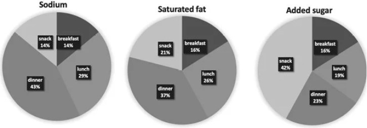
The charts below show the average percentages in typical meals of three types of nutrients, all of which may be unhealthy if eaten too much.
Summarise the information by selecting and reporting the main features, and make comparisons where relevant.
Average percentages of sodium, saturated fats and added sugars in typical meals consumed in the USA
Student answer (Band 5.0)
The chart reveals information regarding three types of different meals, if we eat to much every meal should be dangerious for our health.
From an overall perspective, what stands out from the chart is that there is sodium chart which show some percentage of this meal. Moreover, there is snack 14 percent and breakfast will be same to the snack. There is lunch 29 percent and dinner 43% which is the proper meal of sodium.
Futhermore, saturated fat also contains some percentage which look fantastic meal, there is snack 21% and breakfast 16%. In more precise, there is lunch 26% and dinner 37%.
Additionally, the last figure saw a added suger meal which contains snack 42% and breakfast 16% . There is liitle bit different in lunch and dinner which is approximately 4% which is not a big different. At the end we should use these meals according to the suggestions the reason is that eating to much is unhealthy for our health.
AI examiner evaluation
| Criterion | Band |
|---|---|
| Task Achievement / Task Response | 5.0 |
| Coherence and Cohesion | 5.5 |
| Lexical Resource | 4.5 |
| Grammatical Range and Accuracy | 5.0 |
| Overall | 5.0 |
Task Achievement / Task Response: Band 5.0
You report several figures accurately, including sodium at lunch and dinner (29% and 43%), saturated fat at lunch and dinner (26% and 37%), and added sugar at snacks (42%). However, the response only partly summarises the charts: it does not clearly compare the three nutrients or identify the main overall pattern—that dinner is highest for sodium and saturated fat, while snacks are highest for added sugar. The claim that lunch and dinner differ by about 4% for added sugar is correct, but the actual values (19% and 23%) are omitted. The opening and closing comments about health advice do not describe the data, and phrases such as “proper meal” make the comparisons unclear. A concise overview and more precise reporting of key contrasts would strengthen the response.
Coherence and Cohesion: Band 5.5
The response has a basic structure: it introduces the charts, then discusses sodium, saturated fat and added sugar in separate sections. This grouping helps the reader follow the nutrient categories, and transitions such as “Furthermore” and “Additionally” signal movement between them. However, there is no clear, focused overview, and the opening and final health comments interrupt the progression of a data summary. Within paragraphs, ideas are sometimes linked mechanically or unclearly—for example, “Moreover, there is snack 14 percent and breakfast will be same to the snack.” Repeated sentence openings with “There is” also make the account feel list-like. Organise the response around an overview followed by the most important comparisons, and use clearer links between figures.
Lexical Resource: Band 4.5
You use some relevant chart vocabulary, including “percentage,” “sodium,” “saturated fat,” “snack” and “approximately,” so the reader can recognise the subject. However, the range is limited and several word choices or collocations are inaccurate or unclear. “Three types of different meals” confuses the nutrients with meal categories, while “proper meal of sodium” does not express a clear comparison. “Fantastic meal” is inappropriate for describing a percentage, and “a added suger meal” contains spelling and word-form problems. Repetition of “there is” and “meal” also limits precision. Use terms such as “proportion,” “accounted for” and “highest share” to describe the data, and check spelling and collocations before submitting.
Grammatical Range and Accuracy: Band 5.0
You attempt some longer sentence forms, including “what stands out from the chart is that…” and a sentence beginning “The reason is that…”. Most of the response, however, relies on short, basic clauses, and the longer attempts are not consistently controlled. For example, “The chart reveals information regarding three types of different meals, if we eat…” joins unrelated ideas with a comma, while “there is lunch 29 percent and dinner 43%” lacks a clear grammatical structure for comparing values. There are also errors in articles and agreement, as in “there is sodium chart which show.” These problems sometimes make the intended meaning difficult to follow. Practise complete comparison structures, such as “Dinner accounts for 43%, compared with 29% at lunch,” and check sentence boundaries and subject–verb agreement.
See this exact question answered at other band scores. The same prompt compared across bands.
Browse more IELTS Writing model answers or get your own writing scored by the same AI examiner.