Band 6.0 IELTS Writing Task 1 Model Answer
Overall Band Score: 6.0 · Cambridge IELTS 17 · 2026-11-15
IELTS Writing Task 1 question
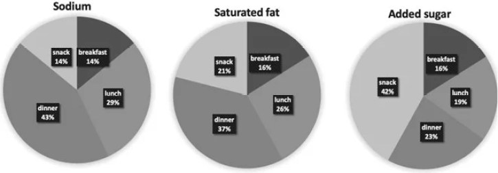
The charts below show the average percentages in typical meals of three types of nutrients, all of which may be unhealthy if eaten too much.
Summarise the information by selecting and reporting the main features, and make comparisons where relevant.
Average percentages of sodium, saturated fats and added sugars in typical meals consumed in the USA
Student answer (Band 6.0)
The given pie chart illustrate the average percentage of sodium, saturated fats and added sugar consumed by the population in the USA
Overall, the added sugar intake is high in snacks where as the consumption of saturated fat and sodium is higher in dinner.
Around forty three percent of sodium is consumed in dinner folllowed by launch where the consumption is twenty nine percent mean while the consumption of sodium is equal by percentage i.e fourteen percent in both breakfast and snacks.
Talking about the consumption of saturated fat here also dinner takes the lead by thirty seven percent while he launch remained at second position with twenty six percent. The snacks cover around 21 percent of saturated fat while the breakfast takes only sixteen percentage.
The consumption of added sugar is high in snack. Sanck occupies fourty two percent of added sugar. The added sugar intake is around twenty three percent while having dinner. The popilation consumes 19 percent which is around one fifth part of added sugar in launch while the breakfast occupies only sixteen percent of added sugar intake.
AI examiner evaluation
| Criterion | Band |
|---|---|
| Task Achievement / Task Response | 6.5 |
| Coherence and Cohesion | 6.0 |
| Lexical Resource | 5.5 |
| Grammatical Range and Accuracy | 5.5 |
| Overall | 6.0 |
Task Achievement / Task Response: Band 6.5
The response identifies the main pattern accurately: dinner accounts for the largest shares of sodium and saturated fat, while snacks lead for added sugar. It also reports the key figures correctly, including 43% sodium at dinner, 37% saturated fat at dinner and 42% added sugar in snacks, and makes useful comparisons between meals. This gives the overview a clear basis in the data. Some details are less fully developed: for example, the added-sugar figures for lunch and breakfast are listed but not compared with the other meal categories, and the overview could summarise the contrast across all three nutrients more precisely. A more concise synthesis of the main highs and lows would make the report more complete and better supported.
Coherence and Cohesion: Band 6.0
The information is arranged in a generally logical sequence: an overview is followed by separate discussion of sodium, saturated fat and added sugar. This makes the main comparisons easy to locate, and linking expressions such as “Overall,” “while” and “followed by” help connect points. However, the progression is somewhat mechanical because each paragraph repeats a similar meal-by-meal pattern, and some connections are awkward, such as “mean while” and “Talking about the consumption.” The overview also repeats the dinner-versus-snacks contrast that is then explained in the body. Use clearer topic sentences and vary how comparisons are grouped—for instance, contrast dinner’s high sodium and fat with snacks’ high sugar—to create smoother progression and more effective cohesion.
Lexical Resource: Band 5.5
The response uses enough topic vocabulary to describe the chart, including “consumption,” “intake,” “percentage” and “occupies,” and it attempts to express ranking with phrases such as “takes the lead” and “remained at second position.” Meaning is generally understandable, but word choice and spelling errors are noticeable and sometimes make the prose less natural. Examples include “launch” for “lunch,” “Sanck,” “folllowed,” “fourty” and “popilation.” Some phrases are also imprecise or awkward, such as “the consumption of sodium is equal by percentage” and “one fifth part.” Aim for accurate spelling and standard chart-reporting collocations, such as “accounts for,” “makes up” and “the same proportion,” rather than relying on repeated or informal expressions.
Grammatical Range and Accuracy: Band 5.5
There is some variety in sentence forms, including comparisons with “while” and a relative clause in “all of which may be unhealthy” is not used here, but the response does attempt longer sentences to report several figures together. Most meanings remain clear. However, some grammatical errors recur, including subject–verb agreement in “The given pie chart illustrate,” missing or incorrect articles and prepositions, and awkward sentence construction in “the consumption of sodium is equal by percentage.” The opening sentence also lacks final punctuation, and several long sentences would benefit from clearer punctuation. Build accuracy by checking singular subjects (“chart illustrates”), using complete comparison structures, and separating figures into shorter sentences when needed. More consistently controlled complex sentences would strengthen the range.
See this exact question answered at other band scores. The same prompt compared across bands.
Browse more IELTS Writing model answers or get your own writing scored by the same AI examiner.