Band 5.0 IELTS Writing Task 1 Model Answer
Overall Band Score: 5.0 · Cambridge IELTS 17 · 2026-11-17
IELTS Writing Task 1 question
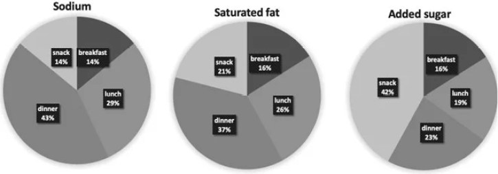
The charts below show the average percentages in typical meals of three types of nutrients, all of which may be unhealthy if eaten too much.
Summarise the information by selecting and reporting the main features, and make comparisons where relevant.
Average percentages of sodium, saturated fats and added sugars in typical meals consumed in the USA
Student answer (Band 5.0)
The 3 pie charts illustrate the average proportions of sodium, saturated fat, and added sugar in the USA.In beginning of shown percentages in comparison. The larger n dominant figure at 43%.sodium in breakfast is 14%are for sodium, saturated fat andadded sugar at 16% and also at 14% in saturated fat at 21% ; however, the consumption of snack meal at added sugar is in large contibuted amount in chart and to some extend the snack meal plays important role here while breakfast is the lowest among all, respectively the pattern of saturated sugar intake in dinner is 37%. A similar pattern was observed for dinner timing, which is highest at 43 in percentage because it is followed by saturated fat at 37%. This indicates that sodium and saturated fat are the most consumed at main meals, while sugar intake is derived from snacking between meals. Breakfast has the lowest percentage in all three charts
AI examiner evaluation
| Criterion | Band |
|---|---|
| Task Achievement / Task Response | 5.5 |
| Coherence and Cohesion | 4.0 |
| Lexical Resource | 5.0 |
| Grammatical Range and Accuracy | 5.0 |
| Overall | 5.0 |
Task Achievement / Task Response: Band 5.5
You identify the three nutrients and include several relevant figures, such as dinner accounting for 43% of sodium and 37% of saturated fat, and snacks contributing 42% of added sugar. The concluding comparison—that sodium and saturated fat are concentrated in main meals while sugar is more associated with snacking—is a useful overview. However, the report is only partially clear and developed: the opening comparison is difficult to interpret, and some figures are attached to the wrong meal or nutrient. For example, “sodium in breakfast is 14%” is unclear in context, and the statement that breakfast is lowest in all three charts is inaccurate because added sugar is lowest at breakfast only jointly with saturated fat, both at 16%, while sodium is lowest at breakfast and snacks equally. Select the main patterns and report each comparison precisely.
Coherence and Cohesion: Band 4.0
There is an attempt to organise the response around the charts and to finish with an overall comparison. Linking expressions such as “however,” “while,” and “This indicates” show an effort to connect ideas. Nevertheless, the information is not arranged coherently: the opening moves abruptly into a fragment, figures and comparisons are crowded into one long section, and the discussion shifts between breakfast, snacks, and dinner without a clear sequence. The repeated dinner comparison also interrupts progression. Use separate paragraphs for an overview and the key details, then group the figures by nutrient or meal. Clearer sentence boundaries and more precise references would help readers follow which percentages belong to which chart.
Lexical Resource: Band 5.0
The response uses relevant chart vocabulary, including “average proportions,” “percentage,” “consumption,” and “pattern,” and attempts to describe comparisons rather than simply list figures. However, the range is limited and several word choices or combinations are inaccurate enough to make meaning difficult. “The larger n dominant figure” is not a clear description, “contibuted amount” is an unsuitable phrase, and “saturated sugar intake” confuses the nutrient categories. “Dinner timing” also does not accurately describe a meal’s share of nutrient intake. Choose precise terms such as “proportion,” “accounted for,” and “intake,” and use the chart labels consistently. Proofreading spelling and spacing would also improve readability.
Grammatical Range and Accuracy: Band 5.0
You attempt to combine ideas using subordinate clauses and contrast, as in “while breakfast is the lowest” and “because it is followed by saturated fat at 37%.” However, the range is limited, and many sentence structures are faulty or incomplete, which sometimes makes the relationships between figures hard to understand. The opening after “The 3 pie charts illustrate…” contains fragments, while “In beginning of shown percentages in comparison” lacks a complete grammatical structure. There are also problems with articles, sentence boundaries, and punctuation, including missing spaces after “USA.” and around several figures. Build shorter, complete sentences first, then add comparisons with accurate clauses and punctuation.
See this exact question answered at other band scores. The same prompt compared across bands.
Browse more IELTS Writing model answers or get your own writing scored by the same AI examiner.