Band 5.5 IELTS Writing Task 1 Model Answer
Overall Band Score: 5.5 · Cambridge IELTS 17 · 2026-11-20
IELTS Writing Task 1 question
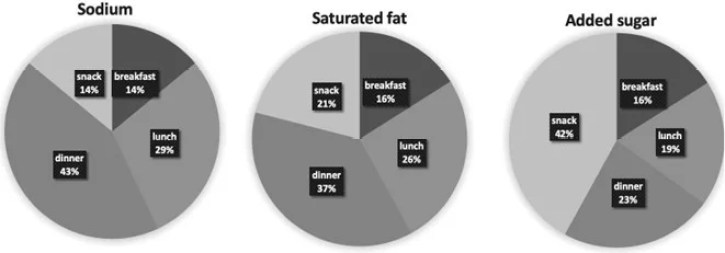
The charts below show the average percentages in typical meals of three types of nutrients, all of which may be unhealthy if eaten too much.
Summarise the information by selecting and reporting the main features, and make comparisons where relevant.
Average percentages of sodium, saturated fats and added sugars in typical meals consumed in the USA
Student answer (Band 5.5)
The chart below illustrates the average proportion in typical meals of three types of nutrients, all of which perhaps unhealthy if eaten too much.
Overall, in this chart they demonstrate the typical meals of three nutrients such as, Sodium, Saturated fat, Added sugar with the high percentage in snacks 42%, in both saturated fat and added sugar 16% in breakfast after that, highest ratio in dinner 43% and in last nutrient 29% in lunch.
Initially, the snack contain on 14% in sodium after that the percentage rise from 14% to 21% in saturated fat and highest value of snack 42% in added sugar. As well as, lowest amount of break fast is 14% in sodium and 16% ratio of breakfast remain same in both saturated fat and added sugar. Furthermore, the largest amount of dinner is 43% in sodium after that the ratio drop from 43% to 37% in saturated fat and 23% in added sugar.
Eventually, the biggest rate of lunch is 29% in first nutrient following that, in the second nutrient the share of lunch is 26%. At last, the lowest fraction of lunch is 19% in third nutrient.
AI examiner evaluation
| Criterion | Band |
|---|---|
| Task Achievement / Task Response | 5.5 |
| Coherence and Cohesion | 5.5 |
| Lexical Resource | 5.5 |
| Grammatical Range and Accuracy | 5.0 |
| Overall | 5.5 |
Task Achievement / Task Response: Band 5.5
You identify the three nutrients and report several relevant figures, including the highest snack share for added sugar (42%) and the highest dinner shares for sodium (43%) and saturated fat (37%). However, the overview is unclear and does not accurately summarise the main pattern: dinner is highest for sodium and saturated fat, while snacks are highest for added sugar. The phrase “with the high percentage in snacks 42%” blurs which nutrient this refers to, and the overview’s reference to “29% in lunch” is not a clear comparison. You cover all meal categories, but the information is mostly listed nutrient by nutrient without a clear synthesis of the key contrasts. State the overall pattern directly, then select the most significant comparisons to support it.
Coherence and Cohesion: Band 5.5
The response has a basic paragraph structure, with an introduction, an overview, and separate paragraphs covering the meal categories. This gives the reader some organisation, and the figures can generally be followed. However, progression is weakened by repetitive sequencing phrases such as “after that,” “Furthermore,” and “At last,” which do not always show a meaningful relationship between the data. The overview also combines several figures in a way that is difficult to interpret, and references such as “the first nutrient” and “the third nutrient” make the reader work to identify the categories. Grouping the main trends first, then comparing the remaining figures with explicit labels, would create clearer progression and more effective cohesion.
Lexical Resource: Band 5.5
You use relevant topic vocabulary, including “percentage,” “ratio,” “share,” and “fraction,” and the nutrient names are generally clear. However, several choices are inaccurate or unnatural for describing chart data, such as “the snack contain on 14%,” “largest amount of dinner,” and “biggest rate of lunch.” Repeating “after that” also limits the range and sometimes suggests a sequence that the chart does not show. Spelling and word-form choices, including “break fast,” further reduce precision. Aim for standard data-reporting collocations such as “accounted for,” “the proportion of,” and “was highest,” and use the meal and nutrient names consistently rather than replacing them with ordinal labels.
Grammatical Range and Accuracy: Band 5.0
You attempt both simple and longer sentences, but control is inconsistent, and errors sometimes make relationships between figures difficult to understand. For example, “all of which perhaps unhealthy” is missing a verb, while “the snack contain on 14%” has problems with agreement and sentence construction. The overview sentence beginning “Overall, in this chart they demonstrate” is also awkwardly formed, and several clauses joined with “after that” lack clear grammatical links. Some sentences communicate individual figures successfully, but complex comparisons are often faulty. Practise forming complete clauses with a clear subject and verb, and use accurate comparison structures such as “the figure rose from X to Y” or “X was higher than Y.”
See this exact question answered at other band scores. The same prompt compared across bands.
Browse more IELTS Writing model answers or get your own writing scored by the same AI examiner.