Band 5.5 IELTS Writing Task 1 Model Answer
Overall Band Score: 5.5 · IELTS Academic Practice Accelerator · 2026-11-16
IELTS Writing Task 1 question
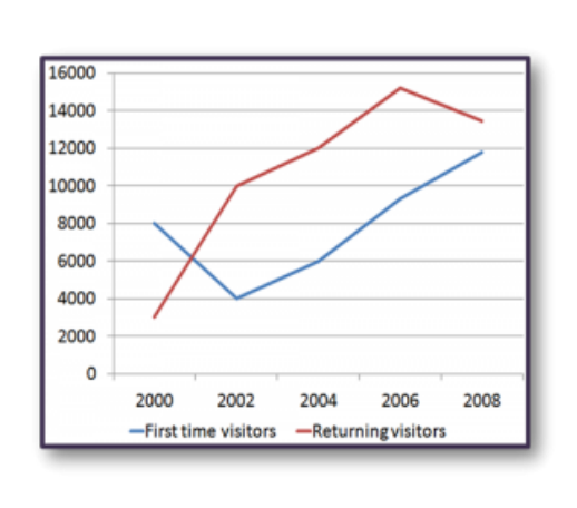
The line graph shows the number of first time visitors and returning visitors who visited Caryl Island from 2000 to 2008.
Summarise the information by selecting and reporting the main features, and make comparisons where relevant.
The line graph shows the number of first time visitors and returning visitors who visited Caryl Island from 2000 to 2008.
Student answer (Band 5.5)
The line graph illustrates the information about the number of first time tourists and returning visitors who visited Caryl Island from 2000 to 2008.
It is clearly seen that the data showed the fluctuation between the first time visitors and returning visitors.
The graph is based on the eight years data. Returning visitors is on peaked in 2006 and the first time visitors is increasing through out the year and is highest value is recorded in 2008.
In 2000, the first time visitors is relatively higher than the returning visitors was figure is that 8000 individuals first time visited and 3000 visitors returned. In 2002, the first time visitors sharply fell to 4000 and returning visitors rapidly increased to 10000. In 2004, 2000 citizens increased in both first time visitors and returned visitors was 4000 to 6000 and 10000 to 12000. In 2006, the returned visitors is on peaked was 15000 people and the first time visitors was also surged to 10000.
In 2008, the returned visitors dropped quickly below 14000 and the first time visitors was slightly rose to 12000.
Finally, both were increased.
AI examiner evaluation
| Criterion | Band |
|---|---|
| Task Achievement / Task Response | 5.5 |
| Coherence and Cohesion | 5.5 |
| Lexical Resource | 5.5 |
| Grammatical Range and Accuracy | 5.0 |
| Overall | 5.5 |
Task Achievement / Task Response: Band 5.5
You identify both visitor groups and report several key figures, including the fall in first-time visitors in 2002 and the rise in returning visitors to a peak in 2006. However, the overview is unclear: saying the data “showed the fluctuation” does not summarise the contrasting overall patterns. First-time visitors fell and then rose, while returning visitors climbed to 2006 before declining. Some details are also imprecise: first-time visitors reached about 9,300 in 2006, rather than 10,000, and returning visitors peaked at about 15,200. The final claim, “Finally, both were increased,” conflicts with the decline in returning visitors from 2006 to 2008. A clearer overview and more accurate comparisons would make the report more complete.
Coherence and Cohesion: Band 5.5
The response has a recognisable structure, moving from an introduction and overview to year-by-year details, and the chronological order helps readers follow the data. However, progression is weakened by an unclear overview and by links that do not accurately express the relationships between figures. For example, “In 2004, 2000 citizens increased in both” makes the comparison difficult to understand, while “Finally, both were increased” does not connect logically with the preceding account of a fall in returning visitors. The repeated “In [year]” openings also make the report feel mechanical. Organise the body around the two trends or use clearer comparisons, and ensure each concluding statement follows from the figures.
Lexical Resource: Band 5.5
You use relevant vocabulary for describing movement, including “fell,” “increased,” “dropped,” and “peak,” so the main trends are generally understandable. There are also attempts at more descriptive language, such as “sharply” and “rapidly.” However, several word choices and collocations are inaccurate or unnatural: “is on peaked,” “was also surged,” and “slightly rose” do not express the trends naturally. “Citizens” is not an appropriate substitute for visitors, and “the eight years data” is awkward. Use standard chart language consistently, such as “reached a peak,” “surged,” and “the figures for the eight-year period.” More precise vocabulary would also help distinguish a rise from a fall.
Grammatical Range and Accuracy: Band 5.0
The response attempts both simple and longer sentences, and the chronological clauses communicate the broad sequence of events. However, grammatical errors are frequent and sometimes make relationships between figures hard to follow. Examples include “Returning visitors is on peaked,” “the first time visitors is increasing,” and “the returned visitors dropped quickly,” where subject–verb agreement and verb forms are faulty. The sentence beginning “In 2004” also lacks a clear grammatical structure, and “the first time visitors was slightly rose” combines incompatible verb forms. Practise forming accurate past-tense sentences with plural subjects—for example, “Returning visitors peaked in 2006, while first-time visitors rose to about 9,300.” This will make your comparisons clearer.
See this exact question answered at other band scores. The same prompt compared across bands.
Browse more IELTS Writing model answers or get your own writing scored by the same AI examiner.