Band 5.5 IELTS Writing Task 1 Model Answer
Overall Band Score: 5.5 · IELTS Momentum Workout · 2026-11-10
IELTS Writing Task 1 question
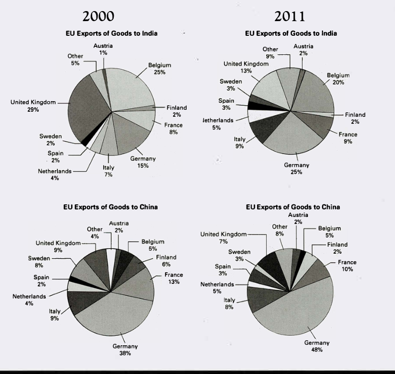
The pie charts below show exports from various EU countries to India and China in 2000 and 2011.
Summarise the information by selecting and reporting the main features, and make comparisons where relevant.
EU Exports of Goods to India and China in 2000 and 2011
Student answer (Band 5.5)
the chart below demonstrate the indian and chinese exportations from the europien united countries in 2000 and 2011 according to the percentage of goods exported from each country
ovreall , it is ovious that the highest quantity of china's exported goods was from germany while india's goods were mostly exported from united kingdom and germany , furthermore the precentage of exports to both india and china varies amoung belguim, italty and other eu countries .
In 2000 the pie chart shows that goods exported to india were mostly from united kingdom and belgium , to elaborate 29% were from uk and 25% from belgium , the graph also record another high presontage of 15% of goods from germany , compared to german's exported goods to china whish surpassed with 38% , and another 13% frane exported goods .
as far as for the year 2011 is concered german goods exported to china incresed to 48 % with other 10 % from france , in another hand the pie chart records an additional quantiy of goods from germany with 25% and less export from united kingdom with 13%.
AI examiner evaluation
| Criterion | Band |
|---|---|
| Task Achievement / Task Response | 5.5 |
| Coherence and Cohesion | 5.5 |
| Lexical Resource | 5.5 |
| Grammatical Range and Accuracy | 5.0 |
| Overall | 5.5 |
Task Achievement / Task Response: Band 5.5
You identify several important features, including Germany’s leading share of exports to China and the prominence of the UK and Belgium in exports to India in 2000. You also report some accurate figures, such as Germany’s 38% share in China in 2000 and its rise to 48% in 2011. However, the overview is vague and partly inaccurate: India’s exports were led by the UK in 2000, but Germany led in 2011, while the statement that India’s goods were mostly from the UK and Germany does not capture Belgium’s substantial shares. Coverage is also selective: many key changes, including the UK’s fall in India and Belgium’s decline, are not clearly compared. A more precise overview and fuller selection of major trends would strengthen the response.
Coherence and Cohesion: Band 5.5
The response has a basic structure, moving from an introduction and overview to details for 2000 and then 2011. This gives the reader some sense of organisation, and phrases such as “In 2000” and “as far as for the year 2011” signal time changes. However, progression is not consistently clear: the 2000 paragraph shifts between India and China without a clear comparison pattern, and the final paragraph combines figures for both destinations in a way that makes their relationship difficult to follow. Linking expressions such as “in another hand” are also used inaccurately, and several ideas are joined into long sentences. Grouping information by destination or by the largest changes would make comparisons easier to track.
Lexical Resource: Band 5.5
You attempt task-relevant vocabulary, including “percentage,” “exported,” “surpassed,” and “increased,” and the reader can generally identify the countries and trends you mean. However, spelling errors are frequent and sometimes make reading difficult, for example “europien,” “ovreall,” “obvious,” “precentage,” and “belguim.” Some word choices and collocations are also unnatural, such as “indian and chinese exportations” and “quantity of goods from Germany”; the charts show shares of EU exports, not quantities. Repetition of “goods” and “exported” limits flexibility. Focus on accurate spelling and standard chart language such as “accounted for,” “share,” and “exports to India/China” to express the data more precisely.
Grammatical Range and Accuracy: Band 5.0
You attempt both simple statements and longer sentences, including a comparison using “compared to,” but control is uneven. Errors in sentence structure and agreement appear in examples such as “the chart below demonstrate” and “the precentage … varies,” where the subject and verb do not agree. Some sentences are incomplete or awkwardly connected, particularly “in another hand the pie chart records an additional quantiy of goods from germany with 25%,” which leaves the comparison unclear. Articles and prepositions are also unreliable, as in “from united kingdom” and “as far as for the year 2011.” Use shorter, complete sentences with a clear subject and verb, and check agreement, articles, and punctuation before adding complex comparisons.
See this exact question answered at other band scores. The same prompt compared across bands.
Browse more IELTS Writing model answers or get your own writing scored by the same AI examiner.