Band 5.0 IELTS Writing Task 1 Model Answer
Overall Band Score: 5.0 · IELTS Momentum Workout · 2026-11-10
IELTS Writing Task 1 question
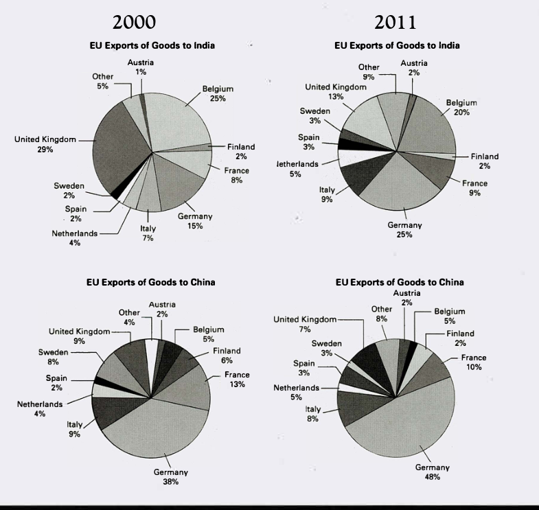
The pie charts below show exports from various EU countries to India and China in 2000 and 2011.
Summarise the information by selecting and reporting the main features, and make comparisons where relevant.
EU Exports of Goods to India and China in 2000 and 2011
Student answer (Band 5.0)
In these pie chart i can easily see that, export from different EU countries into India to China in 2000 to 2011. In these pie chart i can see that some countries export increase rapidly while some are decrasing.EU exports of goods to India in 2000 i can see that Austria's ration is 1% however in 2011 it is increase 1%.There are also some others countries percent increase such as- France , Italy, Netherland,Spain,Sweden.On the other hand some countries ration less than 2000 or still in same percent.Most percent in 2000 is United Kingdom which is slowly down in 2011.
On the others pie chart, Eu exports of goods to China also show that there are so many difference between 2000 to 2011. Germany was the highest percent in that time and it is still remain highest percent also increase in 2011.However, Austria remain the lowest from 2000 till 2011.
In the end , i can say that EU exports in China is improving day by day rather than Eu exports in India.
AI examiner evaluation
| Criterion | Band |
|---|---|
| Task Achievement / Task Response | 5.0 |
| Coherence and Cohesion | 5.5 |
| Lexical Resource | 5.0 |
| Grammatical Range and Accuracy | 5.0 |
| Overall | 5.0 |
Task Achievement / Task Response: Band 5.0
You identify relevant broad patterns: Germany is the largest contributor to China in both years and rises, while the UK has the largest share of exports to India in 2000 and falls by 2011. However, the account is only partial and some comparisons are vague or inaccurate. For India, you say several countries increased but do not report their shares or distinguish small rises from larger changes; the UK’s fall from 29% to 13% is described only as “slowly down.” The conclusion that exports to China are “improving” is not supported by these charts, which show shares rather than total export performance. Include a concise overview and select key figures, such as Germany’s rise in China from 38% to 48% and its increase in India from 15% to 25%.
Coherence and Cohesion: Band 5.5
The response has a basic overall structure: it discusses India first, then China, and ends with a concluding statement. This gives the reader some sense of organisation, and phrases such as “On the other hand” signal contrast. However, progression within the paragraphs is limited: several countries are listed without figures or a clear grouping, and the repeated openings “In these pie chart i can see” make the account feel repetitive. Some links are unclear, particularly “some countries ration less than 2000 or still in same percent,” which does not specify which countries or what comparison is intended. Organise the details into clear comparisons of the main changes, and use references such as “these shares” or “by 2011” to connect ideas precisely.
Lexical Resource: Band 5.0
You use some task-relevant vocabulary, including “exports,” “percent,” “highest,” “lowest,” and “increase,” so the general subject is usually understandable. However, the range is limited and several word choices or forms are inaccurate, sometimes making the meaning difficult to follow. Examples include “ration” for “share,” “decrasing,” “slowly down,” and “so many difference.” “Improving day by day” is also unsuitable because the charts compare two years and do not show overall export growth. Use precise terms for chart data, such as “accounted for,” “share,” “rose,” and “declined,” and check spelling and country names. This would make comparisons clearer and reduce repetition of “percent” and “increase.”
Grammatical Range and Accuracy: Band 5.0
You attempt to connect ideas with clauses and contrast markers, for example, “Germany was the highest percent in that time and it is still remain highest percent also increase in 2011.” However, sentence structures are mostly simple, and attempts to combine several ideas often produce errors that make the relationships unclear. There are recurring problems with articles, agreement, verb forms, and tense: “In these pie chart,” “it is increase,” and “it is still remain” need different grammatical forms. Capitalisation and punctuation are also inconsistent, with missing spaces after full stops and commas. Practise accurate comparison patterns such as “Germany’s share rose from 38% to 48%” and “Austria remained at 2%,” then vary these with correctly formed contrast clauses.
See this exact question answered at other band scores. The same prompt compared across bands.
Browse more IELTS Writing model answers or get your own writing scored by the same AI examiner.