Band 5.5 IELTS Writing Task 1 Model Answer
Overall Band Score: 5.5 · IELTS Momentum Workout · 2026-11-11
IELTS Writing Task 1 question
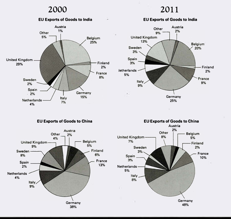
The pie charts below show exports from various EU countries to India and China in 2000 and 2011.
Summarise the information by selecting and reporting the main features, and make comparisons where relevant.
EU Exports of Goods to India and China in 2000 and 2011
Student answer (Band 5.5)
The pie charts illustrates the goods exports to India and China from EU countries in 2000 and 2011.
Overall, goods exports from United Kingdom in 2000 has high percentage than compared to other countries and in 2011 germany has high percent of goods exportation to india. According to China, Germany has high percentage of exports to China in 2000 and it increases in 2011.
Firstly, in 2000 Austria has only 1% in india and china with 2% percentage. However, Austria increases 1% in 2011 that is also equal to Finland and china remains constant. While Finland decreases 4% in 2011 which has 6% in 2000. Germany increases 10% in 2000 to 2011 in India.
Secondly, other EU countries has 5% in india and it becomes 9% in after 11 years. Moreover, China also has other with 4% and in 2011 it doubles. Ten percent of germany exports rate incresaes from 2000 to 2011. Whereas, France decreases one percent in india and in china 3% decreases.
AI examiner evaluation
| Criterion | Band |
|---|---|
| Task Achievement / Task Response | 5.5 |
| Coherence and Cohesion | 5.5 |
| Lexical Resource | 5.0 |
| Grammatical Range and Accuracy | 5.0 |
| Overall | 5.5 |
Task Achievement / Task Response: Band 5.5
You identify the two destinations and years, and your overview correctly notes the UK’s leading share of exports to India in 2000 and Germany’s dominance in China, which grew by 2011. Some reported changes are also accurate, such as Austria’s rise in India and the increase in “Other” for both destinations. However, the overview is incomplete: Germany, not the UK, had the largest share of India exports in 2011, and this key shift is not clearly explained. Several comparisons are inaccurate or unclear: France’s share fell by 3 percentage points in India (from 8% to 9% is actually an increase of 1), while in China it fell by 3; Germany’s India share rose from 15% to 25%, not from 10%. Select the main changes and report the figures consistently.
Coherence and Cohesion: Band 5.5
The response has a basic structure, with an introduction, an overview and two body paragraphs, and sequencing words such as “Firstly,” “Secondly,” “However” and “Whereas” help signal relationships. However, progression is limited because the body paragraphs move between countries and destinations without a clear organising principle. For example, the first paragraph shifts from Austria to Finland and then Germany, while the second combines “Other,” Germany and France. Some links are also unclear, particularly “Austria increases 1% in 2011 that is also equal to Finland and china remains constant.” Group the information by destination or by the most significant changes, and use clear references to distinguish India from China. This would make the comparisons easier to follow.
Lexical Resource: Band 5.0
Your vocabulary is sufficient to identify the chart’s subject and make basic comparisons, using terms such as “increases,” “decreases,” “percentage” and “remains constant.” However, the range is limited and several expressions are repetitive or imprecise, including “high percentage,” “goods exportation” and “exports rate.” Some word choices make the intended comparison difficult to interpret, as in “Germany increases 10% in 2000 to 2011.” Spelling errors such as “incresaes” also reduce accuracy. Use precise chart language and distinguish a share from a percentage-point change: for example, “Germany’s share rose by 10 percentage points” or “accounted for 25%.” A wider set of accurate terms for shares, rankings and changes would improve clarity.
Grammatical Range and Accuracy: Band 5.0
You attempt both simple and more complex sentences, including clauses introduced by “However,” “While” and “Whereas,” but control is inconsistent. Errors occur in agreement and verb forms: “The pie charts illustrates” should be “illustrate,” and “goods exports … has high percentage” needs a plural subject and a clearer verb construction. Tense and comparison patterns are also faulty in “in 2000 has high percentage than compared to other countries.” Several sentences lack clear grammatical connections, especially “Austria increases 1% in 2011 that is also equal to Finland.” These problems sometimes make relationships between figures difficult to understand. Practise accurate past-tense reporting and build comparisons with patterns such as “rose from X% to Y%” and “was higher than.”
See this exact question answered at other band scores. The same prompt compared across bands.
Browse more IELTS Writing model answers or get your own writing scored by the same AI examiner.