Band 6.5 IELTS Writing Task 1 Model Answer
Overall Band Score: 6.5 · IELTS Momentum Workout · 2026-11-14
IELTS Writing Task 1 question
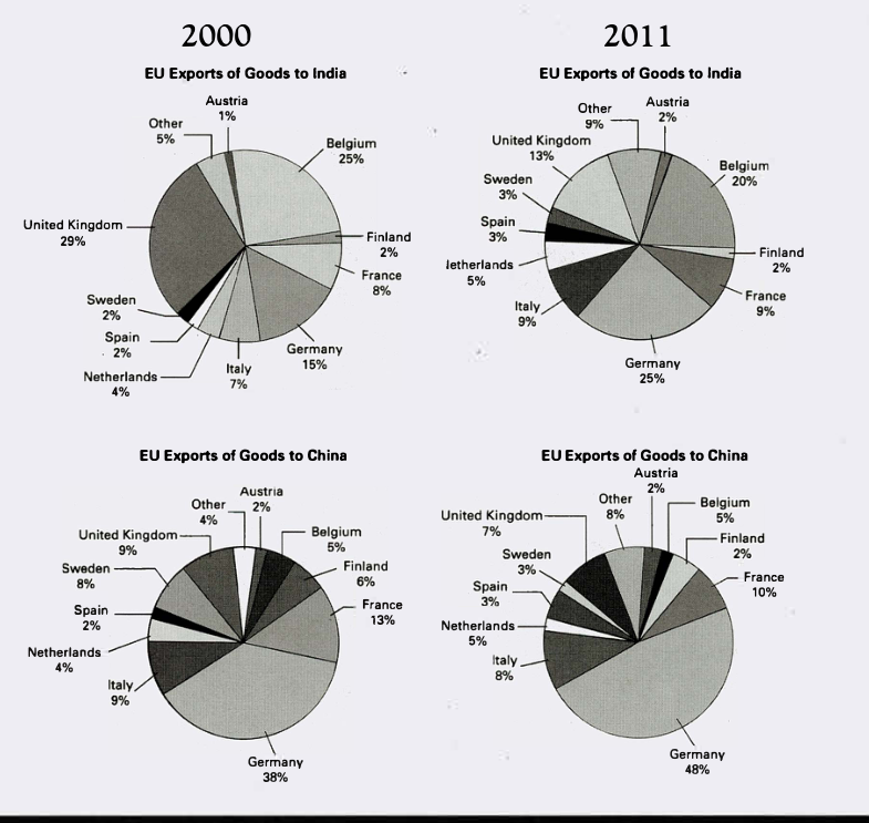
The pie charts below show exports from various EU countries to India and China in 2000 and 2011.
Summarise the information by selecting and reporting the main features, and make comparisons where relevant.
EU Exports of Goods to India and China in 2000 and 2011
Student answer (Band 6.5)
The given pie charts provides the proportion of goods supplied by various EU nations to India in China in 2000 and 2011.
Overall, UK and Belgium supplied the most goods to India in 2000 while Germay provided the most for china. Germany became the biggest supplier for both of the countries in 2011.
The country that exported the highest percentage of goods to India in 2000 was UK which was 29%. The second highest proportion was that of Belgium, which was 25% while Germany held a share of 15%. In 2011, Germany became the bigest supplier of india, standing at 25% while UK declined to 13%. The percentage of goods supplied by Belgium became 20%. The share of countries like Spain, Sweden, Netherlands, France, Austia and Italy increased slightly whereas the share of Finland remianed 2%.
Germany remained the biggest supplier for China in the both years. It held a share of 38% in 2000 and rose to 48% in 2011. The contribution of countries like Sweden, Italy, Finland, France and United Kingdom decreased slightly while the share of Belgium and Austria reamined 5% and 2% respectively. The share of other contires increased to 8% from 4%.
AI examiner evaluation
| Criterion | Band |
|---|---|
| Task Achievement / Task Response | 7.0 |
| Coherence and Cohesion | 7.0 |
| Lexical Resource | 6.0 |
| Grammatical Range and Accuracy | 6.0 |
| Overall | 6.5 |
Task Achievement / Task Response: Band 7.0
You identify the main patterns clearly: the UK and Belgium were leading suppliers to India in 2000, Germany led China, and Germany became the largest supplier to both markets by 2011. Several figures are accurate, including the UK’s fall from 29% to 13% for India and Germany’s rise from 38% to 48% for China. The response also compares changes across the two years. However, some details are over-generalised or incomplete: for China, the decreases are not all slight—Finland fell from 6% to 2%, and Sweden from 8% to 3%. The overview could also better capture the contrast between Germany’s dominance in China and the more distributed shares for India. Overall, the key features are addressed and supported, though some comparisons need more precise development.
Coherence and Cohesion: Band 7.0
The response has a clear overall progression: an introduction, a concise overview, then separate paragraphs for India and China. This makes the two destinations easy to follow, and time comparisons are generally presented in a logical order. Linking expressions such as “Overall,” “In 2011,” and “while” help connect the information. To strengthen cohesion further, make comparisons within each paragraph more explicit and avoid relying repeatedly on lists of countries. For example, the China paragraph could group the largest changes separately from the stable shares, rather than listing several countries as having decreased “slightly.” A few references, such as “the both years,” also interrupt the otherwise clear flow. The organisation is effective, but some links between data points could be more precise.
Lexical Resource: Band 6.0
You use a suitable range of task vocabulary, including “proportion,” “share,” “supplier,” “declined,” and “remained,” and these choices generally communicate the chart information clearly. There is some variation in how you describe percentages, rather than repeating one expression throughout. However, a few word choices and collocations are imprecise, such as “goods supplied by various EU nations to India in China,” which makes the destinations unclear, and “biggest supplier” is less formal than “largest exporter.” Spelling errors—including “Germay,” “bigest,” “Austia,” and “contires”—also limit accuracy. Aim for precise chart language and proofread country names and common reporting vocabulary; this would make the adequate range more controlled and natural.
Grammatical Range and Accuracy: Band 6.0
You use a mix of simple and complex sentence forms, including relative clauses such as “which was 29%” and contrast structures with “while.” Most sentences remain understandable, and the data relationships are usually clear. Some grammatical errors persist, however. The opening says “charts provides,” where the plural subject requires “provide,” and “in the both years” should be “in both years.” There are also article and phrasing problems in “Germany became the biggest supplier of india” and “the share of countries like…”; the latter would be clearer as “the shares for countries such as…”. Check subject–verb agreement, articles, and natural sentence patterns when revising. Greater accuracy across these structures would improve control without sacrificing the range you already attempt.
See this exact question answered at other band scores. The same prompt compared across bands.
Browse more IELTS Writing model answers or get your own writing scored by the same AI examiner.