Band 5.5 IELTS Writing Task 1 Model Answer
Overall Band Score: 5.5 · IELTS Momentum Workout · 2026-11-16
IELTS Writing Task 1 question
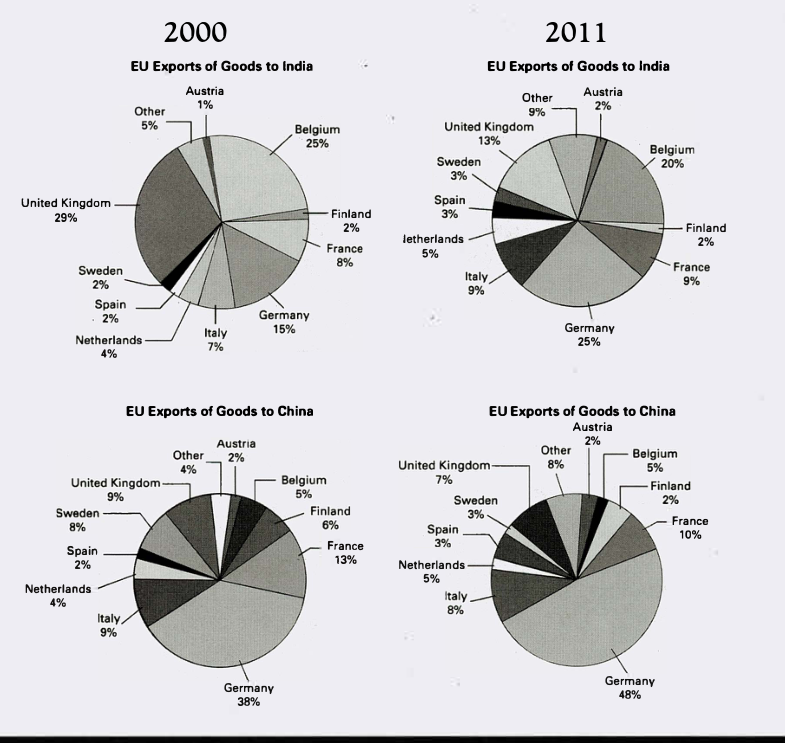
The pie charts below show exports from various EU countries to India and China in 2000 and 2011.
Summarise the information by selecting and reporting the main features, and make comparisons where relevant.
EU Exports of Goods to India and China in 2000 and 2011
Student answer (Band 5.5)
The following pie charts illustrates percentage ratio of export rate from EU countries to India and China from year 2000 till 2011.
If we observe exports to India specifically in year 2000 .We observe 10 countries sending their export goods to India. Starting from Austria the export portion was 1% and it grew to 2% by year 2011.France Germany,Italy,Netherland ,Spain and sweden also experienced expansion in percentage export from year 2000 to 2011.France expanded export by 1%( 8-9) ,Germany increased 10% (15-25%)Italy also observed growth by 1% (7-8),Netherland also by 1% (4-5), Spain also by 1% (2-3) and finally Sweden by 1% (2-3).However Belgium and UK observed decrease in exports rate between year 200o0 and 2011.Belgium percentage dropped by 5% (20% from 25%) and United Kingdom experienced an exponential fall from 29% to 13%. Meanwhile some other countries that are also involved in exports also expanded exports to India by 5% between year [redacted phone].
If we observe export rate from EU countries to China by year 2000 to 2011.First we observed countries whos export rate remained constant between the years .These include Austria 2%, Belgium 5%. The ones that expanded export rate includes Germany by 10%(38-48),Netherland by 1% (4-5%), Spain by 1% (2-3%) ,and other countries by 4 % (4-8%). Finland decreased exports from 6 to 2%, France by 13-10% ,Italy by 9% to 8% ,Sweden by 8-3 % and UK by 9 to 7%.
AI examiner evaluation
| Criterion | Band |
|---|---|
| Task Achievement / Task Response | 4.5 |
| Coherence and Cohesion | 6.0 |
| Lexical Resource | 5.5 |
| Grammatical Range and Accuracy | 5.0 |
| Overall | 5.5 |
Task Achievement / Task Response: Band 4.5
You identify several genuine changes, including Germany’s rise in exports to India and China and the UK’s decline in India, and you report many figures accurately. However, the response mainly lists country-by-country changes rather than summarising the most important features. It lacks a clear overview comparing the two destinations—for example, Germany was the largest exporter to China in both years and increased its share, while India’s leading exporter shifted from the UK to Germany. There are also factual errors: Belgium’s share to India fell from 25% to 20%, a five-percentage-point drop, but the wording around the figures is unclear; Italy’s share to India rose from 7% to 9%, not 7% to 8%. The opening also says ten countries, although the chart includes eleven categories. Select and compare key patterns, and check every figure.
Coherence and Cohesion: Band 6.0
The response has a generally understandable order: it discusses India first and China second, and uses transitions such as “However” and “Meanwhile” to signal contrast or addition. This gives the reader a basic route through the information. However, the organisation within each section is largely a sequence of separate country details, so the main comparisons are not prioritised and the overview is missing. Some linking is mechanical, particularly the repeated “If we observe” openings and repeated “also” constructions. Punctuation and spacing also interrupt the flow, as in “2000 .We observe” and the run-together figures. Grouping increases and decreases into clearer comparison sentences, then adding a concise overview, would make the progression more purposeful.
Lexical Resource: Band 5.5
You use relevant chart vocabulary, including “percentage,” “exports,” “increased,” “dropped,” and “remained constant,” so the topic is generally clear. There are also attempts at more descriptive wording, such as “exponential fall,” although this is not an appropriate description of the change shown. Several collocations and forms are awkward or repetitive: “percentage ratio of export rate,” “sending their export goods,” and “expanded exports” could be expressed more naturally and precisely. Spelling and word-form slips, including “Netherland” and “whos,” also reduce accuracy. Aim for concise, standard reporting language and use “share” or “proportion” consistently when describing the percentages; reserve stronger terms for changes that the data genuinely supports.
Grammatical Range and Accuracy: Band 5.0
You attempt both simple statements and longer sentences that combine several figures, showing some range. The meaning is usually recoverable, but errors in sentence boundaries, agreement, tense, and punctuation occur throughout. For example, “The following pie charts illustrates” has a plural subject with a singular verb, while “If we observe export rate … First we observed” shifts awkwardly between present and past. Several long lists lack clear sentence boundaries, as in the India comparison beginning “France expanded export by 1%,” making the relationships between clauses harder to follow. Full stops are also misplaced or missing, and spaces around punctuation are inconsistent. Use a consistent present tense for describing the charts, check subject–verb agreement, and divide lists into controlled sentences.
See this exact question answered at other band scores. The same prompt compared across bands.
Browse more IELTS Writing model answers or get your own writing scored by the same AI examiner.