Band 5.0 IELTS Writing Task 1 Model Answer
Overall Band Score: 5.0 · IELTS Momentum Workout · 2026-11-19
IELTS Writing Task 1 question
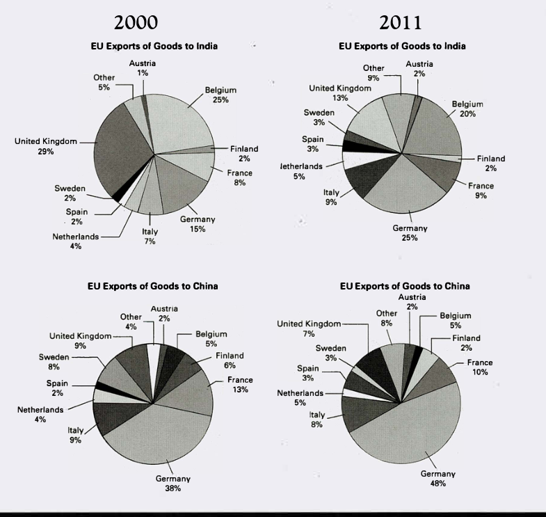
The pie charts below show exports from various EU countries to India and China in 2000 and 2011.
Summarise the information by selecting and reporting the main features, and make comparisons where relevant.
EU Exports of Goods to India and China in 2000 and 2011
Student answer (Band 5.0)
The pie chart illustrates the proportion of total exportation of goods from EU countries to the India and China in the year 2000 and 2011.
Overall, the biggest change was observed in United kingdom and Germany as ration was apper more in 2011. All other countries had consume minimum amount of goods except Belgium and the ratio was fluctated among other nations. Australia had consume least goods as compare to others.
To begin with, in 2000 EU countries had exports highest amount of good in Belgium country by a quarter but in 2011 the value slightly fell down by 5 %. Moreover, highest change was aaper in United kingdom as it was accounted at 29% in 2000 and only 13% good was exports in 2011. Germany was stood at 15% but it reached over 25% in 2011.
Furthermore, in 2000 Sweden, Finland and spain countries had receive equal amount of good over 2% and Netherland, Italy, France and other as stood at 2 to 8% Whereas, in 2011 value was marginally fluctuated in 2011 by 1%
AI examiner evaluation
| Criterion | Band |
|---|---|
| Task Achievement / Task Response | 4.0 |
| Coherence and Cohesion | 5.0 |
| Lexical Resource | 5.0 |
| Grammatical Range and Accuracy | 5.0 |
| Overall | 5.0 |
Task Achievement / Task Response: Band 4.0
You identify the two years and mention several relevant changes, including Belgium’s fall from 25% to 20%, the UK’s decline from 29% to 13%, and Germany’s rise in exports to India. However, the response only minimally summarises the charts: it does not clearly distinguish the India figures from the China figures, and it omits China’s dominant German share, which increased from 38% to 48%. The overview is also inaccurate or unclear: Germany’s share in India rose, but the UK’s fell, so they did not both become more prominent in 2011. The claim that Australia had the least exports is unsupported; the chart shows Austria, not Australia, and several countries share small proportions. Select the main patterns for each destination and report them accurately.
Coherence and Cohesion: Band 5.0
The response has a basic paragraph structure, with an introduction, an overview and two detail paragraphs. Linking phrases such as “Overall,” “To begin with” and “Furthermore” help signal movement between sections. However, there is no clear progression through the four chart series: the discussion shifts between countries and years without consistently identifying whether the figures refer to India or China. The final paragraph is especially difficult to follow, ending with an incomplete comparison that does not specify which values changed. Some connections are also unclear, as in “All other countries had consume minimum amount … except Belgium.” Organise the details by destination, compare 2000 with 2011 within each, and use clear references to guide the reader.
Lexical Resource: Band 5.0
You use some task-related vocabulary, including “proportion,” “exports,” “accounted at” and “marginally,” and you attempt to describe change. However, the range is limited and several word choices or collocations make the meaning difficult to understand. For example, “total exportation,” “had consume minimum amount of goods” and “value was marginally fluctuated” are not natural ways to describe chart data. There are also spelling errors in “apper,” “fluctated” and “Netherland,” while “Australia” appears to be a mistaken country name for Austria. Use precise chart language such as “share,” “accounted for,” “rose,” “fell” and “remained stable,” and check country names and spelling carefully.
Grammatical Range and Accuracy: Band 5.0
You attempt both simple and more extended sentences, including a comparison with “as it was accounted at 29% in 2000 and only 13% … in 2011.” However, the range is limited, and frequent errors in verb forms, articles and sentence construction sometimes make the message hard to follow. Examples include “the biggest change was observed … as ration was apper more,” “All other countries had consume,” and “Germany was stood at 15%.” The sentence beginning “in 2000 Sweden, Finland and spain countries had receive” also has faulty verb forms and an unclear structure. Practise accurate past-tense reporting (“rose,” “fell,” “accounted for”) and build complete comparison sentences with clear subjects and verbs.
See this exact question answered at other band scores. The same prompt compared across bands.
Browse more IELTS Writing model answers or get your own writing scored by the same AI examiner.