Band 6.0 IELTS Writing Task 1 Model Answer
Overall Band Score: 6.0 · IELTS Momentum Workout · 2026-11-20
IELTS Writing Task 1 question
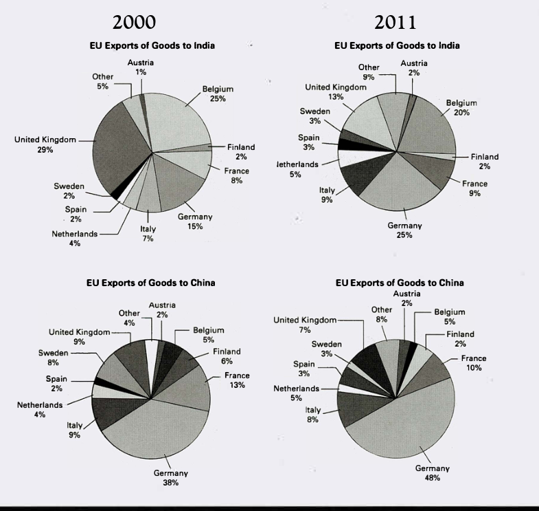
The pie charts below show exports from various EU countries to India and China in 2000 and 2011.
Summarise the information by selecting and reporting the main features, and make comparisons where relevant.
EU Exports of Goods to India and China in 2000 and 2011
Student answer (Band 6.0)
The pie chart illustrates the information on exports from different European countries to India and China over the period of eleven years from 2000 to 2011.
The main trend can be seen for Germany, which increased its exports to both countries over the years, and a great decline can be seen for the United Kingdom. Other countries, such as Finland, show no change in export percentage. A small fluctuation can be observed in other countries.
According to pie chart, the exportation from Germany has greatly increased from 15 to 25% toIndia and 38 to 48% in China. Austria, France, Italy, the Netherlands, Spain, Sweden, and other countries show a slight increase of 1 ot 2 % over the 11 years.
A decline is observed in the percentage of united Kingdom from 29 to 13% in India and 9% to 7% in China can be seen. A slight 2 to 3% decrease in the percentage of exports from Belgium to both countries can be seen. The proportion of Finland remained unchanged over the years.
AI examiner evaluation
| Criterion | Band |
|---|---|
| Task Achievement / Task Response | 6.5 |
| Coherence and Cohesion | 6.5 |
| Lexical Resource | 6.0 |
| Grammatical Range and Accuracy | 5.5 |
| Overall | 6.0 |
Task Achievement / Task Response: Band 6.5
You identify the main contrast well: Germany’s share rises for both destinations, while the UK’s falls, and you include several relevant figures. The overview also notes Finland’s stability. This gives the response a clear account of the central trends. However, some details are inaccurate or too broadly grouped: Belgium’s share to India falls from 25% to 20%, but its share to China stays at 5%, rather than decreasing in both markets. The claim that Austria, France, Italy, the Netherlands, Spain, Sweden and “other countries” all rise by 1–2% is not consistently accurate; for example, Finland’s share to China falls from 6% to 2%. To strengthen the response, compare the two destinations more precisely and select a few representative changes rather than generalising across many countries.
Coherence and Cohesion: Band 6.5
The response has a recognisable structure: an introduction, an overview, and two paragraphs reporting details. The main trends are presented before the supporting figures, and phrases such as “According to” and “A decline is observed” help signal the shift between points. This makes the overall progression understandable. However, the organisation is somewhat list-like, and the final two paragraphs do not consistently group information by destination or by trend. Some links are also awkward, as in “A decline is observed … and … can be seen,” which makes the relationship between the two figures less smooth. Grouping the data into clear comparisons—such as the largest changes for India and then China—would make cohesion more flexible and the progression easier to follow.
Lexical Resource: Band 6.0
You use an adequate range of vocabulary for describing charts, including “increased,” “decline,” “proportion,” “remained unchanged,” and “fluctuation.” These choices generally communicate the trends clearly, and you attempt some more formal wording. At times, however, word choice and collocation are imprecise: “exportation” is less natural here than “exports,” and “a great decline” is not the most suitable way to describe the UK’s changing share. There are also spelling and typing slips, including “ot” and “toIndia,” as well as inconsistent capitalisation of “United Kingdom.” More precise chart language and careful proofreading would improve control without requiring a much wider vocabulary.
Grammatical Range and Accuracy: Band 5.5
You use a mix of simple statements and more developed structures, including “The main trend can be seen for Germany, which increased its exports…” and “Other countries … show no change.” Most of the meaning remains clear, but some grammatical errors and awkward constructions reduce accuracy. For example, “According to pie chart” needs an article, and “increased from 15 to 25% toIndia” has an unclear structure and missing spacing. The sentence beginning “A decline is observed…” combines two clauses awkwardly, while “A slight 2 to 3% decrease … can be seen” would be clearer with a complete, direct construction. Practise accurate articles, sentence boundaries and parallel phrasing when reporting paired figures; this will help you retain variety while improving control.
See this exact question answered at other band scores. The same prompt compared across bands.
Browse more IELTS Writing model answers or get your own writing scored by the same AI examiner.