Band 6.0 IELTS Writing Task 1 Model Answer
Overall Band Score: 6.0 · Cambridge IELTS 17 · 2026-11-09
IELTS Writing Task 1 question
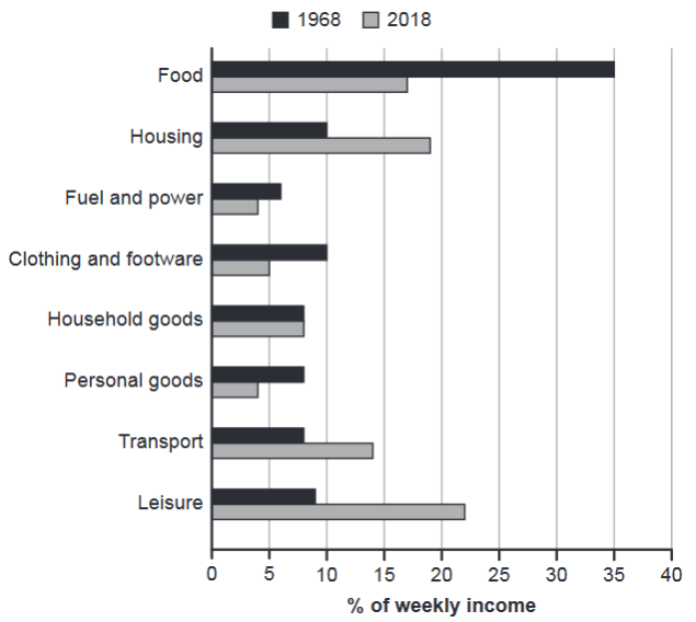
The chart below gives information about how families in one country spent their weekly income in 1968 and in 2018.
Summarise the information by selecting and reporting the main features, and make comparisons where relevant.
1968 and 2018: average weekly spending by families
Student answer (Band 6.0)
This graphic represent how families in one country (no specific country mentionned) spend their weekly income in 1968 and 2018.
The first line shows how many people are spending their money for food. In 1968, 35% of the weekly money was using for food, wich is also the biggest expense for this year on the graphic. It's very intresting because in 2018, approximately 17% of the weekly income was using for food compare to approximately 23% of the income spending in leisure. In 1968, the leisure expenses were only 8% of the weekly income.
We undesrstand with this graphic that nowadays, people prefer to spend their money on leisure than on food. This phenomen is probably relate to a difference lifestyle.
In this graphic we can also see that household goods are exactly the same in 1968 and 2018. The expense on fuel and power are similar (6% in 1968 and 4 in 2018).
Two others aspects are really different :
-The housing was 10% of the weekly income in 1968 and it's now 19% wich is almost the double.
-The transportation is also very different, 7% in 1968 compare to 14% in 2018.
This graphic suggest that the life doesn't cost the same in 2018 compare to 1968, but also that people are not spending their money in the same way.
AI examiner evaluation
| Criterion | Band |
|---|---|
| Task Achievement / Task Response | 6.5 |
| Coherence and Cohesion | 6.0 |
| Lexical Resource | 5.5 |
| Grammatical Range and Accuracy | 5.5 |
| Overall | 6.0 |
Task Achievement / Task Response: Band 6.5
You identify several important comparisons accurately, including the fall in food spending from 35% to about 17%, the rise in housing from 10% to 19%, and the increase in transport. Your overview that spending patterns changed is relevant, and the contrast between food and leisure is a useful feature. This is a reasonably complete response, but some details are inaccurate or insufficiently covered: leisure in 2018 is about 22%, not 23% (a small approximation), while transport was about 8% in 1968, not 7%. You also say household goods were unchanged, but omit its value, and do not report clothing or personal goods. The claim that people “prefer” leisure and the lifestyle explanation go beyond what the chart demonstrates. More precise, balanced reporting would strengthen the response.
Coherence and Cohesion: Band 6.0
The response has a generally understandable sequence: it begins with food and leisure, then discusses household costs and finishes with housing and transport. Paragraph breaks help separate these points, and comparisons such as “in 1968” versus “in 2018” make the time frame clear. However, the organisation is not consistently controlled. The opening refers to a “first line,” although the visual is a bar chart, and the list-like “Two others aspects” section interrupts the flow. The final generalisation repeats the idea that spending changed without adding a clear summary of the main trends. Use a concise overview near the beginning, then group the largest rises and falls into logically connected paragraphs, with clearer links between comparisons.
Lexical Resource: Band 5.5
You use relevant topic vocabulary, including “weekly income,” “expense,” “household goods,” “fuel and power,” and “transportation,” so the main subject is usually clear. There is some variety in how you describe change, such as “almost the double” and “very different,” but several choices are imprecise or unnatural for chart reporting. Phrases such as “the weekly money was using for food” and “people prefer to spend their money” do not express the data naturally, while “phenomen” and “mentionned” show spelling problems. Repeated use of “graphic” also limits precision. Build a more accurate set of reporting expressions, such as “accounted for,” “rose to,” and “fell to,” and check spelling and collocations before submitting.
Grammatical Range and Accuracy: Band 5.5
You attempt a mix of simple and more complex sentences, including the contrast beginning “It's very interesting because in 2018…” and the concluding clause introduced by “but also.” The overall meaning is generally recoverable, but some grammatical errors recur. For example, “This graphic represent” needs subject–verb agreement, and “the weekly money was using for food” has an incorrect verb construction. In “compare to approximately 23%,” the comparison form is not correctly integrated into the sentence, and “the life doesn't cost the same in 2018 compare to 1968” has a faulty clause structure. Aim for accurate patterns such as “families spent 35% of their income on food” and “compared with 1968,” while varying sentence forms without sacrificing control.
See this exact question answered at other band scores. The same prompt compared across bands.
Browse more IELTS Writing model answers or get your own writing scored by the same AI examiner.