Band 6.0 IELTS Writing Task 1 Model Answer
Overall Band Score: 6.0 · Cambridge IELTS 17 · 2026-11-10
IELTS Writing Task 1 question
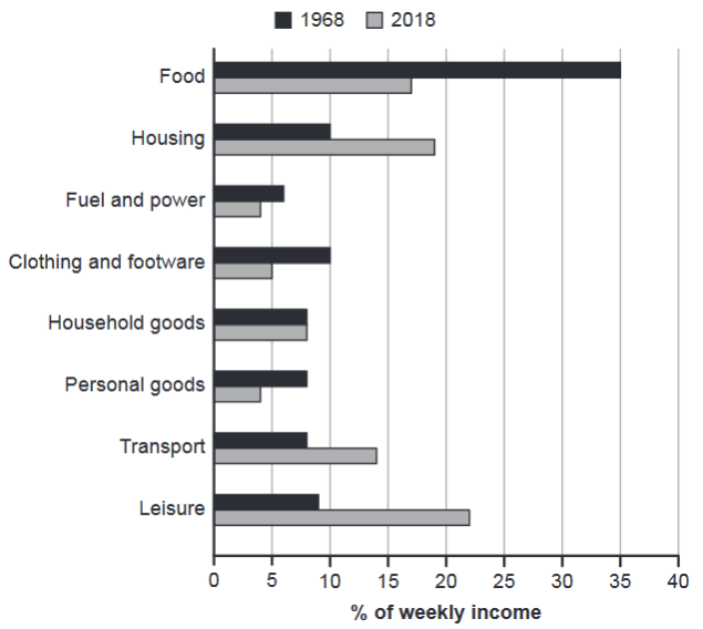
The chart below gives information about how families in one country spent their weekly income in 1968 and in 2018.
Summarise the information by selecting and reporting the main features, and make comparisons where relevant.
1968 and 2018: average weekly spending by families
Student answer (Band 6.0)
The data in the bar graph represents the weekly expenditures of families on various activities of life in a region in the years 1968 and 2018.
Overall, what stands out of the chart is a comparison between the two years,1968 and 2018. The information illustrates, how people have spent their money earned in a week on different aspects of their lives. This includes percentage of weekly income spent on food, house rents or morgages, fuel and power, clothing and shoes, household items, personal accessories, transportation and leisure activities.
By looking into the details we can clearly see that in the year 1968 people used to spend more of their income on food items that is about 35% of their weekly salary. Secondly, rents and morgages as well as wadrobe expanses covered 10% of the total income. Whereas, spending on leisure activites is on third number but shopping of household and personal goods as well as transportation holds the equal share from the earnings. Lastlly, fuel expanses are only 6%.
Moreover, in the year 2018 data shows that families are spending a high volume of money on the leisure activites not on the food that is 22% and 16% respectively. On the second number again is the housing expanse but it has almost doubled as compared to 1968. The spending on transportation has also increased relative to 1968. However, fuel needs still remain the lowest category but now personal expenditures have also joined them according to 2018's data.
AI examiner evaluation
| Criterion | Band |
|---|---|
| Task Achievement / Task Response | 6.0 |
| Coherence and Cohesion | 6.5 |
| Lexical Resource | 6.0 |
| Grammatical Range and Accuracy | 5.5 |
| Overall | 6.0 |
Task Achievement / Task Response: Band 6.0
You identify the chart’s subject and make relevant comparisons across both years, including the major shift from food (35%) to leisure (22%) and the rise in housing and transport. The overview, however, is mostly a description of what the chart contains rather than a concise summary of its main trends. Some details are inaccurate or unclear: food in 2018 is reported as 16% rather than about 17%, and the 1968 statement that housing and wardrobe expenses were both 10% overlooks that clothing was 10% but housing was also 10%; the later ranking of leisure and the equal shares is difficult to follow. You also omit the 2018 figures for several categories. Select the clearest increases, decreases and stable categories, and report them precisely.
Coherence and Cohesion: Band 6.5
The response has a recognisable structure: an introduction, a general statement, and separate paragraphs for 1968 and 2018. This makes the comparison broadly easy to follow, and transitions such as “Moreover” and “However” help signal movement between points. To strengthen progression, make the overview a distinct summary of the main changes rather than repeating that the chart compares two years and listing all categories. Some links are mechanical or unclear, particularly “Whereas, spending on leisure activities is on third number but…”; the relationship between the categories is hard to interpret. Use clearer comparison structures and group figures by trend—for example, categories that fell, rose, or stayed similar—so the reader can follow the data without relying on ranking phrases.
Lexical Resource: Band 6.0
You use an adequate range of topic vocabulary, including “weekly expenditures,” “percentage,” “income,” “transportation,” and “leisure activities,” and the intended meaning is generally understandable. There are also attempts at more formal phrasing, such as “relative to 1968.” However, several word choices and collocations are inaccurate or awkward: “activities of life,” “house rents or mortgages,” “on third number,” and “high volume of money” do not describe chart categories naturally. Spelling errors such as “morgages,” “wadrobe,” “expanses,” and “activites” also reduce precision. Prefer the chart’s straightforward labels—“housing,” “clothing,” and “personal goods”—and use standard comparison language such as “accounted for,” “rose,” and “fell.”
Grammatical Range and Accuracy: Band 5.5
You attempt a mix of simple and complex sentences, including contrast clauses with “Whereas” and “However,” and most of the message remains understandable. Some grammatical and punctuation errors nevertheless affect clarity. For example, “what stands out of the chart” has an incorrect preposition, and “The information illustrates, how…” uses an unnecessary comma between the reporting verb and its clause. The sentence beginning “Whereas, spending…” is not a complete, well-connected sentence, while “food items that is about 35%” has faulty agreement and sentence construction. There are also inconsistent tense choices when describing the two years. Build comparisons with complete clauses, check subject–verb agreement, and use past tense consistently for the historical data.
See this exact question answered at other band scores. The same prompt compared across bands.
Browse more IELTS Writing model answers or get your own writing scored by the same AI examiner.