Band 6.5 IELTS Writing Task 1 Model Answer
Overall Band Score: 6.5 · Cambridge IELTS 17 · 2026-11-10
IELTS Writing Task 1 question
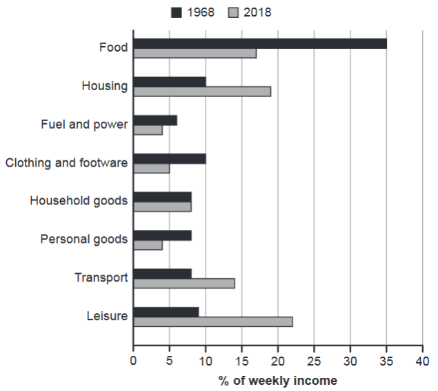
The chart below gives information about how families in one country spent their weekly income in 1968 and in 2018.
Summarise the information by selecting and reporting the main features, and make comparisons where relevant.
1968 and 2018: average weekly spending by families
Student answer (Band 6.5)
The bar chart illustrates information regarding the spendings of families on their weekly earnings in a country in 1968 and 2018.
Overall, in the past, families spent their most of their income on food while currently they spent most of their money on leisure activity.
In 1968, people spent 35% of their earnings which was the most among all expenditure and around 6% on fuel and power which was the lowest among all. In 2018, people spent 17% approximately on food and around 4% on fuel which is even lower than the past. People spent the major portion of their income on lesiure activity in 2018 which was around 22% while it was just roughly 9% in 1968.
People spent more money on transport recorded at nearly 14% and housing at rougly 19% in 2018 than in 1968 while the number was 8% and 10% respectively. In contrast, individuals in 1968 spent bigger amount of their earnings on clothing and footwear stand at 10% and personal goods at roughly 8% than in 2018 where the number was approximately 5% and 3% approximately. For household goods families spent a similar amount of money in both the years.
In conclusion, spendings of past families were more on domestic part and daily necessaries while present day families are more interested on travel and recreational site.
AI examiner evaluation
| Criterion | Band |
|---|---|
| Task Achievement / Task Response | 7.5 |
| Coherence and Cohesion | 7.0 |
| Lexical Resource | 6.0 |
| Grammatical Range and Accuracy | 6.0 |
| Overall | 6.5 |
Task Achievement / Task Response: Band 7.5
The response gives a clear overview of the main shift: food was the largest category in 1968, whereas leisure was largest in 2018. It also selects relevant comparisons, including the fall in food spending from 35% to about 17%, and the increases in housing and transport. Most reported figures match the chart; the personal-goods figure for 2018 is given as roughly 3% rather than 4%, a small discrepancy. The final claim that earlier spending was more on “domestic part and daily necessaries” is broad and not fully supported by the categories, and the chart shows spending shares rather than what families were interested in. Keep the overview focused on measurable changes and develop the remaining categories with precise comparisons.
Coherence and Cohesion: Band 7.0
The response is organised into an introduction, an overview, and paragraphs comparing the two years, so the reader can follow the main progression. Linking expressions such as “In contrast” and “while” help signal comparisons, and the categories are generally grouped sensibly. However, the final “In conclusion” paragraph repeats the overview and introduces a broad interpretation rather than adding useful chart information. Some comparisons are also packed into long sentences, particularly the sentence beginning “People spent more money on transport,” which makes the relationships between figures less smooth. Use the final paragraph space for a concise overview, and group increases and decreases more consistently to make cohesion more controlled.
Lexical Resource: Band 6.0
There is adequate vocabulary to describe the chart, including “illustrates,” “expenditure,” “portion,” and “in contrast.” The writer also attempts varied expressions such as “major portion” and “daily necessaries,” but some choices are unnatural or imprecise for this task. “Spendings” is not the usual noun in this context, “lesiure” is misspelled, and “recreational site” does not accurately describe the leisure category. Phrases such as “the number was” are also vague when referring to percentages. These choices do not prevent understanding, but they limit precision and naturalness. Prefer standard chart language such as “proportion,” “accounted for,” and “share of weekly income,” and check spelling carefully.
Grammatical Range and Accuracy: Band 6.0
The response uses a mix of simple and more complex structures, including clauses with “while,” “which,” and “where,” and the main comparisons are usually understandable. Some grammatical errors remain. For example, “families spent their most of their income” has an incorrect determiner pattern, while “clothing and footwear stand at 10%” uses an unsuitable verb form in a past-time comparison. The sentence beginning “People spent more money on transport recorded at nearly 14%” is also structurally awkward because the relationship between the spending and the figure is not clearly expressed. Maintain consistent past tense when describing both years, and use complete comparison structures such as “Transport accounted for 14% in 2018, compared with 8% in 1968.”
See this exact question answered at other band scores. The same prompt compared across bands.
Browse more IELTS Writing model answers or get your own writing scored by the same AI examiner.