Band 5.5 IELTS Writing Task 1 Model Answer
Overall Band Score: 5.5 · Cambridge IELTS 17 · 2026-11-11
IELTS Writing Task 1 question
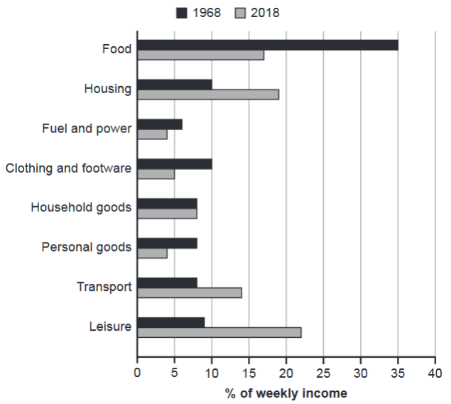
The chart below gives information about how families in one country spent their weekly income in 1968 and in 2018.
Summarise the information by selecting and reporting the main features, and make comparisons where relevant.
1968 and 2018: average weekly spending by families
Student answer (Band 5.5)
This bar chart shows the families expenses on different things from their weekly income in 1968 and 2018. The blue line shows the money spent in 1968 and gray line represents 2018.
The families spent their most of weekly income on food in 1968 and the income spent on fuel and power is minor due. Alternatively, the most money spent in 2018 is on leisure and spend a little on personal goods.
Firstly, families prefer in 1968 to spent their money on quality of food and they spent a minor on the fuel and power, while people in 2018 mostly spent their weekly income on leisure and housing. The 2018 families are less prefer to spend their money on personal goods. The housing weekly expenses in 1968 is moderate but it has high expenses after leisure in 2018. In 2018 people usually prefer simple clothes and footware so they spent less money but 1968 a clothing and footware have same budget as housing. In both times, families spent almost equal money on household goods. Transport expenses is high in 2018 due to new technology and modern and fast cars but in 1968, transport expenses are less than 2018.
AI examiner evaluation
| Criterion | Band |
|---|---|
| Task Achievement / Task Response | 6.0 |
| Coherence and Cohesion | 5.5 |
| Lexical Resource | 5.5 |
| Grammatical Range and Accuracy | 5.0 |
| Overall | 5.5 |
Task Achievement / Task Response: Band 6.0
You identify the main contrast accurately: food takes the largest share in 1968, while leisure is highest in 2018, and you note the rise in housing and transport and the similar household-goods figures. These are relevant features and show a reasonable understanding of the chart. However, some comparisons are imprecise or incomplete. For example, calling fuel and power the smallest category in 1968 overlooks that it is indeed the lowest, but the overview would be stronger if it also highlighted the substantial fall in food spending and the rise in leisure. The claim that families chose “quality of food” and that transport rose “due to new technology and modern and fast cars” is not supported by the chart. Focus on reporting visible changes rather than explaining their causes.
Coherence and Cohesion: Band 5.5
The response has a recognisable overall structure: an introduction, a brief summary of the main extremes, and further comparisons. Linking words such as “Alternatively,” “Firstly,” and “while” help signal relationships between ideas. However, progression is not consistently clear because several comparisons are placed together without a systematic order, and some points repeat earlier statements—for example, the preference for leisure and housing is mentioned more than once. The opening overview also combines several details without clearly distinguishing the biggest overall changes. Group the data into a clear overview followed by comparisons of categories that rose, fell, or stayed similar, and use references such as “this category” only when their meaning is unmistakable.
Lexical Resource: Band 5.5
You use relevant chart vocabulary, including “weekly income,” “expenses,” “budget,” and “transport,” and you attempt to describe comparisons with phrases such as “less than” and “almost equal.” However, word choice and collocation are often awkward, which makes some descriptions less precise: “spent their most of weekly income,” “a minor on the fuel,” and “less prefer” do not express the intended meanings naturally. “Blue line” and “gray line” are also inaccurate for a bar chart, where the visual elements are bars. Spelling errors such as “footware” further reduce accuracy. Build a reliable set of phrases for describing proportions and change, such as “accounted for,” “the share allocated to,” “rose,” and “fell,” and check spelling and collocations.
Grammatical Range and Accuracy: Band 5.0
You attempt both simple and more complex sentences, including comparisons joined with “while” and “but,” so there is some variety in structure. Meaning is generally recoverable, but errors in sentence construction and grammatical forms are evident. For example, “The families spent their most of weekly income” has an incorrect possessive structure, while “families prefer in 1968 to spent” uses an incorrect verb form and tense. Agreement is also inconsistent in “The housing weekly expenses … is moderate,” and the sentence beginning “In 2018 people usually prefer…” shifts between present and past forms. Use past tense consistently for the two years, check subject–verb agreement, and practise accurate comparative clauses. More controlled sentence patterns would make your comparisons easier to follow.
See this exact question answered at other band scores. The same prompt compared across bands.
Browse more IELTS Writing model answers or get your own writing scored by the same AI examiner.