Band 5.5 IELTS Writing Task 1 Model Answer
Overall Band Score: 5.5 · Cambridge IELTS 17 · 2026-11-11
IELTS Writing Task 1 question
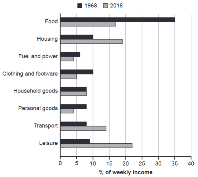
The chart below gives information about how families in one country spent their weekly income in 1968 and in 2018.
Summarise the information by selecting and reporting the main features, and make comparisons where relevant.
1968 and 2018: average weekly spending by families
Student answer (Band 5.5)
The bar chart illustrates the informaion among families in one country spent thier weekly income in 1968 and 2018.
overall, families spent most of their income in food and on the other hand they spen their less income in fuel and power.In 2018. most of the families were spent their income in leisure and less in fuel and power.
In 1968, families were spent most of their incomr in food at 35% and they were spent less income in fuel and power,while families were spent their income in housing at 10%, clothing and footware at 10%, household goods and personal goods at 8%, transport at 8% and at the end they spent 9% income at leisure.
In 2018, families were spent their many income in leisure at 22% and food at 16%, while they spent thier income in housing at 18%, clothing and footware at 5%, household goods at 8% samilar in 1968, personal goods at 4% and transport at 13%.
AI examiner evaluation
| Criterion | Band |
|---|---|
| Task Achievement / Task Response | 5.5 |
| Coherence and Cohesion | 6.0 |
| Lexical Resource | 5.0 |
| Grammatical Range and Accuracy | 5.0 |
| Overall | 5.5 |
Task Achievement / Task Response: Band 5.5
You identify the main contrast: food takes the largest share in 1968, while leisure is highest in 2018, and you include figures for most categories. However, the overview is unclear and partly inaccurate: fuel and power is the smallest category in 1968, but in 2018 clothing and personal goods are lower. Several figures are also misreported: 2018 food is about 17%, housing 19%, and transport 14%, rather than 16%, 18%, and 13%. The response reports many details, but does not clearly summarise the broader changes, such as the sharp fall in food spending and rises in housing, transport, and leisure. A more precise overview and accurate comparisons would make the key features clearer.
Coherence and Cohesion: Band 6.0
The response has a recognisable structure: an introduction, an overview, and separate paragraphs for the two years. This helps the reader follow the basic comparison. However, progression within the paragraphs is limited, and the lists of figures feel mechanical rather than grouped by meaningful trends. Linking phrases such as “on the other hand” and “while” are used, but some connections are unclear or awkward, and the overview repeats information from the detail paragraphs. Improve cohesion by grouping categories that rose or fell, using clear comparisons between years, and separating the overview from the supporting figures. Check punctuation around linking phrases so that sentence boundaries are easy to follow.
Lexical Resource: Band 5.0
You use relevant topic vocabulary, including “weekly income,” “food,” “housing,” and “leisure,” so the reader can generally understand what the chart describes. However, the range is limited and several phrases are inaccurate or unnatural, such as “spent their many income,” “spent their less income,” and “spent 9% income at leisure.” Spelling errors, including “informaion,” “thier,” and “samilar,” also reduce accuracy. Use more precise reporting language and vary the repeated verb “spent”; for example, describe a category as “accounted for” a share of income or say that spending “rose” or “fell.” These changes would make the comparisons clearer and more natural.
Grammatical Range and Accuracy: Band 5.0
Most sentences attempt to communicate relevant comparisons, but grammatical control is inconsistent. The repeated construction “families were spent” is incorrect; use “families spent” or “families allocated.” There are also problems with sentence boundaries and punctuation, as in “fuel and power.In 2018.”, and with clause structure in “while families were spent their income in housing.” The response relies mainly on simple statements and lists, while attempts to connect ideas with “while” are often faulty. Practise accurate past-tense reporting and build comparisons with controlled structures such as “Food accounted for 35% in 1968, compared with 17% in 2018.” This would improve both range and clarity.
See this exact question answered at other band scores. The same prompt compared across bands.
Browse more IELTS Writing model answers or get your own writing scored by the same AI examiner.