Band 5.5 IELTS Writing Task 1 Model Answer
Overall Band Score: 5.5 · Cambridge IELTS 17 · 2026-11-11
IELTS Writing Task 1 question
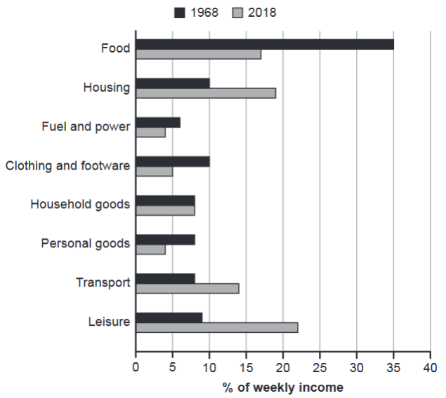
The chart below gives information about how families in one country spent their weekly income in 1968 and in 2018.
Summarise the information by selecting and reporting the main features, and make comparisons where relevant.
1968 and 2018: average weekly spending by families
Student answer (Band 5.5)
The bar graph shows information about the family weekly income spent in 1968 and in the year 2018 in a specific country.
Overall, its a comparison between the different type of activities in year 1968 and in the year 2018.
Initially, 1968 the highest percentage is of food and the second most expenses is on housing. Household goods and personal goods are at the same percentage. The percentage of expenses on clothing is slightly above than the fuel and power. The percentage of expenses spend on transport and leisure is below than 10%.
While in the year 2018, there are abundant of changes occur. The percentage of leisure and transport increases and reaches to 14% and 22%. No changes can be seen in household goods. The expenses on Fuel and personal good shows decline in their expenses as compared to 1968. The clothing and footware also shows negative impact the the percentage reaches to 10%. In housing, the percentage increases and reaches to almost one quarter. In food a huge decline can be seen.
In conclusion, the expenses on food in 1968 is at the top. As the years passes the highest percentage of expenses is on Leisure.
AI examiner evaluation
| Criterion | Band |
|---|---|
| Task Achievement / Task Response | 6.0 |
| Coherence and Cohesion | 6.0 |
| Lexical Resource | 5.5 |
| Grammatical Range and Accuracy | 5.0 |
| Overall | 5.5 |
Task Achievement / Task Response: Band 6.0
You identify the main contrast accurately: food is the largest category in 1968, while leisure becomes the largest in 2018, and you note the rise in housing and transport and the unchanged household-goods figure. These are relevant features and give the response a clear overall direction. However, some details are inaccurate or unclear: in 1968, housing at 10% is tied with clothing, rather than being clearly the second-largest expense; and in 2018, leisure is 22% and transport is 14%, but your sentence reverses these figures. The statement that clothing reaches 10% in 2018 is also incorrect; it falls to 5%. Develop the comparisons more precisely and report the key figures consistently.
Coherence and Cohesion: Band 6.0
The response has a recognisable structure, moving from an introduction to a description of 1968, then 2018, and a brief concluding comparison. This makes the information generally easy to follow. The paragraphing also helps separate the two years. However, progression within the body is sometimes mechanical: repeated openings such as “The percentage…” and “The expenses…” make the account feel like a list. “Initially” and “While” do not always create clear relationships between the points that follow, and the conclusion repeats the main contrast without adding a useful synthesis. Grouping the largest changes together—for example, the fall in food alongside the rise in leisure—and using clearer comparisons would improve cohesion and flow.
Lexical Resource: Band 5.5
You use relevant chart vocabulary, including “percentage,” “decline,” “increases,” and “comparison,” so the topic is generally clear. There is also some attempt to vary wording, such as “huge decline.” However, several choices are inaccurate or unnatural for describing data: “activities” does not accurately describe all the spending categories, “abundant of changes occur” is awkward, and “negative impact” is not suitable for a neutral chart summary. There are also word-form and spelling problems, including “footware” and “personal good.” Aim for precise terms such as “spending category,” “rose,” “fell,” and “remained unchanged,” and check collocations and spelling before submitting.
Grammatical Range and Accuracy: Band 5.0
You attempt both simple statements and longer sentences, and the reader can usually understand the intended comparisons. However, grammatical control is inconsistent, particularly in sentence openings, agreement, and clause construction. For example, “Initially, 1968 the highest percentage is of food” lacks a clear grammatical link between the time phrase and the main clause; “there are abundant of changes occur” combines incompatible structures; and “the highest percentage of expenses is on Leisure” has an awkwardly formed comparison. Tense and agreement also shift, as in “the expenses … shows decline” and “As the years passes.” Practise forming complete clauses with consistent past-tense verbs, and check subject–verb agreement and articles. More accurate control of these patterns would make your comparisons clearer.
See this exact question answered at other band scores. The same prompt compared across bands.
Browse more IELTS Writing model answers or get your own writing scored by the same AI examiner.