Band 6.0 IELTS Writing Task 1 Model Answer
Overall Band Score: 6.0 · Cambridge IELTS 17 · 2026-11-11
IELTS Writing Task 1 question
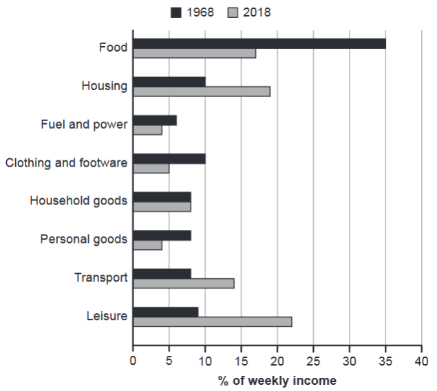
The chart below gives information about how families in one country spent their weekly income in 1968 and in 2018.
Summarise the information by selecting and reporting the main features, and make comparisons where relevant.
1968 and 2018: average weekly spending by families
Student answer (Band 6.0)
The barchart shows how families utilized their weekly earnings in a particular state from 1968 to 2018.
Overall, the dominant proportion on expenditure was on food in 1968 while in 2018 it was used on leisure but the least expenditure was spent on fuel and power over a period of five years. It can also be seen that in 2018,the lowest amount of money was spent in personal goods.
To begin with the year 1968, food was the highest commodity where families utilized their income ,it accounted for 35 percent . This was followed by housing an clothing and footware which had a similar percentage of 10.Moreover, household goods,personal goods, transport and leisure made up about 8 percent .The lowest was fuel and power which had a proportion of 6.
Looking at the year 2018,leisure was the most prioritized activity by the families with nearly 23 percent.Housing followed closely with a percentange of almost 19 percent.Additionally, food accounted for approximately 16 percent while transport had a rate of about 14 percent. On household goods, families used equal amount of earnings with the year 1968 on items such as personal goods, transport,and leisure which was a percentange of just about 8 percent. The least in that period was fuel and power and ersonal goods which had nearly 4 %.
AI examiner evaluation
| Criterion | Band |
|---|---|
| Task Achievement / Task Response | 6.0 |
| Coherence and Cohesion | 6.0 |
| Lexical Resource | 6.0 |
| Grammatical Range and Accuracy | 5.5 |
| Overall | 6.0 |
Task Achievement / Task Response: Band 6.0
You identify the main shift from food being the largest category in 1968 to leisure in 2018, and you report several relevant figures, including food at 35% and housing at about 19%. This gives the response a clear overview and covers both years. However, some comparisons are unclear or inaccurate: the statement that the least expenditure was on fuel and power “over a period of five years” does not match the chart’s 50-year span, and in 2018 personal goods and fuel and power are both about 4%, rather than personal goods alone being the lowest. The final comparison also incorrectly groups transport and leisure with household goods as unchanged; only household goods remained at about 8%. More precise selection and explanation of these changes would strengthen the report.
Coherence and Cohesion: Band 6.0
The response has a recognisable structure: an introduction and overview are followed by separate paragraphs for 1968 and 2018. Sequencing phrases such as “To begin with” and “Looking at the year 2018” help readers follow the time-based organisation. However, cohesion is sometimes weakened by unclear links between ideas. In particular, the sentence beginning “On household goods” combines unchanged household spending with personal goods, transport and leisure, making the comparison difficult to interpret. Some punctuation and spacing around transitions also interrupt the flow. Grouping the figures by clear patterns—categories that rose, fell or stayed stable—and using more precise references would make the progression more coherent.
Lexical Resource: Band 6.0
You use an adequate range of task-related vocabulary, including “accounted for,” “proportion,” “prioritized,” and “followed closely,” and the main meaning is generally clear. There are, however, several inaccurate or awkward choices that reduce precision. “The dominant proportion on expenditure” is not a natural way to describe the largest spending category, while “commodity” and “activity” do not fit all the chart categories. Spelling errors such as “barchart,” “footware,” “percentange,” and “ersonal” are also noticeable. Aim for consistent, accurate terms such as “category,” “share of weekly spending,” and “expenditure,” and check spelling carefully. This would make the vocabulary more natural and precise without requiring unnecessarily complex wording.
Grammatical Range and Accuracy: Band 5.5
You attempt both simple and more complex sentence forms, and most of the information remains understandable. Some grammatical errors persist, particularly with sentence boundaries, articles and agreement. For example, “food was the highest commodity where families utilized their income, it accounted for 35 percent” joins two independent clauses with only a comma. In “families used equal amount,” the article is missing, and “which was a percentage” has an unclear reference and agreement with the list that precedes it. There are also inconsistent spaces after commas and around punctuation. Use full stops or conjunctions to separate complete clauses, and check articles and pronoun references. Greater control of these patterns would make the varied sentence structures more accurate.
See this exact question answered at other band scores. The same prompt compared across bands.
Browse more IELTS Writing model answers or get your own writing scored by the same AI examiner.