Band 5.5 IELTS Writing Task 1 Model Answer
Overall Band Score: 5.5 · Cambridge IELTS 17 · 2026-11-11
IELTS Writing Task 1 question
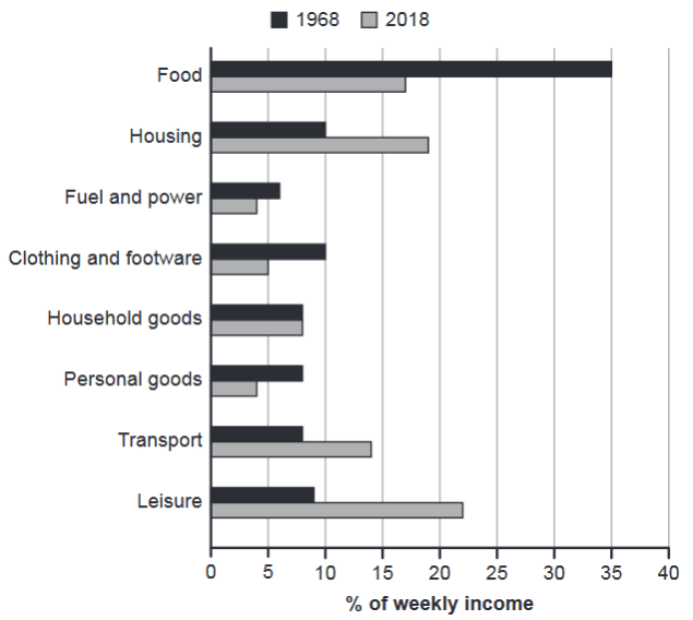
The chart below gives information about how families in one country spent their weekly income in 1968 and in 2018.
Summarise the information by selecting and reporting the main features, and make comparisons where relevant.
1968 and 2018: average weekly spending by families
Student answer (Band 5.5)
The bar chart given below gives information about how families spent their weekly income in a country. The bar chart compares expenditure of various categories in 1968 and in 2018.
The food category being the top most expense in 1968 nearly halved from 35% in 1968 to consuming 17% of weekly income in 2018. The clothing and footware also represent the same statistics as it consumed 5% of weekly income in 2018 and 10% in 1968. However, the housing seems to have nearly doubled in 1968 from 10% to 18% in 2018.
The same proportion of weekly income is consumed for household goods in 2018 as it was in 1968. The fuel and power nearly has almost halved by 8% in 2018 and it was 12% in 1968. despite transport has got more expensive in 2018 as it takes up double of what it took in 1968 ranging from 8% in 1968 to almost 15% in 2018 which sounds strange.
The leisure is nearly out of affordability in 2018 as it takes up almost 22% of weekly income compared to 1968 that was only 9%. The personal goods got cheaper in 2018 as it consumed only 9% of weekly income but they were expensive in 1968 with taking up same weekly income as of household goods almost 8%.
AI examiner evaluation
| Criterion | Band |
|---|---|
| Task Achievement / Task Response | 5.5 |
| Coherence and Cohesion | 5.5 |
| Lexical Resource | 6.0 |
| Grammatical Range and Accuracy | 5.5 |
| Overall | 5.5 |
Task Achievement / Task Response: Band 5.5
You cover all eight spending categories and make several relevant comparisons, including the sharp fall in food spending and the rise in leisure and housing. However, some figures are inaccurate: fuel and power was about 6% in 1968 and 4% in 2018, not 12% and 8%, while personal goods fell from about 8% to 4%, rather than 9%. The overview is also implicit rather than clearly summarising the main pattern; for example, you could state that food was the largest item in 1968, whereas leisure and housing became the leading categories in 2018. Some comments, such as leisure being “out of affordability” and transport sounding “strange,” add unsupported interpretation instead of reporting the chart.
Coherence and Cohesion: Band 5.5
The response is divided into paragraphs and generally groups related comparisons, so the reader can follow the categories being discussed. However, there is no clear overview paragraph, and the progression between details is sometimes difficult to track. The second paragraph moves from food to clothing and then housing without a clear organising principle. Linking expressions such as “However,” “despite,” and “The same proportion” are used, but some connections are awkward or unclear; the transport sentence beginning “despite transport” is especially hard to follow. A more effective structure would give a concise overview first, then compare the categories that rose and those that fell, using clear references to each year.
Lexical Resource: Band 6.0
You use a reasonable range of vocabulary for describing data, including “weekly income,” “proportion,” “consumed,” and “nearly doubled.” These choices help communicate the main comparisons, and most of the meaning remains clear. Some expressions are imprecise or unnatural for a chart report: “top most expense,” “out of affordability,” and “got cheaper” do not describe the percentages accurately or formally. “The same statistics” is also vague when referring to clothing expenditure. There are spelling and word-choice slips, including “footware” and “ranging” where a clearer comparison would be preferable. Aim for precise reporting verbs and neutral language rather than interpreting affordability or whether an item became expensive.
Grammatical Range and Accuracy: Band 5.5
You attempt a mix of sentence forms, including comparisons with “from … to …” and clauses introduced by “as” and “despite.” However, some complex sentences are not controlled successfully. For example, “The fuel and power nearly has almost halved by 8% in 2018” has an awkward verb construction, and “despite transport has got more expensive” does not form a correct subordinate clause. The sentence about housing also reverses the comparison structure: it should say that spending rose from 10% in 1968 to about 19% in 2018. Punctuation and sentence boundaries are inconsistent, particularly in the long transport sentence. Use shorter, complete comparison sentences and check that each clause has a clear subject and correctly formed verb.
See this exact question answered at other band scores. The same prompt compared across bands.
Browse more IELTS Writing model answers or get your own writing scored by the same AI examiner.