Band 6.0 IELTS Writing Task 1 Model Answer
Overall Band Score: 6.0 · Cambridge IELTS 17 · 2026-11-12
IELTS Writing Task 1 question
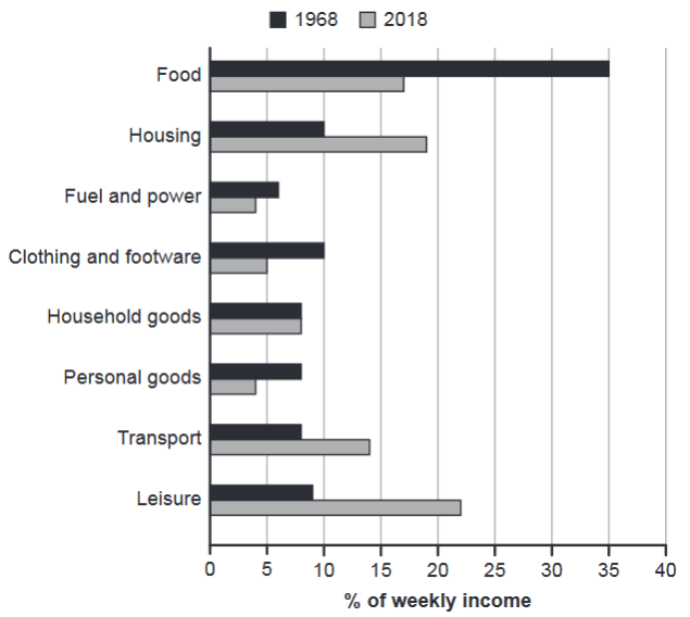
The chart below gives information about how families in one country spent their weekly income in 1968 and in 2018.
Summarise the information by selecting and reporting the main features, and make comparisons where relevant.
1968 and 2018: average weekly spending by families
Student answer (Band 6.0)
The bar chart illustrates the average weekly expenditure of families in a country across eight different categories in 1968 and 2018.
Overall, food accounted for largest proportion in 1968 while in 2018 families were spending their money to leisure activities. Spending on the food, fuel and power, clothing and footware along with the personal goods declined in 2018 while transport and housing incresed.
In 1968 families were spending their money on food 35% that is higher then the other categories. However this figure dropped to approximately 17% in 2018. In 1968 families were also spending more on clothing and footware category that is 10% of their weekly income but similarly it also declined to half the percentage (5%) in 2018. Personal goods were also higher in 1968 approximately 7% which fell to 4% in 2018.
In contrast housing furniture rose from 10% in 1968 to 19% in 18% in 2018. Leisure saw the most substantial increase reaching approximately 22% in 2018 compared with just 9% in 1968. Transport spending also increased from around 8% to 14%. Household good however, remains stable in both year approximately 8%.
AI examiner evaluation
| Criterion | Band |
|---|---|
| Task Achievement / Task Response | 6.5 |
| Coherence and Cohesion | 6.5 |
| Lexical Resource | 5.5 |
| Grammatical Range and Accuracy | 5.5 |
| Overall | 6.0 |
Task Achievement / Task Response: Band 6.5
You identify the main contrast clearly: food was the largest category in 1968, whereas leisure was highest in 2018, and you report several important rises and falls. Most figures are consistent with the chart, including food (35% to about 17%), leisure (9% to 22%), and transport (8% to 14%). The overview also groups the declining and increasing categories effectively. However, some details are less fully or accurately reported: housing is described as “housing furniture,” and the sentence gives a confusing figure of “19% in 18% in 2018.” Fuel and power is noted as declining in the overview but is not quantified or discussed later. Clarifying these details and covering the remaining categories more evenly would make the summary more complete.
Coherence and Cohesion: Band 6.5
The response has a clear overall structure: an introduction, a summary of the main trends, and paragraphs comparing decreases and increases. Contrast markers such as “However” and “In contrast” help readers follow the comparisons, and the information generally progresses logically. Some links and references are less controlled, though. For example, “similarly it also declined” is repetitive, while “this figure” and “it” require readers to infer which category is being discussed. The housing sentence is especially difficult to follow because the figures are repeated and the wording interrupts the comparison. Use clearer category-based references and make each sentence express one comparison cleanly; this would strengthen the progression and make cohesion less mechanical.
Lexical Resource: Band 5.5
You use relevant chart vocabulary, including “accounted for,” “proportion,” “declined,” “rose,” and “substantial increase,” which allows you to describe the main trends. However, several noticeable word-choice, collocation, and spelling problems limit precision. “Spending their money to leisure activities” is not a natural way to describe the data; “expenditure on leisure” would be more suitable. “Housing furniture” appears to confuse the category label, and “footware,” “incresed,” and “good” contain spelling or form errors. Repeated use of “spending” and “families were spending” also narrows the range. Aim for accurate category names and vary expressions such as “accounted for,” “represented,” and “the share allocated to.”
Grammatical Range and Accuracy: Band 5.5
You attempt a mix of simple and complex sentences, including a contrast with “while” and a comparison introduced by “compared with.” The main meaning is usually understandable, but some grammatical errors recur. Articles are missing in “accounted for largest proportion” and “on food 35%”; comparison forms are incorrect in “higher then”; and subject–verb agreement is faulty in “Household good … remains stable” and “families … was spending.” The housing sentence, “rose from 10% … to 19% in 18% in 2018,” also has a faulty structure that obscures the comparison. Check articles, agreement, and sentence construction, and proofread each figure sentence to ensure it has a clear subject and a correctly formed comparison.
See this exact question answered at other band scores. The same prompt compared across bands.
Browse more IELTS Writing model answers or get your own writing scored by the same AI examiner.