Band 4.5 IELTS Writing Task 1 Model Answer
Overall Band Score: 4.5 · Cambridge IELTS 17 · 2026-11-12
IELTS Writing Task 1 question
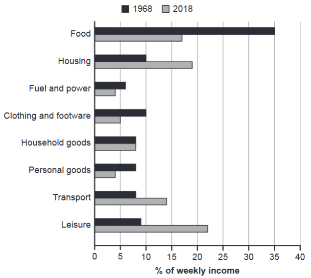
The chart below gives information about how families in one country spent their weekly income in 1968 and in 2018.
Summarise the information by selecting and reporting the main features, and make comparisons where relevant.
1968 and 2018: average weekly spending by families
Student answer (Band 4.5)
The chart illustrate how families in a country spend there weekly income in 1968 and 2018.
Food has highest ratio in spending money. People spend more weekly money on food because it is nessasory item for living. While fuel and power has least amount of ratio in spending money because it is not that much important for life.
Food has highest ratio in spending money weekly it is about 35% in 1968 and in 2018 it is about 20%. Household goods and peronal goods have almost same amount of ratio. Both has less then 10% in 1968 and in 2018 household has slightly above then 5% and less then 5% in personal goods. In housing the ratio is 10% in 1968 and almost 20% in 2018. The least ratio among all is fuel and power which is slightly higher then 5% in 1968 and in
AI examiner evaluation
| Criterion | Band |
|---|---|
| Task Achievement / Task Response | 4.0 |
| Coherence and Cohesion | 4.0 |
| Lexical Resource | 5.0 |
| Grammatical Range and Accuracy | 5.0 |
| Overall | 4.5 |
Task Achievement / Task Response: Band 4.0
You identify the chart’s subject and report several relevant figures, including food at about 35% in 1968 and housing rising from 10% to almost 20%. However, the response only partially covers the data: it ends mid-sentence while discussing fuel and power, and omits important comparisons such as leisure rising from 9% to 22% and transport from 8% to 14%. The overview is also limited and includes unsupported explanations about why people spend on food or fuel; Task 1 should describe the chart rather than speculate about causes. The response is five words below the required minimum. To develop the report, complete the comparison of both years across the main categories and give a concise overview of the largest changes.
Coherence and Cohesion: Band 4.0
There is some basic organisation: the opening introduces the chart, followed by comments on spending categories and figures. However, the ideas do not progress clearly from an overview to a systematic comparison, and the second and third paragraphs repeat the claim that food has the highest share. Linking is limited, with “While” introducing a fragment-like contrast, and the final sentence stops before completing the comparison. This makes the report feel unfinished and leaves relationships between categories unclear. Grouping the main increases together and the decreases or stable figures together, then using clear links such as “By contrast” and “Meanwhile,” would create a more coherent progression.
Lexical Resource: Band 5.0
You use a small set of relevant terms, including “weekly income,” “ratio,” “household goods,” and “fuel and power,” so the topic is generally understandable. However, vocabulary is repetitive and some choices are unnatural for describing a chart: “highest ratio in spending money” is repeated, while “amount of ratio” is not an appropriate collocation. There are also noticeable spelling errors, including “there,” “nessasory,” and “peronal,” which reduce accuracy. Use precise reporting language such as “accounted for,” “share,” and “proportion,” and vary the verbs used to describe changes. For example, “housing rose” and “food fell” are clearer and more concise than repeatedly referring to a “ratio.”
Grammatical Range and Accuracy: Band 5.0
The response relies mainly on simple sentence patterns, with a few attempts to connect ideas using “because” and “while.” Frequent errors affect accuracy, including subject–verb agreement in “The chart illustrate” and “Both has,” and incorrect comparative structures in “less then 10%” and “slightly above then 5%.” The sentence beginning “While fuel and power…” is not well integrated with the preceding sentence, and the final sentence is incomplete. These problems sometimes make the relationships between ideas difficult to follow. Practise accurate agreement and comparison forms, and use complete sentences—for example, “Fuel and power accounted for just over 5% in 1968, falling to 4% in 2018.”
See this exact question answered at other band scores. The same prompt compared across bands.
Browse more IELTS Writing model answers or get your own writing scored by the same AI examiner.