Band 5.0 IELTS Writing Task 1 Model Answer
Overall Band Score: 5.0 · Cambridge IELTS 17 · 2026-11-13
IELTS Writing Task 1 question
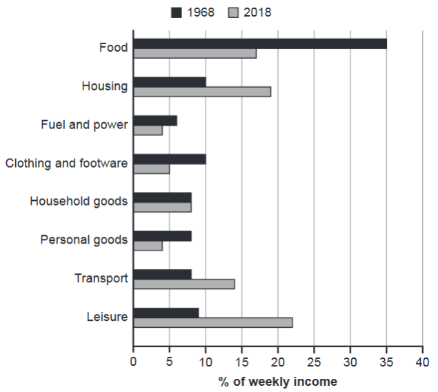
The chart below gives information about how families in one country spent their weekly income in 1968 and in 2018.
Summarise the information by selecting and reporting the main features, and make comparisons where relevant.
1968 and 2018: average weekly spending by families
Student answer (Band 5.0)
The given bar chart elucidates information about average of weekly spending by families in 1968 and 2018 . The chart compares the data in number or percentage . Overall it is clear that there are noticeable differences among the categories shown in the chart . According to the chart the first activity is food . In 1968 the average of food percentage is 35 and 2018 the weekly average of food is 17 % . The next part is housing . In 1968 the weekly average of housing is 10 % and 2018 the weekly average of housing is 19 % . In 1968 the fuel and power of weekly average is 6% and 2018 the weekly avetage of fuel and power is 4 % . In 1968 the clothing and footware the weekly average is 10% and 2018 the weekly average is 5% . In 1968 the weekly average of household goods is 8% and 2018 the average is 8% . In 1968 the weekly average of personal goods is 8% and 2018 the average is 4% . In 1918 the average of transport average is 8% and 2008 the average is 14% . In 1968 the weekly average of leisure is 9% and 2018 the weekly average of leisure is 23% . The chart compares the all categories shown in the chart .
AI examiner evaluation
| Criterion | Band |
|---|---|
| Task Achievement / Task Response | 4.5 |
| Coherence and Cohesion | 4.5 |
| Lexical Resource | 5.5 |
| Grammatical Range and Accuracy | 5.0 |
| Overall | 5.0 |
Task Achievement / Task Response: Band 4.5
You report figures for most categories and identify several genuine contrasts, such as food falling from 35% to 17% and housing rising from 10% to 19%. However, the response is mainly a list of category-by-category values rather than a clear summary of the main features. The overview, “there are noticeable differences,” is too general to identify the key pattern: food was the largest share in 1968, while leisure was largest in 2018, and spending shifted towards leisure, housing and transport. There are also factual errors: transport is described as “1918” and “2008,” and leisure in 2018 is about 22%, not 23%. Select and compare the most important changes, and ensure every figure is accurate.
Coherence and Cohesion: Band 4.5
The response follows a recognisable sequence through the chart categories, and repeated references to 1968 and 2018 help readers understand which period each figure belongs to. However, the information is presented as one long paragraph, with little distinction between an introduction, an overview and supporting details. Repeated sentence patterns such as “In 1968 the weekly average…” make the report feel like a list rather than a connected comparison. The opening and closing statements also repeat the broad idea that the chart compares categories without advancing the summary. Use separate paragraphs and group related changes—for example, categories that increased versus those that decreased—so the progression is clearer and linking feels less mechanical.
Lexical Resource: Band 5.5
You use relevant chart vocabulary, including “percentage,” “categories,” “housing,” and “fuel and power,” so the reader can generally follow the subject. However, the range is limited and several phrases are repetitive or imprecise, especially “weekly average” and “the next part.” Expressions such as “average of weekly spending” and “compares the data in number or percentage” are awkward for describing a chart of proportions. There are also spelling errors in “avetage” and “footware,” and “1918” appears where the category’s year should be 1968. Aim for concise, accurate reporting language and vary verbs such as “accounted for,” “rose,” “fell,” and “remained unchanged.”
Grammatical Range and Accuracy: Band 5.0
Most sentences use a basic subject–verb pattern, and the intended comparisons are usually understandable. However, the range of sentence structures is narrow, with repeated constructions such as “In 1968 the weekly average of…” and limited use of clauses to compare the two years. Several grammatical problems affect accuracy, including “the average of weekly spending,” “In 1968 the average of food percentage is 35,” and “The chart compares the all categories.” Tense and article use are also inconsistent. For example, describe the chart in the present (“the chart shows”) and report the figures with a consistent past form (“food accounted for 35%”). Practise combining paired figures into accurate comparative sentences and check articles and sentence punctuation.
See this exact question answered at other band scores. The same prompt compared across bands.
Browse more IELTS Writing model answers or get your own writing scored by the same AI examiner.