Band 5.5 IELTS Writing Task 1 Model Answer
Overall Band Score: 5.5 · Cambridge IELTS 17 · 2026-11-13
IELTS Writing Task 1 question
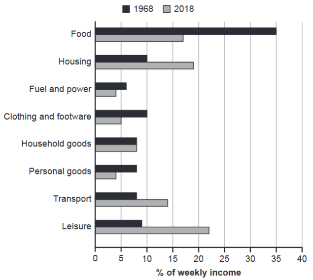
The chart below gives information about how families in one country spent their weekly income in 1968 and in 2018.
Summarise the information by selecting and reporting the main features, and make comparisons where relevant.
1968 and 2018: average weekly spending by families
Student answer (Band 5.5)
The bar graph compaires the average weekly spending on daily basics needs by families in 1968 and 2018
It is clearly seen that, food was the most where families send and least was fuel and power on 1968 but in 2018 leisure is most preferd to spend but for personal goods and fule, power was least prefed.
looking into the picture, it is clearly seen that food was the highest in 1968 to spend where 40% weekly income was used after that housing and colthing and footware is most preferd by 10% weekly income is used. leisure is in third by around 8% and tansport , household were in same but fuel and power was least around 6 % is spend.
On the other hand, in 2018 leisure was in top by around 23% and food was in 17% by making housing in second place by 19% of weeekly income to spend. Transport was in fourth place by 14% and household goods around 7% and others like fuel and power and personal goods were below 5%.
AI examiner evaluation
| Criterion | Band |
|---|---|
| Task Achievement / Task Response | 6.0 |
| Coherence and Cohesion | 5.5 |
| Lexical Resource | 5.0 |
| Grammatical Range and Accuracy | 5.0 |
| Overall | 5.5 |
Task Achievement / Task Response: Band 6.0
You identify the main contrast: food takes the largest share in 1968, while leisure leads in 2018, and you note housing and transport as important 2018 categories. Several comparisons are relevant, but some figures and rankings are inaccurate. Food was about 35% in 1968, not 40%; leisure was about 9%, rather than 8%, and transport, household goods and personal goods were each about 8%, not transport and household goods alone. In 2018, household goods remained around 8%, while fuel and personal goods were about 4% each. The overview is present, but the response would be stronger with a clearer summary of the broad shifts, such as the fall in food spending and rise in leisure, housing and transport, supported by more precise figures.
Coherence and Cohesion: Band 5.5
The response has a recognisable structure: an introduction, a brief overview, and separate descriptions of the two years. The transition “On the other hand” also helps signal the comparison. However, progression within the detail paragraphs is uneven, and some links are mechanical or unclear. For example, “after that housing and clothing and footware” does not clearly explain how these categories compare, while the final sentence groups several categories together without a consistent order. Repeated openings such as “it is clearly seen” add little cohesion. Organise each year’s figures from highest to lowest, and use concise comparison phrases such as “by contrast” or “whereas” only where they clarify a relationship.
Lexical Resource: Band 5.0
You use relevant chart vocabulary, including “weekly income,” “highest,” “least,” and “in second place,” so the reader can generally understand the categories and comparisons. However, the range is limited and several word-choice, collocation and spelling problems make the description less precise. Phrases such as “daily basics needs,” “families send,” and “most preferd to spend” are not natural ways to describe expenditure. There are also repeated spelling errors, including “compaires,” “colthing,” “tansport,” and “weeekly.” Aim for accurate, neutral reporting language rather than describing categories as preferences. Learning a few reliable phrases for proportions and rankings will make the account clearer and more appropriate for an academic chart summary.
Grammatical Range and Accuracy: Band 5.0
You attempt both simple statements and longer sentences, and the reader can usually follow the intended comparisons. However, sentence control is inconsistent, particularly in longer constructions. For example, “It is clearly seen that, food was the most where families send” has an incomplete and confusing structure, while “housing and colthing and footware is most preferd” has a subject–verb agreement problem. Missing or misplaced articles and punctuation also affect clarity, as in “food was in 17% by making housing in second place.” Use direct sentence patterns such as “Food accounted for 35% of weekly spending in 1968.” Then add a controlled comparison, for example, “By 2018, this figure had fallen to 17%, whereas leisure had risen to 22%.”
See this exact question answered at other band scores. The same prompt compared across bands.
Browse more IELTS Writing model answers or get your own writing scored by the same AI examiner.