Band 6.0 IELTS Writing Task 1 Model Answer
Overall Band Score: 6.0 · Cambridge IELTS 17 · 2026-11-13
IELTS Writing Task 1 question
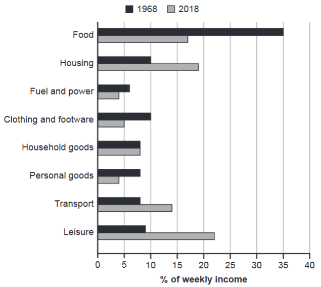
The chart below gives information about how families in one country spent their weekly income in 1968 and in 2018.
Summarise the information by selecting and reporting the main features, and make comparisons where relevant.
1968 and 2018: average weekly spending by families
Student answer (Band 6.0)
The chart illustrates the information about the households that how much salary they spent in 1968 and between 2018.
Overall, in 1968, mostly individual spent their weekly salary on food than comapre to all other catagories.The percentage of the people who spent their money on leisure is considerbly higher across other expenses.The figure of food, fuel,clothing and personal good declined in 2018 while housing, transport and leisure increased by 2018.
The percentage of food in 1968, peaked at 35 percent but fell down in 2018 to around 17 percent .The individuals spent their money fuel and power by approximately 7 percent but a slight decrease in 2018 for 4 percent .In 2018, the catagory of clothing and goods for personal use was also decreased than compare to 1968.
The percentge of housing was 10 percent in 1968 while there was a significant growth in 2018 of approximately 8 percent .People spent more money on transport in 2018 than in 1968 .The most dramatic change was in the percentage of leisure because people spent their income in 2018, which was as double then as in 1968.
AI examiner evaluation
| Criterion | Band |
|---|---|
| Task Achievement / Task Response | 6.5 |
| Coherence and Cohesion | 6.0 |
| Lexical Resource | 5.5 |
| Grammatical Range and Accuracy | 5.0 |
| Overall | 6.0 |
Task Achievement / Task Response: Band 6.5
You identify the main overall shift: food spending fell substantially, while housing, transport and leisure took larger shares in 2018. You also report the key food figures accurately and recognise leisure as a major change. This gives the response a clear, relevant overview. However, some comparisons are incomplete or imprecise: clothing and personal goods are grouped together without figures, household goods (unchanged at about 8%) are omitted, and the claim that leisure was “as double” is not exact (9% rose to 22%). The housing increase is described as “approximately 8 percent,” which could be clearer as a rise from 10% to 19%. More precise coverage of the remaining categories would make the summary more fully developed.
Coherence and Cohesion: Band 6.0
The response has a recognisable structure: an introduction, an overview and two paragraphs of details. The overview usefully groups categories by whether their shares rose or fell, and the later paragraphs generally move from food and fuel to other spending areas. However, progression within the detail paragraphs is not always clear, and several comparisons are left vague, such as “the category of clothing and goods for personal use was also decreased.” Linking phrases such as “while” and “because” are used, but some connections are awkward or do not clearly express the intended comparison. Organise the figures into clearer groups—for example, declining categories and rising or stable categories—and use explicit year-to-year comparisons to strengthen cohesion.
Lexical Resource: Band 5.5
You use relevant chart vocabulary, including “percentage,” “declined,” “increased,” “peaked” and “significant growth,” so the main trends are usually understandable. However, word choice and collocation are often inaccurate or repetitive: “spent their weekly salary,” “the percentage of the people,” and “the percentage of leisure” are less natural ways to describe shares of household income. There are also noticeable spelling errors, including “comapre,” “catagories,” “considerbly” and “percentge.” These do not prevent the reader from understanding the general message, but they reduce precision and fluency. Practise standard phrases for describing proportions and check spelling carefully before submitting.
Grammatical Range and Accuracy: Band 5.0
You attempt both simple and more complex sentences, including comparisons with “while” and a relative clause in “because people spent their income in 2018.” However, grammatical control is inconsistent, and errors sometimes make relationships between figures unclear. For example, “the households that how much salary they spent” has a faulty clause structure, while “the figure … was … higher across other expenses” lacks a clear comparison. There are also problems with articles, agreement and verb forms, as in “mostly individual spent” and “was also decreased.” Sentence boundaries and spacing around punctuation need attention too. Build accuracy by using reliable patterns such as “spending on X rose from … to …” and checking each sentence for a clear subject and verb.
See this exact question answered at other band scores. The same prompt compared across bands.
Browse more IELTS Writing model answers or get your own writing scored by the same AI examiner.