Band 6.0 IELTS Writing Task 1 Model Answer
Overall Band Score: 6.0 · Cambridge IELTS 17 · 2026-11-13
IELTS Writing Task 1 question
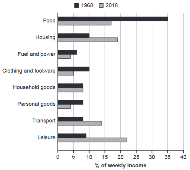
The chart below gives information about how families in one country spent their weekly income in 1968 and in 2018.
Summarise the information by selecting and reporting the main features, and make comparisons where relevant.
1968 and 2018: average weekly spending by families
Student answer (Band 6.0)
The bar chart presents information about spending weekly income by families in two different years (1968 and 2018). The figures are given as a percentages.
Overall, spending money on food was highest in 1968, while in 2018 people spent their income mostly on leisure. Meanwhile in both years, they less spent money on fuel and power. Furthermore in 2018, families least spent least money personal goods.
Initially, in 1968, families spent 35% of their weekly income on food while this figure decreased to approximately 22% in 2018. However, spending money on housing were 10% in 1968, and then the figure rose toalmost 20% in 2018.
On the other hand, people spent money on fuel and power, household goods, and personal goods were around 5% to 10% in both years respectively. Furthermore, clothing and footwear were 10% in 1968 and reduced to 5% in 2018. In contrast, families spent money on transport was above 5% in 1968, and grew to approximately 15% in 2018. Lastly, families spent their weekly income on leisure was almost 10% in 1968, while in 2018, it rose to above 20%.
AI examiner evaluation
| Criterion | Band |
|---|---|
| Task Achievement / Task Response | 6.5 |
| Coherence and Cohesion | 6.5 |
| Lexical Resource | 6.0 |
| Grammatical Range and Accuracy | 5.5 |
| Overall | 6.0 |
Task Achievement / Task Response: Band 6.5
You identify the main shift clearly: food was the largest category in 1968, while leisure was largest in 2018, and you note the rise in housing and transport. Most figures are broadly accurate, including food at 35% and housing rising from 10% to almost 20%. However, the food figure for 2018 is misreported as approximately 22%; the chart shows about 17%, while leisure is about 22%. The overview also says fuel and power was the lowest in both years, but in 2018 personal goods and fuel and power are tied at about 4%, and clothing is higher at 5%. The response covers the chart, but some comparisons and key details need more precise reporting to make the summary fully clear.
Coherence and Cohesion: Band 6.5
The response has a recognisable structure: an introduction, an overview, and two paragraphs describing the figures. Its progression from the main categories to the remaining categories is generally easy to follow, and contrast markers such as “However,” “On the other hand,” and “In contrast” help signal comparisons. At times, though, these links feel mechanical or do not express the relationship precisely; for example, “On the other hand” introduces a list of categories rather than a clear opposing point. The overview’s final statements also overlap and are difficult to follow. Grouping the categories more deliberately—for example, major rises and falls in one paragraph, then smaller changes in another—and using clearer references would strengthen cohesion.
Lexical Resource: Band 6.0
You use an adequate range of task-related vocabulary, including “decreased,” “rose,” “reduced,” and “approximately,” which helps describe changes. However, several phrases are repetitive or imprecise, particularly repeated forms of “spent money on” and “spent their weekly income on.” Some collocations are awkward, such as “people spent their income mostly on leisure,” where “allocated the largest share to leisure” would be more natural. There are also word-form and spelling issues, including “as a percentages” and “footwear” (the chart label is “footwear,” though the response also uses “footware” in the task wording context). More precise terms for proportions and changes would improve flexibility and accuracy without requiring overly complex vocabulary.
Grammatical Range and Accuracy: Band 5.5
You attempt a mix of simple and complex sentences, including comparisons with “while” and “whereas”-type contrast structures, and the main meaning is usually understandable. However, some grammatical errors recur. For example, “The figures are given as a percentages” has an article and plural mismatch, while “spending money on housing were 10%” has subject–verb agreement problems. The construction “families spent money on transport was above 5%” also combines sentence patterns incorrectly, and “they less spent money” has an incorrect word order. These errors make some sentences awkward, even though the overall message remains clear. Practise building comparisons with a consistent subject and verb, such as “spending on housing stood at 10% and then rose to…”.
See this exact question answered at other band scores. The same prompt compared across bands.
Browse more IELTS Writing model answers or get your own writing scored by the same AI examiner.