Band 4.5 IELTS Writing Task 1 Model Answer
Overall Band Score: 4.5 · Cambridge IELTS 17 · 2026-11-13
IELTS Writing Task 1 question
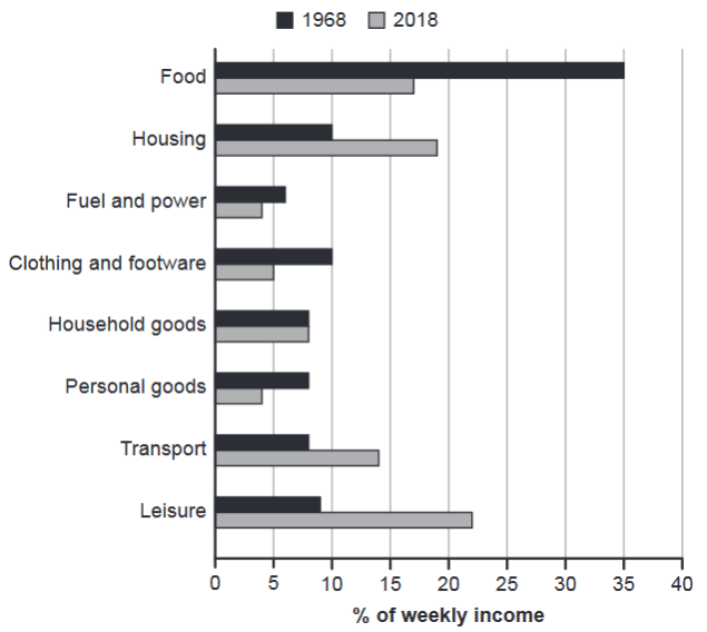
The chart below gives information about how families in one country spent their weekly income in 1968 and in 2018.
Summarise the information by selecting and reporting the main features, and make comparisons where relevant.
1968 and 2018: average weekly spending by families
Student answer (Band 4.5)
The bar graph illustrates the information about families that spent their weekly income in different years. The major features represented in the bar graph includes food,housing, fuel, power, household and personal goods.
The families in the respective country were spending more than 50% of their income on food resources in 1968 whereas in 2018 the percentage has reduced greatly. Back in 1968 the amount spend from the income on housing was immensly less than the income spend on housing.
The money from the income used for fuel and power in 1986 and 2018 and comparatively similar. in 1986 the part of the income spend on clothing and footware was slightly more than the amount spend in 2018, showing the improvement in resources.
The weekly income spend by the families on the household good in 1986 and 2018 in exactly the same The money spend on personal goodsin 1986 was huge as compared to 2018. The amount from the income spend on transport has been increased more than as compared to income spend in 1986, showing the great difference in both transport wise.The comparison between both the years represent the difference in priorites.
AI examiner evaluation
| Criterion | Band |
|---|---|
| Task Achievement / Task Response | 4.0 |
| Coherence and Cohesion | 4.5 |
| Lexical Resource | 5.0 |
| Grammatical Range and Accuracy | 5.0 |
| Overall | 4.5 |
Task Achievement / Task Response: Band 4.0
The response identifies several relevant categories and attempts comparisons between the two years, including food, housing, fuel and power, clothing, household goods, personal goods and transport. However, the account is only minimally informative because key figures and trends are inaccurate or unclear. Food spending was about 35% in 1968, not “more than 50%”; housing rose from about 10% to 19%, but the comparison is expressed unclearly; and leisure, the largest category in 2018 at about 22%, is omitted. The years are also repeatedly given as 1986 rather than 1968, and the overview does not accurately summarise the main changes. Report the largest categories and the clearest rises and falls, using the chart’s actual years and approximate values.
Coherence and Cohesion: Band 4.5
There is some organisation by category, and phrases such as “whereas” and “as compared to” show an attempt to connect comparisons. However, the response lacks a clear overall progression: it begins with a vague introduction, moves through individual categories without a distinct overview, and ends with a general statement about “priorites.” Several sentences run together or have unclear links, particularly the passage beginning “The weekly income spend by the families on the household good.” The repeated use of “in 1986 and 2018” also makes the comparisons difficult to follow. Grouping the main decreases together and the increases or stable figures together, with clear paragraph breaks and accurate references, would make the information easier to understand.
Lexical Resource: Band 5.0
The response uses some task-relevant vocabulary, including “percentage,” “income,” “housing,” “transport” and “comparison,” so the topic is generally recognisable. However, the range is limited and several expressions are repetitive or imprecise, such as “money from the income,” “amount spend” and “great difference.” Some word choices also create misleading interpretations: “showing the improvement in resources” is not supported by the clothing figures, and “huge” is too informal and vague for a chart description. Spelling errors such as “immensly,” “footware” and “priorites,” along with missing spaces in “goodsin,” reduce accuracy. Use precise terms such as “share,” “proportion,” “rose,” “fell” and “remained unchanged” to describe the data.
Grammatical Range and Accuracy: Band 5.0
The response attempts both simple and longer comparative sentences, for example, “The money from the income used for fuel and power…” and “The amount from the income spend on transport…”. However, the range is limited, and frequent errors in verb forms, agreement, sentence boundaries and punctuation make several statements difficult to interpret. Examples include “families that spent their weekly income,” “the major features … includes,” and “The weekly income spend … in exactly the same,” which is also left without a full stop. The sentence beginning “The money from the income used…” lacks a clear main verb, while the shift to “in 1986” further obscures meaning. Practise complete, direct comparison structures, such as “Spending on housing rose from 10% to 19%.”
See this exact question answered at other band scores. The same prompt compared across bands.
Browse more IELTS Writing model answers or get your own writing scored by the same AI examiner.