Band 5.5 IELTS Writing Task 1 Model Answer
Overall Band Score: 5.5 · Cambridge IELTS 17 · 2026-11-14
IELTS Writing Task 1 question
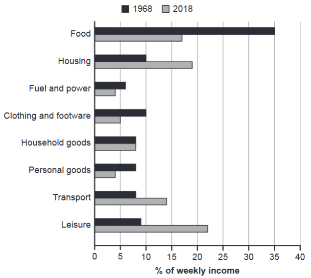
The chart below gives information about how families in one country spent their weekly income in 1968 and in 2018.
Summarise the information by selecting and reporting the main features, and make comparisons where relevant.
1968 and 2018: average weekly spending by families
Student answer (Band 5.5)
The given bar chart illustrates the information that how families in one country consume their weekly income in the year 1968 and 2018.The weekly salary was spent on eight categories such as food,housing, fuel and power,clothing and footware,household ,personal goods,transport and leisure.The weekly income is calculated in the percentage form.
Overall, In 1968 families spend most of their wages on food but least on fuel and power. Meanwhile,In 2018 families spend highest income on Leisure while lowest on fuel and power as well as on personal goods.
In 1968, the weekly salary spent on food was 35% while approximately 7% on fuel and power.10% on clothing and footware,housing was equal.However, income spent on Leisure was 9%.Moreover on household,personal goods and transport remains same that is almost 8%.
In 2018, the majority wages almost 23% spend on leisure time while 4% on fuel power and personal goods.19,17 and 14 % on housing,food and transport while income spent on household,clothing and footware was 8% and 5
AI examiner evaluation
| Criterion | Band |
|---|---|
| Task Achievement / Task Response | 6.0 |
| Coherence and Cohesion | 6.0 |
| Lexical Resource | 5.5 |
| Grammatical Range and Accuracy | 5.0 |
| Overall | 5.5 |
Task Achievement / Task Response: Band 6.0
You identify the chart’s main contrast: food was the largest spending category in 1968, whereas leisure was highest in 2018, and fuel and power was among the lowest in both years. Several figures are also reported accurately, including 35% for food in 1968 and 19% for housing in 2018. However, some details are unclear or inaccurate: fuel and power is about 6%, not 7%, in 1968, and the 2018 figures are presented in a compressed, incomplete sentence. The overview also says personal goods was tied for the lowest in 2018, but does not clearly compare the substantial shifts in food, housing and leisure. A clearer summary of these changes, with precise category-to-value links, would make the response more complete.
Coherence and Cohesion: Band 6.0
The response has a recognisable structure: an introduction, an overview, and separate paragraphs for each year. This gives the reader a basic route through the information, and transitions such as “Overall,” “Meanwhile,” and “In 2018” help signal the stages. However, cohesion is sometimes mechanical, and several details are crowded together rather than developed in clear sentences. For example, “10% on clothing and footware, housing was equal” leaves the relationship between the figures unclear, while the final sentence lists several percentages without consistently attaching each one to a category. The response also ends abruptly. Use complete, parallel comparisons and clearer links between categories to improve progression and make the data easier to follow.
Lexical Resource: Band 5.5
You use relevant chart vocabulary, including “bar chart,” “categories,” “percentage,” and “majority,” so the topic is generally clear. However, some word choices and collocations are imprecise: “consume their weekly income” and “weekly salary” do not naturally describe household expenditure, and “leisure time” refers to time rather than the spending category. There are also spelling and form issues, such as “footware,” and repeated use of “spend” and “income spent.” These choices make parts of the report less precise, although the intended meaning is usually recoverable. Build a more accurate range around expenditure, proportions and changes, and check category names carefully.
Grammatical Range and Accuracy: Band 5.0
The response attempts both simple statements and longer sentences, and the main comparisons can usually be understood. However, grammatical control is uneven. The opening phrase “illustrates the information that how” has an incorrect clause structure, and “In 1968 families spend” uses the wrong tense for past data. Several fragments appear in the data paragraphs, including “10% on clothing and footware, housing was equal” and “Moreover on household…”; these need complete clauses with clear subjects and verbs. Punctuation and spacing are also inconsistent, particularly around commas and full stops. Practise forming complete comparative sentences and maintaining past-tense reporting; this will make the range of structures more effective and reduce errors that currently interrupt the flow.
See this exact question answered at other band scores. The same prompt compared across bands.
Browse more IELTS Writing model answers or get your own writing scored by the same AI examiner.