Band 5.5 IELTS Writing Task 1 Model Answer
Overall Band Score: 5.5 · Cambridge IELTS 17 · 2026-11-14
IELTS Writing Task 1 question
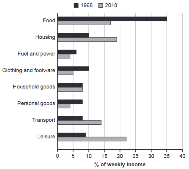
The chart below gives information about how families in one country spent their weekly income in 1968 and in 2018.
Summarise the information by selecting and reporting the main features, and make comparisons where relevant.
1968 and 2018: average weekly spending by families
Student answer (Band 5.5)
The bar graph depicts the budgeting of total salaries of the families in a country that they spare to meet the need of various items in 1968 and 2018.
Overall these expenses include food,housing,energy sources,clothing,footware,household items and personal goods.
According to the illustration,food contributed a significant proportion of 35% income expenditure per week in 1968 .On the other hand ,19% income was spared by the people for food in 2018 .And a least proportion of salaries of roughly 6% were spared for energy sources in 1968.In contrast to this citizens spent maximum income of approximately 22% on recreational activities in 2018 and roughly 4% income was spent on energy sources in 2018 .A similar trend was exhibited by the people expenses regarding personal goods in 2018.Housing finances also contributed a major proportion of roughly 18% in 2018.The household goods expenses have shown a similar proportion of 8% in both 1968 and 2018.
AI examiner evaluation
| Criterion | Band |
|---|---|
| Task Achievement / Task Response | 5.0 |
| Coherence and Cohesion | 5.5 |
| Lexical Resource | 5.5 |
| Grammatical Range and Accuracy | 5.5 |
| Overall | 5.5 |
Task Achievement / Task Response: Band 5.0
You identify several relevant figures, including food at 35% in 1968, leisure at about 22% in 2018, and household goods at 8% in both years. However, the response only partly summarises the chart: it gives no clear overview of the main changes, and some figures are inaccurate. Food in 2018 was 17%, not 19%; housing was 19%, rather than roughly 18%. The opening also says the chart shows how families budget “total salaries,” although it reports shares of weekly income. Important comparisons, such as the fall in food spending and the rise in transport and leisure, are not clearly developed. Select the largest changes and state them accurately in a concise overview before supporting them with figures.
Coherence and Cohesion: Band 5.5
The response has a recognisable sequence: it introduces the chart, gives a broad statement, and then reports selected figures. Linking expressions such as “On the other hand” and “In contrast” show an attempt to connect comparisons. However, the overview does not clearly guide the reader, and most details are crowded into one long paragraph, so the progression between categories is difficult to follow. Some links are also unclear: “A similar trend” does not specify what personal-goods spending is similar to, and the response omits a clear comparison of the two years for several categories. Group the information into an introduction, an overview, and focused detail paragraphs, using comparisons that explicitly name both categories or years.
Lexical Resource: Band 5.5
You use some relevant chart vocabulary, including “proportion,” “contributed,” and “approximately,” and the reader can generally understand the categories being discussed. However, several expressions are imprecise or unnatural for describing expenditure: “budgeting of total salaries,” “spare to meet the need,” and “housing finances” do not accurately convey the chart’s meaning. “Energy sources” is also less precise than the chart label “fuel and power,” while “recreational activities” is a broad substitute for leisure. Spelling and presentation are inconsistent, including “footware” and missing spaces after commas. Prefer standard reporting phrases such as “accounted for,” “spent on,” and “share of weekly income,” and use the chart’s category labels consistently.
Grammatical Range and Accuracy: Band 5.5
You attempt some complex sentence forms, including contrasts introduced by “On the other hand” and “In contrast,” and the main message is usually recoverable. However, control is uneven in longer sentences, particularly where several figures and clauses are joined with full stops and “and.” For example, “And a least proportion of salaries of roughly 6% were spared” has an awkward sentence opening and an unclear grammatical construction; “food contributed a significant proportion of 35% income expenditure” also lacks a clear relationship between the percentage and income. Punctuation spacing is inconsistent, and the long sequence of details makes sentence boundaries hard to follow. Use shorter, complete sentences and check articles, clause structure, and punctuation when reporting each comparison.
See this exact question answered at other band scores. The same prompt compared across bands.
Browse more IELTS Writing model answers or get your own writing scored by the same AI examiner.