Band 6.5 IELTS Writing Task 1 Model Answer
Overall Band Score: 6.5 · Cambridge IELTS 17 · 2026-11-15
IELTS Writing Task 1 question
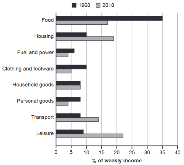
The chart below gives information about how families in one country spent their weekly income in 1968 and in 2018.
Summarise the information by selecting and reporting the main features, and make comparisons where relevant.
1968 and 2018: average weekly spending by families
Student answer (Band 6.5)
The bar graph illustrates that how family spent there weekly income on different things like food, housing, fuel and power, clothing and footware, transport, personal goods and liesure between 1968 and 2018.
Overall, it shows that families spent more on the food, fuel and power, clothing and footware and personal goods in 1968 as compared to 2018. And they spent less on the housing, transport and liesure in 1968 as compared to 2018, while the expenditure for household goods is same in both the intervals.
Families spent approximately 35%, 6%, 10%, and 8% on food, fuel and power, clothing and footware and personal goods in 1968 respectively, while they spent 17%, 4%, 5% and 4% on same needs in 2018 respectively. Furthermore their weekly income used for housing, transport and leisure is 10%, 8% and 9% respectively in 1968, while they spent on same things with percentage values of 19%,14% and 22% respectively in 2018. To sum up, families mostly spent on food in 1968 and on leisure in 2018.
AI examiner evaluation
| Criterion | Band |
|---|---|
| Task Achievement / Task Response | 7.5 |
| Coherence and Cohesion | 6.5 |
| Lexical Resource | 6.0 |
| Grammatical Range and Accuracy | 5.5 |
| Overall | 6.5 |
Task Achievement / Task Response: Band 7.5
The response identifies the main shifts accurately: food, fuel, clothing and personal goods took a smaller share in 2018, while housing, transport and leisure took more, and household goods remained unchanged. The overview also highlights the largest category in each year, with food leading in 1968 and leisure in 2018. Most figures are reported correctly, including the substantial change in food spending and the rise in leisure. This gives the account a clear, relevant summary of the chart. To make the reporting more fully developed, explicitly compare the unchanged household-goods figure of 8% in both years in the detail paragraph, and use more precise comparative language to emphasise the scale of the main changes rather than mainly listing figures.
Coherence and Cohesion: Band 6.5
The response has a clear four-part structure: introduction, overview, detailed comparisons, and a brief concluding summary. Information is grouped sensibly, and phrases such as “while” and “as compared to” help signal contrasts between the years. The overview gives the reader a useful guide to the main trends before the figures are presented. However, some linking is mechanical or repetitive, particularly the repeated “while” and “respectively,” and the final “To sum up” largely repeats the overview rather than adding a new comparison. The reference to “same needs” is also not fully precise. For stronger progression, organise the details into clearer groups and vary the linking and referencing so the relationships between categories are easier to follow.
Lexical Resource: Band 6.0
The vocabulary is adequate for describing the chart, with relevant terms such as “weekly income,” “expenditure,” “percentage values,” and “approximately.” The response also uses comparison language to describe increases and decreases, so the main information remains clear. However, the range is somewhat repetitive: “spent” and “same” recur, and phrases such as “spent on same things” are imprecise for formal data reporting. There are also spelling errors in “there,” “footware,” and “liesure,” and “bar graph illustrates that how” is an awkward word choice and construction. Use accurate category names and more varied reporting verbs, such as “accounted for,” “rose,” or “fell,” to improve precision and formality.
Grammatical Range and Accuracy: Band 5.5
The response attempts a mix of sentence forms, including a complex overview with “while” and longer sentences that compare the two years. These structures generally communicate the intended trends, and the reader can follow the figures. However, grammatical control is uneven. The opening clause, “illustrates that how family spent,” has an incorrect clause pattern and lacks an article; “families spent more on the food” also uses an unnecessary article. In “their weekly income used for housing,” the verb structure is incomplete, and “the expenditure … is” shifts to the present tense despite describing past data. The long detail sentences also rely heavily on lists and “respectively.” Practise accurate past-tense reporting and complete clause structures, while retaining some complex comparisons.
See this exact question answered at other band scores. The same prompt compared across bands.
Browse more IELTS Writing model answers or get your own writing scored by the same AI examiner.