Band 5.5 IELTS Writing Task 1 Model Answer
Overall Band Score: 5.5 · Cambridge IELTS 17 · 2026-11-16
IELTS Writing Task 1 question
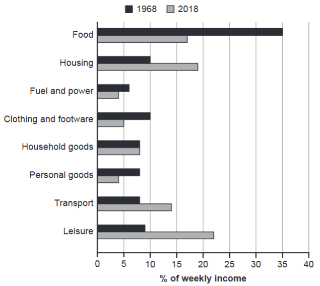
The chart below gives information about how families in one country spent their weekly income in 1968 and in 2018.
Summarise the information by selecting and reporting the main features, and make comparisons where relevant.
1968 and 2018: average weekly spending by families
Student answer (Band 5.5)
The given chart illustrates information about how families in one country spent their weekly fund between 1968 and 2018, while eight activities are shown in the graph.
Overall, activities name including food, housing, fuel and power, clothing and footware, household goods, personal goods, transport and leisure. High income used in food activity, in contrast the leisure catedories is used low income in weekly plan.High percentage used in food and lower percentage used in leisure activities.
Firstly, food percentage is 35% in 1968 and 17% in 2018, in contrast the leisure 8% and 23% with the timeframe of 1968 to 2018. then the other category is transport families spent income 8% and 18% with the timeframe of 1968 to 2018, while the personal goods is 4% and 8% in the period of 1968 and 2018.
Secondly, housing ratio is 10% and 18% in the period of 1968 to 2018, whereas, then the other activity is clothing and footware and the proportion is 5% and 9% and last category is household goods and the ration is similar and the percentage was 9% in the period of 1968 to 2018.
AI examiner evaluation
| Criterion | Band |
|---|---|
| Task Achievement / Task Response | 5.5 |
| Coherence and Cohesion | 5.5 |
| Lexical Resource | 5.0 |
| Grammatical Range and Accuracy | 5.0 |
| Overall | 5.5 |
Task Achievement / Task Response: Band 5.5
You identify the chart’s subject and report several relevant categories, including the substantial fall in food spending from 35% to 17% and the rise in leisure spending. However, the overview is unclear and internally contradictory: it says leisure was the lowest category, then claims food was highest and leisure lowest, although leisure was the largest share in 2018. Several figures are also inaccurate: leisure is about 9% rather than 8% in 1968 and 22% rather than 23% in 2018; transport is 14%, not 18%, in 2018; personal goods are 8% then 4%, not 4% then 8%; and clothing is 10% then 5%. A clearer overview and more accurate comparisons are needed.
Coherence and Cohesion: Band 5.5
The response has a basic paragraph structure, with an introduction, an overview, and two body paragraphs, and the labels “Firstly” and “Secondly” signal an attempt to organise details. However, progression is difficult to follow because the overview repeats or contradicts itself, and the body paragraphs group figures without a clear comparison pattern. Linking phrases such as “in contrast” and “whereas, then” are sometimes awkward or do not clearly connect the information. The final sentence also combines clothing and household goods in a confusing way. Organise the categories into meaningful groups, use one clear overview, and connect each comparison directly to the relevant year and category.
Lexical Resource: Band 5.0
You use relevant chart vocabulary such as “percentage,” “proportion,” “category,” and “spent,” so the reader can generally recognise the topic and intended comparisons. However, the range is limited and several choices are inaccurate or unnatural, including “weekly fund,” “activities” for spending categories, “leisure catedories,” and “housing ratio.” There are also spelling errors in “footware,” “catedories,” and “ration,” which reduce precision. Use standard terms such as “share of weekly income,” “spending category,” and “accounted for.” Check spelling carefully and avoid calling the categories activities, since the chart reports household expenditure rather than participation in activities.
Grammatical Range and Accuracy: Band 5.0
You attempt both simple statements and longer comparisons, for example, “Food percentage is 35% in 1968 and 17% in 2018,” and a sentence beginning “while the personal goods…”. However, the longer constructions are often faulty or incomplete, and sentence boundaries and punctuation are inconsistent. The overview contains a fragment-like list (“Overall, activities name including…”), while “High income used in food activity” lacks a clear grammatical relationship between the subject and verb. Tense and article use are also uneven. Build comparisons with a reliable pattern, such as “Spending on food fell from… to…,” and use complete sentences with clear subjects and verbs. This will make the data easier to understand.
See this exact question answered at other band scores. The same prompt compared across bands.
Browse more IELTS Writing model answers or get your own writing scored by the same AI examiner.