Band 5.5 IELTS Writing Task 1 Model Answer
Overall Band Score: 5.5 · Cambridge IELTS 17 · 2026-11-16
IELTS Writing Task 1 question
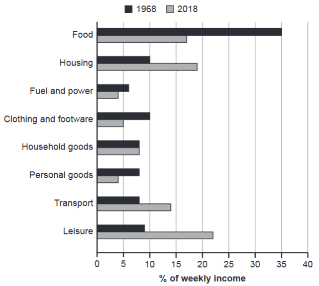
The chart below gives information about how families in one country spent their weekly income in 1968 and in 2018.
Summarise the information by selecting and reporting the main features, and make comparisons where relevant.
1968 and 2018: average weekly spending by families
Student answer (Band 5.5)
The bar chart represents the average weekly expenditure of families in different six categories in 1968 and 2018.
Overall, the families in 1968 spend maximum amount of their earning in food where as the families spend around more in leisue in 2018. Money spend over household goods stay equal in both period of time.
The figures illustrates that in 2018 the families spend around 35% of the weekly income in food where as families spend only around 17% of their weekly income in food. But the pattern differs in case of housing. Here, the families of 1968 spend only 10% of their incomre in housing but the families of 2018 spends around 18% of their weekly income. During both period of time families spend minimum on fuel and power. They used to spend around 7% and 4% of there weekly income.Families of 1968 they used to spend around 10% of their income in clothing and footware where as the families of 2018, they spem only 5% of their weekly income.Families used to spend minimum on household and personal goods. They have equal expenditure of 7.5% in household whereas in 1968 they spend around 7.5% in transport and in 2018 around 18% of the income was spend on transport.
AI examiner evaluation
| Criterion | Band |
|---|---|
| Task Achievement / Task Response | 5.5 |
| Coherence and Cohesion | 5.0 |
| Lexical Resource | 5.5 |
| Grammatical Range and Accuracy | 5.0 |
| Overall | 5.5 |
Task Achievement / Task Response: Band 5.5
You identify several important comparisons, including the sharp fall in food spending, the rise in housing, and the unchanged household-goods figure. However, the overview is incomplete: it does not clearly summarise the main shifts across the chart, such as leisure becoming the largest category in 2018 and food being the largest in 1968. There is also a significant reversal in the food figures: you say 2018 was about 35% and then assign about 17% to the other year, whereas the chart shows 35% in 1968 and 17% in 2018. Transport is also reported as about 18% in 2018, rather than approximately 14%. Several categories are omitted or grouped unclearly, so the key features are only partly covered.
Coherence and Cohesion: Band 5.0
The response has a basic overall structure, with an opening, an overview, and a paragraph of comparisons. Some linking expressions, such as “Overall,” “But,” and “whereas,” help show relationships between figures. However, progression within the main paragraph is difficult to follow: categories are introduced in a long sequence, and the final sentences combine household goods, personal goods, and transport without a clear comparison pattern. The repeated “families spend” construction also makes the account feel list-like. Grouping the largest changes together, then covering the remaining categories in a separate sentence or paragraph, would create clearer progression. Use references such as “this figure” only when their meaning is unmistakable.
Lexical Resource: Band 5.5
You use relevant chart vocabulary, including “weekly income,” “expenditure,” and “spend,” and the reader can generally understand which categories you are discussing. However, the range is limited and several word-choice, collocation, and spelling errors reduce precision. For example, “spend maximum amount of their earning” is not a natural way to describe the largest share, while “Money spend over household goods stay equal” is difficult to interpret. There are also misspellings such as “leisue,” “incomre,” “footware,” and “spem.” Aim to use a consistent set of accurate reporting phrases, such as “accounted for,” “the proportion allocated to,” and “rose/fell,” and check spelling carefully.
Grammatical Range and Accuracy: Band 5.0
You attempt both simple and more extended sentences, including comparisons with “whereas” and “but,” but control is uneven. Errors in verb forms and agreement occur repeatedly: “families … spend” is used for past data, “the figures illustrates” has incorrect agreement, and “the families of 2018 spends” does not match its subject. Some sentence patterns are also incomplete or awkwardly joined, as in “Families of 1968 they used to spend,” and punctuation is missing before “Families” after “weekly income.” These problems sometimes make relationships between ideas harder to follow. Practise past-tense reporting and build comparisons around complete clauses, checking subject–verb agreement and sentence boundaries.
See this exact question answered at other band scores. The same prompt compared across bands.
Browse more IELTS Writing model answers or get your own writing scored by the same AI examiner.