Band 6.0 IELTS Writing Task 1 Model Answer
Overall Band Score: 6.0 · Cambridge IELTS 17 · 2026-11-17
IELTS Writing Task 1 question
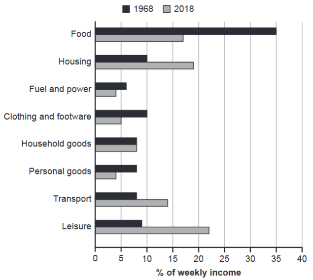
The chart below gives information about how families in one country spent their weekly income in 1968 and in 2018.
Summarise the information by selecting and reporting the main features, and make comparisons where relevant.
1968 and 2018: average weekly spending by families
Student answer (Band 6.0)
The bar graph provides the information regarding families spending their weekly income in a country in the period of 1968 and 2018. In general, there are few significant similarties in the data.
An anlaysis of chart indicates that the families spending average income on food was 35% in the past and its about 15% in 2018, it declined, and on the housing its increased from 10%income spent to nearly 18% people investing on housing more.The fuel and power has decreased by above 5% to below 5%.
Further examination of the data shows that clothing and footware was around 10% and it come down to 5%, Then household goods stayed at same percentage. And the personal goods also declined from nearly 8% to below 5%.Transport was around 8% it raised to 14%, and leisure activities as highest income spend its upto 22% from just 8%.
Overall, the pattern displays more differences then similarties and people spent income on housing and leisure activites as highest records then others.This data can help Government to plan its stratgies.
AI examiner evaluation
| Criterion | Band |
|---|---|
| Task Achievement / Task Response | 6.5 |
| Coherence and Cohesion | 6.5 |
| Lexical Resource | 5.5 |
| Grammatical Range and Accuracy | 5.0 |
| Overall | 6.0 |
Task Achievement / Task Response: Band 6.5
You cover all eight spending categories and identify the main shifts: food spending fell, while housing, transport and leisure rose; you also note that household goods remained stable. The overview recognises that the pattern changed, and most figures are broadly consistent with the chart. However, some comparisons are imprecise: food is about 17% in 2018, rather than “about 15%,” and the 1968 leisure figure is 9%, not 8%. The overview could also state the most important contrast more clearly—for example, food was the largest category in 1968, whereas leisure was largest in 2018. The comment about government planning is not supported by the chart and does not help summarise its data. More precise reporting and a sharper overview would strengthen the response.
Coherence and Cohesion: Band 6.5
The response has a recognisable structure, moving from an introduction to comparisons and a concluding overview. Grouping several categories in the middle paragraphs helps the reader follow the changes, and phrases such as “Further examination” signal progression. However, the opening claim that there are “few significant similarities” conflicts with the conclusion that there are “more differences then similarities,” and neither clearly previews the key pattern. Some sentences combine several figures and changes without clear boundaries, making relationships harder to follow. The final government-planning comment also interrupts the chart summary. Use a concise overview after the introduction, then organise the details into clear comparisons, with accurate linking and punctuation.
Lexical Resource: Band 5.5
You use relevant vocabulary for describing data, including “declined,” “increased,” “stayed,” and “raised,” so the main trends are generally understandable. There are also attempts at more formal phrasing, such as “Further examination of the data.” However, word choice and collocation are often awkward: “families spending average income,” “people investing on housing,” and “highest income spend” do not express the intended comparisons naturally. Spelling errors such as “similarties,” “anlaysis,” “footware,” and “activites” are noticeable, while “records” is not an appropriate term for category proportions. Build a reliable set of chart-description phrases and check spelling and word forms before submitting.
Grammatical Range and Accuracy: Band 5.0
You attempt both simple statements and longer sentences, including comparisons with “from … to …,” but control is uneven. Several sentences have faulty structure, as in “An analysis of chart indicates that the families spending average income on food was 35%,” where the subject and clause construction are unclear. There are also problems with articles and prepositions (“on the housing,” “to nearly 18% people”), verb forms (“it come down”), and sentence boundaries, including the comma splice in “it was 35% …, it declined.” These errors sometimes make the relationships between figures difficult to interpret. Practise forming complete comparison sentences with a clear subject and verb, and use full stops or conjunctions to separate linked ideas.
See this exact question answered at other band scores. The same prompt compared across bands.
Browse more IELTS Writing model answers or get your own writing scored by the same AI examiner.